I am back, although a little late. Dad had surgery and there was Thanksgiving. As I set out to do, I practiced drawing some faces and conducted a master study of Frans Hans. I also drew a scenery in 2-point perspective but I didn't have the time nor the will to draw in 3-point perspective. I just found it plain boring to draw landscapes so imma have to think of a way to make these perspective studies fun (I think I may just progress to learn more about the human anatomy as I enjoy drawing characters, and right now I am just drawing faces). While drawing faces, I noticed my line work improved when I used the Mercury brush instead of whatever inking brush I was using before. Compare the three face drawings in one page vs. the two other ones which I shaded separately and tell me that the latter doesn't look better than the former. Anyhow, as far as the shading goes, I think it turned out alright with the first one but the second one, the Frans Hals study, the shadow family has too much contrast between the reflected light and core shadows, thus giving the impression that the reflected light is halftones when it is actually not. But please, let me know how I can improve as I find shading digitally very difficult. I have heard of clipping and using different layers but I am not very knowledge in either. I have attempted using "multiply" layers, albeit to no avail (as evidenced by the Frans Hals shading which, again, ended up adding too much contrast b/w core shadows and bounce light).

Perspective:

Head Drawings and Studies:


Next Week's Commitments:

  • Continue doing master studies from George Bridgeman's books
  • Learn to draw hair

(I have limited myself to only two commitments since last week I overburdened myself with too many of them, as evidenced by the fact I did not complete my 3-point perspective drawing which I will soon tackle)

Hope your dad is doing ok!

If you have a story, perhaps consider drawing something with your characters in it to keep your interest, like maybe if ur character is traveling somewhere, and u draw the bg for that with them in it (thats what i do at least haha)

Oh clipping is quite simple and i use it all the time: say you have a circle on the bottom layer. then you make a new layer above that, when you draw without clipping, it goes all over the page. BUT if clipping is turned on, it only colors the circle (or whatever shape or line/stroke you are clipping to) therefore helping u color within the confines of that shape

Personally i dont recommend using multiply layers until you get a good grasp of shading - using it randomly makes the colors look weird - personally i don't use it often - i just color pick the colors i want

I'll make a video of a study for you tomorrow (I hope lol - will email myself so that i don't forget.)

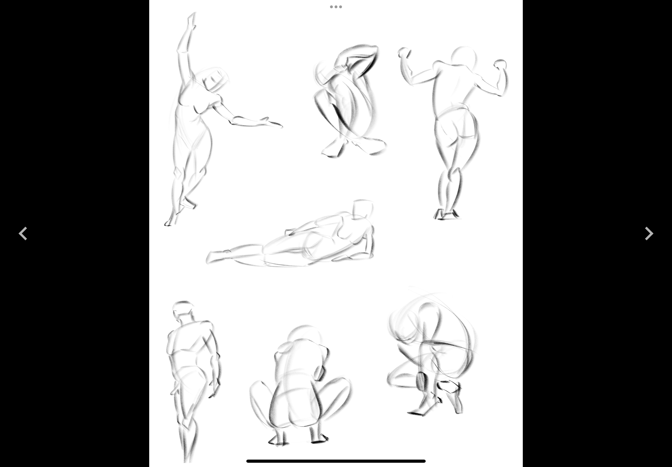
BTW i do recommend that if you are trying to color/shade in grayscale that you also turn the pic grayscale like it is for the second pic :smile: that helps in differentiating the different types of grey to use.

such a good idea :smile: i always plan for too many things and never get all of em done XD

btw your building/persp studies look great i think!

you also did really good on the one you drew traditionally and i think its just in the digital ones your colors are too far apart in terms of value. if you picked closer shades of grey it'd look better too.

^ I LOVE these tiny people they are SO cute XD