It's been a while! I've been having trouble with hair and drawing the head at a side view angle so I tried to do a little study.
I'm STILL on term 4 trying to go over and learn the muscles of the arms and legs. I'm having a lot of trouble with those and so I think I will just group all of the muscles that do the same function together so I can reduce the work load.
I'm also starting to forget some of the torso anatomy. Mainly how the serratus and obliques connect so I'll have to review that as well.
However, I will soon draw a bunch of fullbody sketches from imagination and color code the muscles. Hopefully I will be able to finish my anatomy studies this weekend!
Reviewing some anatomy right now and I thought I would share this with everyone here. Maybe it will help some of you as well!
I knew where the triceps originate and insert, but I didn't know how to draw it when the other muscles are included as well. Maybe I didn't watch the lessons closely enough, but I couldn't find that information anywhere. So I just googled it haha.
I've learned that the long head of the triceps will go above the Teres Major and then go under the Teres Minor and the Infraspinatus. Keeping this in mind, you will be able to correctly insert the arm into the body when drawing the back view.
If there is something wrong with this, please point it out to me!
Here are some portrait studies I did today!
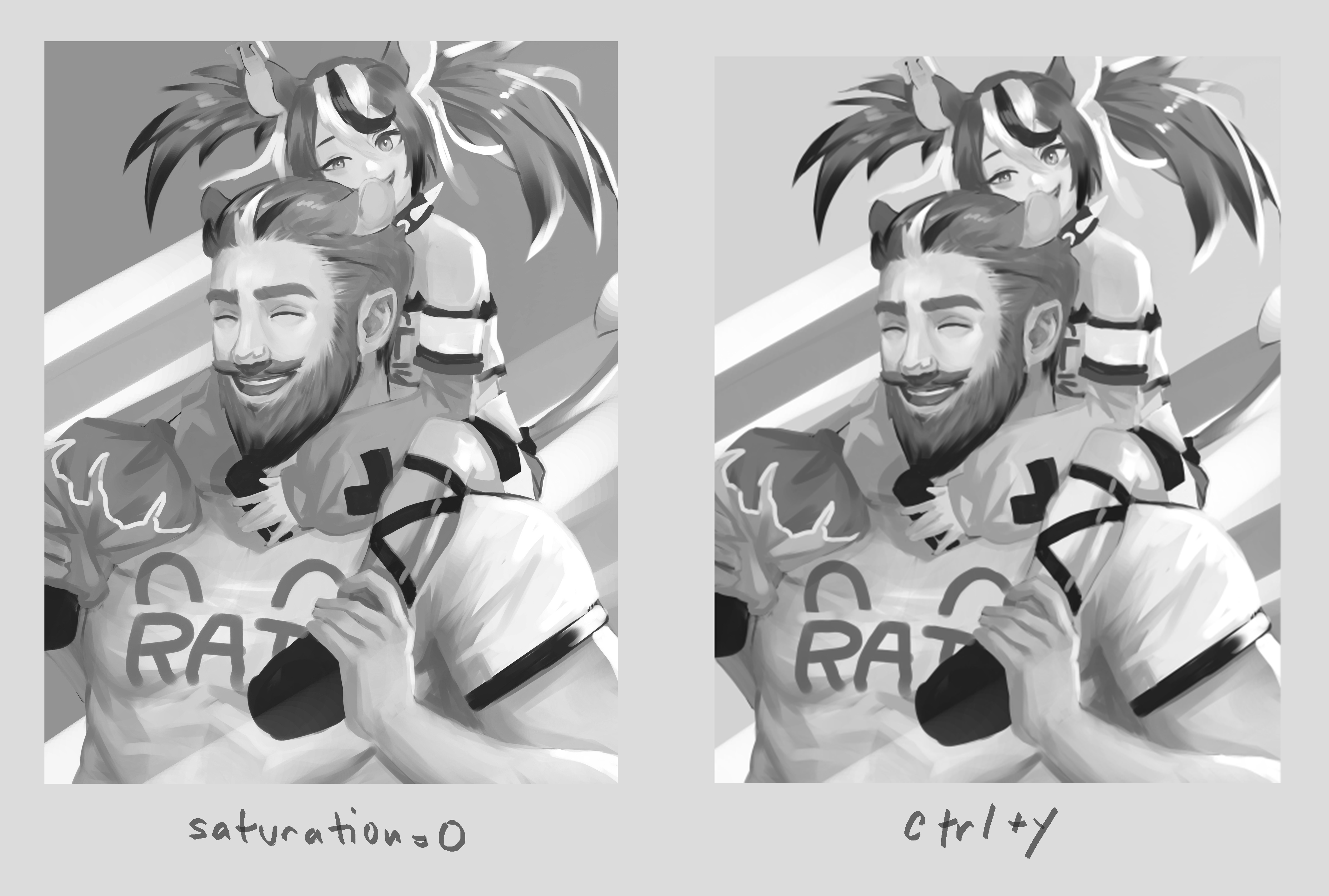
I'm trying to understand how to shade and how to use lighting correctly. Also studying the planes of the face again cause I've forgotten almost all of it LOL!
The reference for the grayscale study I did was given to me by a friend and since they paid for the reference, I don't think I should post it here. But if you would like to know where I got the reference for the toddler and the girl, you can check out Ahmed Aldoori's 50 Head Challenge board on Pinterest here: https://pin.it/6cw1K72
I said I would finish term 4 by this weekend, but it seems I will need a lot more time.
If there are anyway criticisms, please dont hesitate to leave them!
Edit: I'm not sure if I'm allowed to leave links in my posts, so if it's problematic please let me know and I'll remove it!
@Lukiesartventure Thank you! I'm not very confident yet to open commissions, but I'll definitely start giving it more thought
@Lockenheim Thanks! I'll keep pumping out the artworks and improving with you />O< /
@omarkamil2003 Thank you! I see that you've recently joined. Let's improve lots and lots this year!
@LesleyCarol I see! That's good to know. Also thanks! I have been watching and doing a lot of color related videos / studies so it's helpful to know it's working to some extent ahah
Here is a personal artwork I've worked on! My friend is a huge fan of this one hololive vtuber on youtube that goes by the name baelz and so I thought I would try to draw them.
I've been doing a lot of studies, but I still feel like I'm at square one? I don't really understand how to use lighting, how to use effective colors and how to design forms for the clothing etc even though that's what I have been studying.
Maybe I'm studying wrong? I wonder if I'm too worried about making my studies look good that I'm drifting away from the actual purpose of studying which is to consciously make an effort to learn something from the reference.
If anyone else is experiencing this I would love your insight on it! Thank you in advance
I think you used all your points to max out color and shape skills. Your colors and light environments make the illustrations look interesting and fun to look at.
To me it seems like the other fundamentals like values and anatomy aren't on the same level and make things seem a bit off. Your faces are nice but the body and hands seem a little stiff. For the values, some areas are really light even though they're not the closest surfaces to the light source , like the girl's knee or the guy's arm. Also his face seems bright despite it facing away from the light source.
I don't know if you've seen this video by Marco Bucci, but he talks about how some digital color triangles/squares mis-represent colors and their values. He also mentions why using a saturation layer isn't an accurate representation of the values for color.
I made a comparison with your pic to show how different ways of viewing values. If you view it through "proof setup" it'll give you a more accurate look.
It might help to do some grey value studies with basic shapes and blobs and then do more with with color.
I don't know about that ahaha... I personally think my colors and shape skills aren't that great... but yes I am having a lot of trouble with values, lighting, and anatomy.
And Marco Bucci! I have watched a lot of his videos. Basically everything I know about color comes from Marco haha.
The one you linked is one of the videos that I put on the backburner cause it just made me more confused about colors than anything else lol.
I do remember the contents of the video though. Something about how colors getting darker or staying the same in value as you increase saturation even though you made it lighter in value on the color wheel. My brain died ㅠㅠ
I'll try doing some greyscale studies as you said. I'll focus more on actually learning this time rather than making a pretty picture LOL. Thanks for the detailed analysis!