Hi! Thanks, there is a long way to go for me though... I had to have a sneak peek and look at your work too! I love your cross-hatching!
Thanks! Hatching is fun 😃 I say enjoy the journey!
Hi!
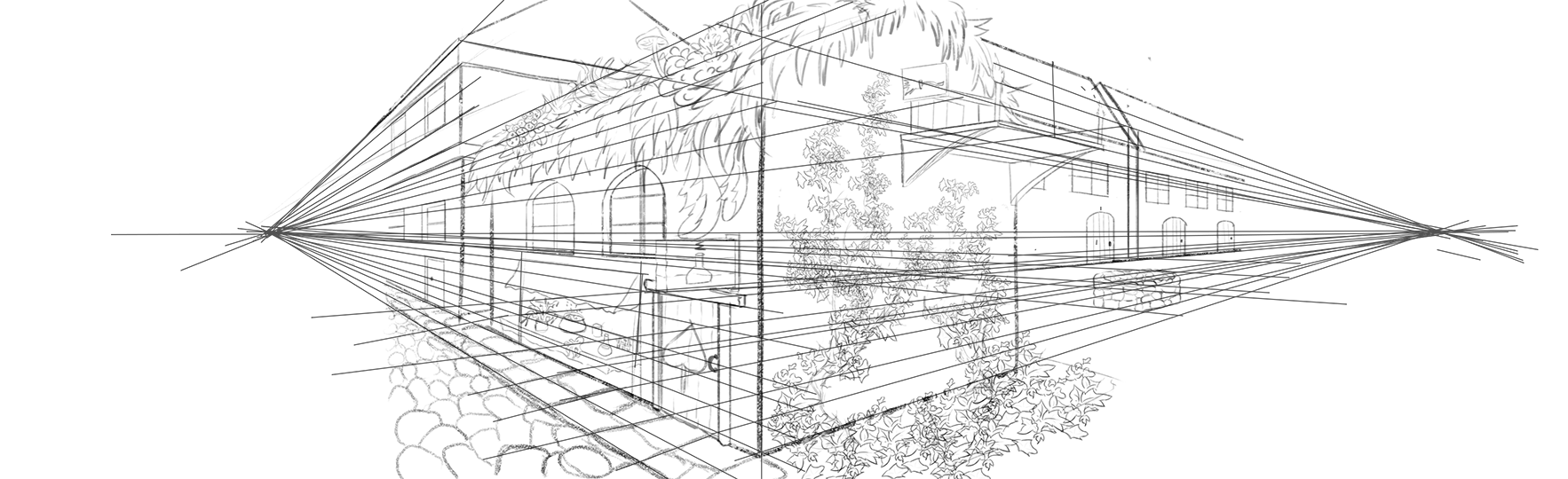
I have finished a building drawing in 2 point perspective. It was fun to see how perspective straight away makes boring drawing more interesting! The biggest challenge was (surprisingly) drawing the well in the right perspective. I have tried a few times and in the end I got to it by drawing a box first and then trying to fit a cylinder in. I feel that it was a bit of a dum-dum method though. Is there any easier/ quicker approach to drawing circular objects in 2 point perspective?
A different issue is an ivy wall - it is made from a self-made brush - but I feel it does not "fit" the drawing, and also has a sad tendency to look like messy spray if I make the picture any smaller. Is it because I painted it too thick or did I made the brush itself too dense or poorly defined?
If you see any issues with perspective please let me know!
Cheers 

This is looking very nice! Congrats on having the patience and perseverance (I struggle a lot with making detailed perspective work!)
So, perspective wise, it looks mostly accurate. I think the topmost window over the platform is slightly off. Apart from that the symbol on the door looks a little skewed and larger on the left, but as it is slightly going to the left, it should be smaller to that side.
Then the proportions, I'm not 100% sure, but I think the doors on the houses to the right should be smaller than the house on the left, and the house on the left
As for the foliage, I think you did a great job as you drew each curve or leaf on its own, you didn't make it too messy or badly defined. I'd say maybe one solution to your problem could be to use a better defined brush, higher res image or if it's too busy, to imply some of the lines rather than draw them completely. If you under-paint this lightly with a textured brush and give it a water color feel you can more than imply the foliage without having to draw every detail for example.
Great work!
cheers
Thanks! It is nice to see the perspective in work but I have to admit the struggle was real and there was some silent swearing involved when I needed to redraw the same elements for the x time 
Thanks for checking the perspective! I will apply some changes to the things you mentioned and get back when it's ready.
With the foliage - I'll try to experiment with it a bit more with what you suggested and we'll see what comes out 
Thank you for your help!
Hi! So I have done some touchups of suggested elements and also after changing the foliage (a new word in my dictionary added  ) got a bit too giddy and added some more greys to the picture.
As for the doors on the right - I have changed them but I have made them even bigger, as those are supposed to be these massive European-style gates through the backyard.
Hope it all does some more sense now
Again thank you for the tips and critique! 

Looking awesome!
Thank you! It's been a bit of a project and I have been doing a few hours and then coming back another day so time is very much an estimate. And I have to admit, I am embarrassingly slow  - So I'd say in total about 2 days of initial perspective work and then another good few hours with adding the greys. But a lot of this was also learning how to make custom brushes, first-time usage of some other PS tools and also standard - painting on the wrong layer so now you have to do it all over again- issue.
Hi! I have started some things from term 2 to increase the variety of stuff to practice and man I sure feel like this is a new level of challenge for this term.
But practice, practice, and one more time practice!
Here are my sweaty attempts with the head constructions.
List of things to improve on:
1. Freehand circles still have a tendency to be more ellipsoid, usually in horizontal direction.
2. Measuring 1/2 and 1/3 is at somehow inaccurate
3. I do not know if I do the small ellipse in the right way (so the poles match the direction of the face and the mid-cross is 90' inside) but somehow it makes the construction hold?
4. Lineart is still sad but working on it.
5. I am often ending up with chubby short jawed faces - and then need to redraw them - I suspect it is due to points 1) and 2), but sometimes it does it even if things seem measured well.
If you have any suggestions please let me know!


These heads look good. Since they look small here it may be hard to notice but I think you make the mandibular ramus a tad too long (the back of the jaw that comes down from the skull at the temporomandibular joint), maybe to compensate for slightly long symmetry lines at the front (the chin is too low)
Very slight differences make a huge impact on the overall feel
Keep it up! Cheers

Thanks! I must be overcompensating with the fear of chubby face incidents. And yah, maybe if ill have a head a lot bigger 2-3mm one or the other way would not be making such a big difference. Next week's challenge updated!
18 days later
As I was away for a while figured it's better to draw with pen and pencil than not at all. I find it a refreshing and challenging experience. No erasing! - That was my personal challenge as I think I overuse it and also get too fixated on unimportant bits while digital drawing. Definitely going to do some more in the future!


