

Just wanted to say hi and that the design you are working on is pretty cool, the helmet is pretty dehumanizing, interesting way to take it.
In the front image you have what appears to be a belt on the character, I think that is a good idea and work trying out on the initial concept.
Looking forward to seeing more of this.
Renooooo. glad to see that you joined! you might not remember me, but its oki. your stuff is looking really good though! keep up the good work! 
@PeterH ahh thanks yes I felt that was the right direction for what I imagined but we'll see how it comes together. I'm looking to try to humanize her in other ways besides just showing a face. Thanks for looking!
@MODOF Ayy Amir right? Yo man haha glad you are doing the Art War as well : )
Color exploration. Thinking of going with B or D. Might push back the color saturation and shades here and there we'll see. Time to do fight sketches to show what she can do.

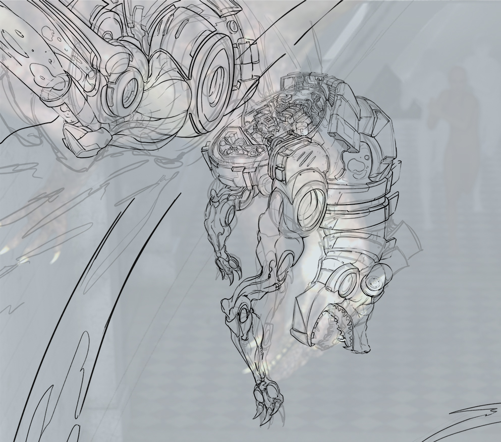
fight animation exploration stuff and messing with some poses.. gonna do 1 or 2 more pages of this. I need to push more complicated animation fight actions to really get her concept across...need to push out of my comfort zone in that aspect a bit more.
Need to show animation or where she takes out her whip from and how she wields/generates energy from. Gonna take a handful of my favorite ones and polish them up more to put within my concept sheet to give more mood of how she functions.

These are all so awesome!
You have an amazing line work!
Love the ones with the whip going above her


Last one looks sure hyper epic ^^
@mr_dessin ty for kind words ^ v^
so I have the rough scene set up just so I have everything set up and I know my space a bit more out of my head. This is just a base reference for posing/placement/lighting.


Crazy details :faint: !
No doubt this will look epic in the end ^^
@mr_dessin appreciate the kind words ^ ^;;
wip - working on general lighting for characters I'd like. Will fix the perspective in place for car and other props i'd like to put in later. Going with a cyberpunk grim dark feel. So will also change the main characters colors when I get to it.


Here are my options. The top one is following the perspective of the camera from my reference 3d set up.
The bottom one is what I created that possibly fits the scene better
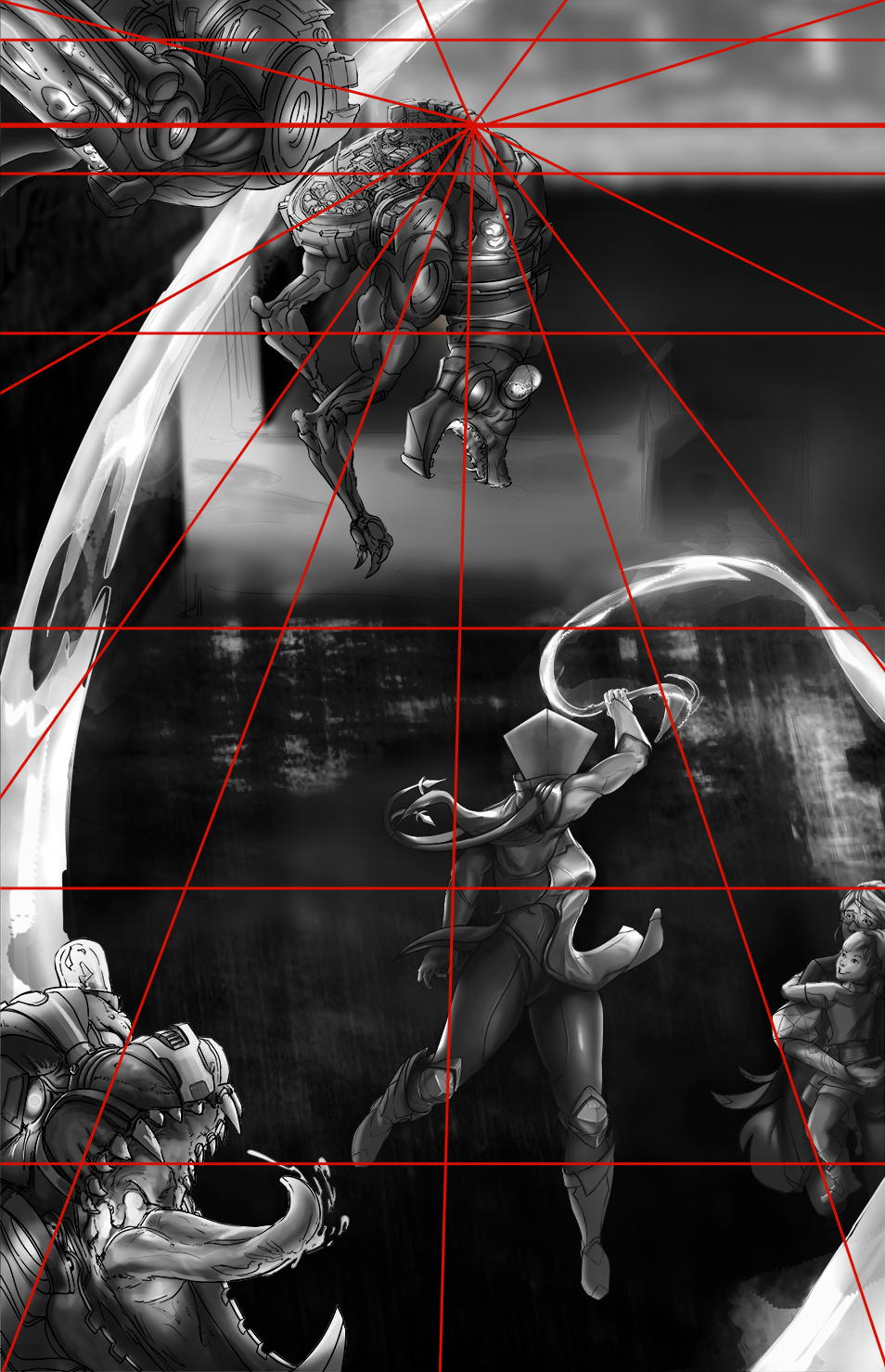
If I go with the top one since the vanishing point is so far up I could set up the bg to show more depth... but show less of the BG. If I go witht he one i created it'll show more of the cyberpunk BG elements I could put in... Mmmm..... I might go with the first one, it feels a little more challenging and allow me to work with the 'less is more' approach so time wise it could possibly help me as it takes away more elements I'd have to render. Also allows me to have opportunities to find creative solutions that mostly focuses from the top down and how I can incorporate cyberpunk properties.