• Gave myself 5 days to do something. This is what I managed to do. I'm trying to get better at illustrations, but I have patience to work on something for 3 days maximum :( Splash_Process.jpg5000x3140 2.21 MB Splash_Process-6.jpg3896x2429 2.83 MB concept list char copy.jpg5388x3000 1.7 MB
    20.6k
  • Did a character concept for a course.https://www.artstation.com/artwork/P6gm3y - more:) list1.jpg3541x1920 2.82 MB
    20.6k
  • Day 4: Star Wars May The 4th =] Queen Padmé Amidala in my art style! First time drawing her and I really enjoyed making this one! Used watercolours, ink pen, acrylic markers and gold paint for accents on my Canson mix media sketchbook. I hope you like it!
    81.6k
  • A creature design from a while back
    by
    6.6k
  • Here is some more recent stuff, I need to make more body studies
  • It's been a while and god, it is so cringe to go through all previous messages xDmy study.
    20.6k
  • Thank you! I finally cleaned that up. Meanwhile started 3 more ..I have a habit of taking too long to finish a piece, then I lose interest in it and just start something else. I found 8 from recently i started and abandoned, that are decent enough to not delete, but not finished. There’s also been a number of drawings I felt I “outgrew” - became better before I finished them, and it would be easier to start from scratch than fix them. Anyone else thinking that?
  • Lady Death Fanart Collectible: Part 6 Polypaint and base Hi, it’s time to share with you another part of the process to create this fanart piece. Polypaint As this is my first collectible fanart I didn’t have previous experience with polypaint so I tried my best and played a bit with it.I wanted to give a ghostly and eerie look to Lady Death, she is beautiful and deadly, but at the end of the day she is a woman that died and was reborn at hell as an avenging spirit, that’s why I gave her skin tone a bluish very cold tone.As you will see I gave myself some creative freedom to deviate from the traditional color scheme that this characater has in comics and illustrations.To add a bit of sensuality by painting some freckles on the face and the chest. The dark nature of this character was the perfect excuse to gave her a kind of goth make up, very dark shadows around the eyes, blue lips and fingernails. I know that the original character includes sexy red lips but I wanted this girl to have a sexy but at the same time creepy look, that’s why we can see some thin veins emanating from her eyes. The biggest chromatic change I did for this character is at the hair. Lady Death has a characteristic white weavy hair but in my fanart I decided to gave her a very saturated blue color.The reason behind this wasn’t only an aesthetic choice. I want that the face area strongly pulls the attention of the viewer so this area needed a stronger contrast. Another reason is that I want her to have a more modern look, as I mentioned before, I’m strongly attracted to women with goth/punk look. I gave myself half an hour or more to analyse the work of experienced sculptors that create collectibles and I discovered that the use of darker values on the skin is often applied to create a greater sense of volume and three-dimensionality. I found that areas with heavy ambient occlusion are the perfect places to paint with darker colors in order to increase the separation between different forms. Even though she has a bluish skin tone, I used a bit of warmer hues in areas that, in real life, tend to go towards red and pink, this is very obvious in the nose, cheeks, and knuckles. Thinking with a logical mind it’s completely absurd to have warmer tones on the body of a zombie like creature but I didn’t want to limit myself by using only blue tones, it looks boring and artificial. In real life these colors are created by blood vessels in areas where the skin is very thin. ** Scythe **for her weapon I applied a cool gray with some warmer variations, this color scheme is influenced by the work of H.R giger. Base I’d like to talk about the design for the base which, to be honest, I forgot to develop along with the character.My main idea with the base is to show that Lady Death inhabits a very sterile and arid land, at the end of the day she is at hell.You can see a that she walks over dirt and rocks, a sign that she’s surrounded by death and loneliness. As part of the landscape we can see some bones and skulls to reinforce the idea of lack of living creatures, yet we can see three hands that try to reach her legs.This hands represent that all creatures are subordinated to her power and seek an evil blessing with a simple touch of the princess of the damned.1- The hand with skin burns represents the souls of those who are newcomers to hell, tortured souls that suffer for the sins comitted on earth.2- The hand with greenish rotten skin and pustules is the reminder of the decay that has infected the souls of those who have been trapped and have forgotten their humanity3- Last but not least, the hand of a demon shows that even dark creatures and entities bow before her presence. The cherry on the top, at least in my vision, are the simese twins that emerge from the ground, this malevolent creatures remind us that in hell there’s only perversion and any trace of innocence is lost. Thanks for reading till this pointI’m really happy to be very close to finish this creative journey, last but not least it’s mandatory to talk about splitting the sculpture in several pieces to be printed, this will be my last entry before showing the final rendered images. See yaMay Zbrush be with you
    1.4k
  • memory 2min gartic phone, used ref 2m gartic, used ref for pose 2min gartic 2min gartic 2min gartic 2min gartic memory memory memory memory study memory memory memorymemory memory memory memory memory memory study memorystudy study stylized left memory, right study study memory memorymemory memory memory memorymemory memory, porportions r offmemory memorystudystudy memorymemorymemory memory memory memory memory memory memory memory, right leg is a bit broken The feeling of only getting 1 - 3 likes on a social media post will never not be discouraging. But nothing is discouraging enough to make me quit drawing. I think the strategy of drawing a lot of stuff and waiting a while to post is good though rather than posting it immediately and then feeling that sadness on the next set of drawing
  • Urban Dragon Girl Wip Urban Dragon Girl_wip1.jpg5000x5000 1.11 MB
  • Long time no see! New artworks produced lately
    6.5k
  • studies studies juri study imagination, how I feel before a speech imagination imagination study something I drew for my presentation also drew this for my presentation, didn't fix the one hand being bigger than the other imagination + study study studies study study, I need to fix the face a bit based on screenshot from anime but in my style study. except for the eye study studies studies study. changed some things tho imagination imagination imagination study studies, except top right samurai based on anime screenshot wolverine studies, changed some of the poses a lil, not very good at all, but first time i drew the character ever. semi study studies study imagination imagination imagination , for first time ever i tried to draw over 3d model for middle pose, I dont like the result tbh, but it makes it much easier than coming up with it from memory.imagination, except right figurestudies imagination + studies, coming up with action poses r hard, these are not dynamic enough, I will redraw better ones in future. imagination , imagination imagination study, except for eye imagination imagination imagination doodles except for the two chrollos imagination storyboard thumbnail, idk if i ever shared this. my storyboards end up being a little detailed since i usually just draw in one layer.
    by
    22.1k
  • Quick fun sketch. CyberFish.jpg2394x3857 674 KB
  • Neon Gambit This is a fan art of my all time favorite character Gambit from the X-Men.I made this a birthday gift (26.04.2024) to myself and honestly I really do like how it turned out in the end =] I hope you like it as well =]
    81.6k
  • Art Blog - April to September 2023 Suffer a little burn out. Look at some memes. Here's some art from in between. critique.jpg1333x5736 1.77 MB
    20.3k
  • And some more! Been painting over them a bit more this time. Some variants I tried for the old guy using mainly the liquify tool. Someohow looking a bit like Owen Wilson (not intended :D)
  • Cafe sketch/color study
  • Hello! My name is Vithor, I am from Brazil, studied Design at a local college worked as an illustrator for more than 10 years. I took a time off around 3 years ago and am trying to get back in my art shape and maybe become professional again. Here are some recent pictures: You can find timelapses for most of them on my instagram: www.instagram.com Vithor Albertim (@vithor_albertim) • Instagram photos and videos 123 Followers, 638 Following, 19 Posts - See Instagram photos and videos from Vithor Albertim (@vithor_albertim) Comments and critiques are always welcome.Cheers!
  • @patrycja.lerch Thank you I created another variant, which might capture the witch look I was going for better
  • Thank you @daceronine! If I remember I save in google cloud, I will have to stick a note to do it more often. Lamp is from life. Poses are from refs but I look at refs for a while and then try to do it myself and look it up if needed. Outfits and rest is from imagination Something went wrong while installing system so we will have to wipe everything again... pc works but something is wrong. We will wait till internet is done and I will save everything on cloud this time Threads came out in eu. It's been 3 days and I had more engagement than after half a year on instagram. It feels really nice I hope it stays this way A portrait of old dude. It's the same character I posted a while ago. Inspired by Bayard Wu work. At first I thought of him as a bear but I named him Fenrir and I think wolf suits him better. Eye gave me a bit of hard time but I think it is fine now. I focused on face and forgot about area below. The way I draw hair clashes with greying hair. I had the same problem while doing Lohse's white hair. Does it looks like it is greying here? I love how desaturated red looks blue there. I keep lying to myself that I will use different color scheme but It all comes down to this blue and yellowish one it is just flipped this time Have a great day!
  • Been bad about posting updates on the forum. I figure I should just throw down stuff. instead of waiting until I finish something.
    14.5k
  • Havent done much this year since I am focusing on learning programming and deving my own Indie Game . But here 's a New Year Piece 2024 , she 's the mascot for my Game Studio - Lucid Realm : Lucid Chan ! LucidChan_v001_sketches.jpg3072x4352 973 KB
  • IMG_0637.jpeg3240x4050 1.6 MB
  • Long Crested Eagle studyI had so much fun making this one and honestly I love that Eagle! It looks so cool! Used for this one high quality watercolours, high quality watercolour sketchbook/ cold press and it was 300 grams paper.I hope you like it!
    81.6k

Nice details, good luck with further updates!

Thank you :wink: . Thats what im mostly in .. detailed lineart. And hopefully during the next ten days this will make a huge leap XD

WORKING ON A WARRIORS FACE ..... #ARTWAR

I decided to put some more work into the characters face (really should pic a name in the near future) because I wasn't happy with some of the elements. I switch the whole face, because I most of the pictures in the web show ODIN without a right eye. Also worked on the beard ... didn't liked the first beard-ring-design and the overall shape. Also wanted to make him look more alive ... he needed details. I'm not sure with the tattoo on the forehead but with the rest .. yeaaa..thats probably it. Fun fact .. I don't know why, but i think he looks a bit like Batista the Wrestler XD.

All versions of the face >>> https://www.artstation.com/artwork/A9ZwAW
Al parts of the project can be found here >>> https://www.artstation.com/artwork/1n48LZ

SIXTH SKETCHES [24DEC2018] "HAND OF THE GODS" #ARTWAR


Time for a big update ... at least i think its one. I re-designed a pretty good part of the bodyarmor and added some norse details to it. Now I'm pretty happy with the look and I think I will stick to this. Also added the new face to the design. After that I made comparing sheet you see above to use it as a base for the design of the for the personal stuff, equipment and details u need to fill a characterdesign with life. Then i added a life-size version of the spear. Over all I'm damn happy with the design ... still need to design another weapon, but after that i think i start to work on the "action illustration". Really hope i get it done before the deadline. With all the details and all that stuff ... its going to be tough XD. Still a lot of work.

All versions of the characters face >>> https://www.artstation.com/artwork/A9ZwAW

Al parts of the project can be found here >>> https://www.artstation.com/artwork/1n48LZ

artwar #sketch #wip #workinprogress #characterart #characterdesign #illustration #conceptart #wacom #photoshop #cubebrush #artstation #norse #viking #fanatasy #scifi #gameart #gamedesign

SEVENTH SKETCHES [30DEC2018] "HAND OF THE GODS" #ARTWAR


Well ... i guess .. that's it. Think the designe - phase is done. I thought I would be done a bit earlier...but then I read the guidelines for the #ARTWAR again and saw, that I have to do a front AND a backside-sketch of the character. Also I decided do a second run on the weapon - design because, although I like the esthetics of modern days weapon-design, I wanted a different ... more scifi-isch ... more fitting look ( more on that in another post, link below this text ). All that gave me the option to more or less review the whole design an add some ideas here and there. The other good thing is ... they added another seven days to the contest deadline. As I still need to draw a full colored illustration of the character in action that is a pretty good decision for me XD. I'm sure I will make some more small changes here and there during the illustration, but that's a normal process I guess. Im really happy with the whole result and I have a ton of ideas in my mind to fill this world with more illustrations, story's and live. But first ... I need to make an illustration :wink: .

All versions of the characters face >>> https://www.artstation.com/artwork/A9ZwAW

Al parts of the project can be found here >>> https://www.artstation.com/artwork/1n48LZ

Weapon -Design -Details >>> https://www.artstation.com/artwork/oOJP34

Final Concept - Sheet >>> https://www.artstation.com/artwork/Vd29A5

artwar #sketch #wip #workinprogress #characterart #characterdesign #illustration #conceptart #wacom #photoshop #cubebrush #artstation #norse #viking #fanatasy #scifi #gameart #gamedesign

WEAPON DESIGN SKETCHES [30DEC2018] "HAND OF THE GODS" #ARTWAR


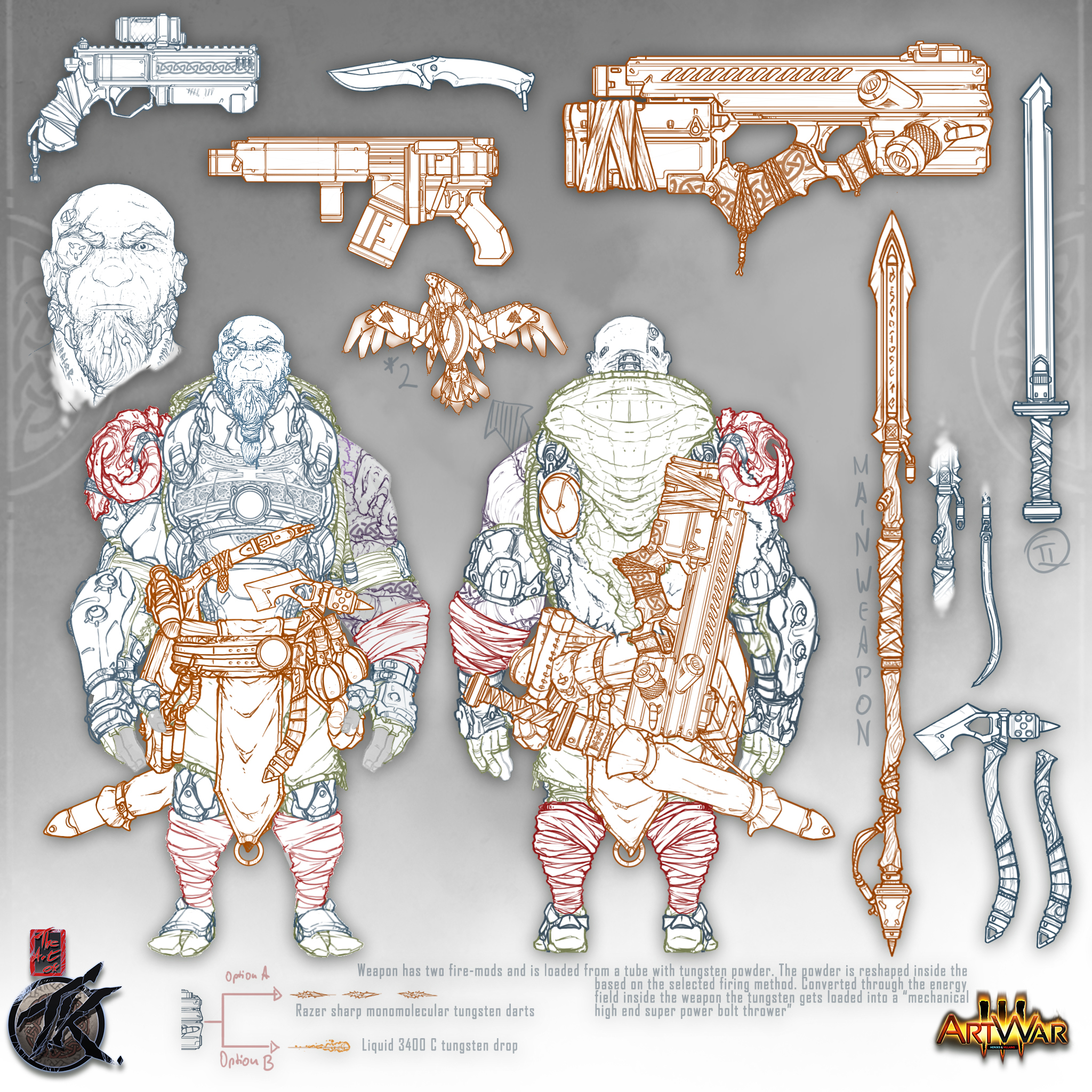
Weapon design ... i always liked to do that. Thinking through the technical details and usage of the weapon, trying to imagine the thoughts that might be behind the design of the weapon if someone actually would try to build it, the culture that made this weapon, whether it be a firearm or a close combat weapon, in what kind of way i can combine the technical possibilities of the specific world the weapon would exist in and the visual requirements that are created by the look / design language of the overall world/game/concept the weapon is created for ... going through all these things is actually fun for me. I picked some references i thought that would help me to find the right look and stated with something i simply like .. modern days weapon esthetics. Then i tried to imagine how it would change a weapon like that, if it would be owned by a culture that lives in the sci-fi / fantasy mix world version of the northern mythology. And I wasn't happy with the result. Shit .. what now? I restarted the thinking process and realized that the weapon wasn't "fantasy" enough but at the same time it wasn't "scifi" enough for the world i have in mind. So i picked up the idea of a modern day / scifi crossbow and looked at some vids about tank ammunition that works with hyper-velocity molten metal ...sound cool to me :wink: . Additionally i wanted the weapon to be a one-hand firearm . The character wields a big spear ... so there are rarely situations where he would have both hands for a firearm. So I designed it compact / bulpup style.

The internal mechanism utilizes a high tech - slingshot / crossbow system that accelerates the projectiles of the weapon on hyper velocity level. The ammunition of the weapon is a tungsten-powder and every magazine holds enough powder for a couple hundred shot. The conversion chamber melts the needed amount of powder and transfers it to the infusion system where it takes its final, pre-programmed form and is then fired by the slingshot. On form is either a razor sharp dart of solid tungsten with mono-molecular edges, that is used for bursts and "soft" targets, or the other form is a single shot 3400 °c bigger bolt of molten tungsten for "hard" targets. At least in my mind this should have some cool effects XD.

All versions of the characters face >>> https://www.artstation.com/artwork/A9ZwAW

All parts of the project can be found here >>> https://www.artstation.com/artwork/1n48LZ

Weapon -Design -Details >>> https://www.artstation.com/artwork/oOJP34

Final Concept - Sheet >>> https://www.artstation.com/artwork/Vd29A5

artwar #sketch #wip #workinprogress #characterart #characterdesign #illustration #conceptart #wacom #photoshop #cubebrush #artstation #norse #viking #fanatasy #scifi #gameart #gamedesign

FINAL CONCEPT SHEET [30DEC2018] "HAND OF THE GODS" #ARTWAR


This is the final character concept sheet for my entry on the 2k18 / 2k19 #ARTWAR by cubebrush. More info in my blog on Artstation.

All versions of the characters face >>> https://www.artstation.com/artwork/A9ZwAW

All parts of the project can be found here >>> https://www.artstation.com/artwork/1n48LZ

Weapon -Design -Details >>> https://www.artstation.com/artwork/oOJP34

artwar #sketch #wip #workinprogress #characterart #characterdesign #illustration #conceptart #wacom #photoshop #cubebrush #artstation #norse #viking #fanatasy #scifi #gameart #gamedesign

Illustration Sketch One [06JAN2019] "HAND OF THE GODS" #ARTWAR


Time to give the big boy some action ... finally started with the illustration.

All versions of the characters face >>> https://www.artstation.com/artwork/A9ZwAW

All parts of the project can be found here >>> https://www.artstation.com/artwork/1n48LZ

Weapon -Design -Details >>> https://www.artstation.com/artwork/oOJP34

artwar #sketch #wip #workinprogress #characterart #characterdesign #illustration #conceptart #wacom #photoshop #cubebrush #artstation #norse #viking #fanatasy #scifi #gameart #gamedesign

Illustration Sketch Two [10JAN2019] "HAND OF THE GODS" #ARTWAR

Just a quick snapshot of my work on the illustration. Have lost some worktime during the last days due to "external influences" ... means there are two pretty hard days of work and long nights coming up for me. I will not give up. I want to do this!

All versions of the characters face >>> https://www.artstation.com/artwork/A9ZwAW

All parts of the project can be found here >>> https://www.artstation.com/artwork/1n48LZ

Weapon -Design -Details >>> https://www.artstation.com/artwork/oOJP34

sketch #wip #workinprogress #characterart #characterdesign #illustration#conceptart #wacom #photoshop #cubebrush#artstation #norse #viking#fanatasy #scifi #gameart #gamedesign

I hate to write this .. but .. its 6:20 AM in Germany, I'm awake for more the 20 Hrs, my back hurts from sitting on my art tablet, I'm tired as hell, my linework started to get sloppy hrs ago, its hard to make decisions and coffee has no effect on me anymore ... and I'm not event finished with the lineart. Close, but not finished. I wont get it done in time. And thats only the lineart ... i would still need to apply the colors. This is frustrating me so damn f@cking hard ... but I give up. I will not be able to deliver my artwork in time. Good luck to all the other participants of the #Artwar ... but I quit. Maybe next time.

8 days later

By far the most detailed badass concept sheet i've seen in a long time!
Lot of thought process and intricacies.
You got a fan! 🤘⭐✨

Thank you man :wink: ... its .. well i always tend to work pretty detailed and i once learned that a detailed background helps to create a good artwork because u have a good foundation to base your work on

1 month later

THATS IT .. i finally finished this. It was fun, although it took way longer then i thought it would .... but again i learned a lot. Today, 13/03/2K19 this pretty much represents my creative skillset. Thats what i can deliver. Im really happy how the artwork looks and hope i will illustrate more of this world soon. Basically he is a paladin devoted to Odin in a northern mythology based sci-fi world im working on. More info about the project and the story in my blog on Artstation.

All versions of the characters face >>> https://www.artstation.com/artwork/A9ZwAW

Al parts of the project can be found here >>> https://www.artstation.com/artwork/1n48LZ

Weapon -Design -Details >>> https://www.artstation.com/artwork/oOJP34

sketch #wip #workinprogress #characterart #characterdesign #illustration #conceptart #wacom #photoshop #cubebrush #artstation #norse #viking #fanatasy #scifi #gameart #gamedesign