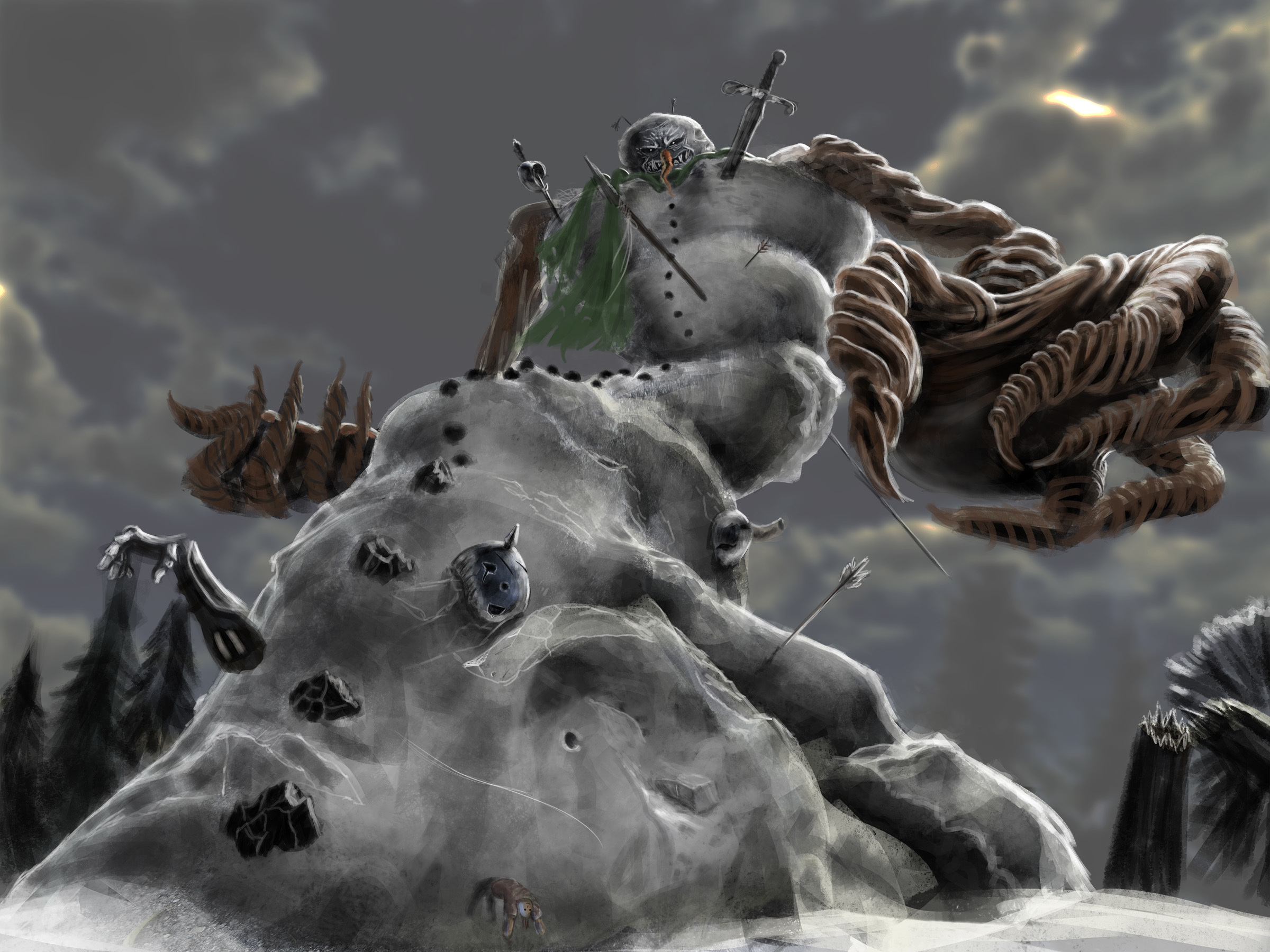
- Thank you! I finally cleaned that up. Meanwhile started 3 more ..I have a habit of taking too long to finish a piece, then I lose interest in it and just start something else. I found 8 from recently i started and abandoned, that are decent enough to not delete, but not finished. Thereās also been a number of drawings I felt I āoutgrewā - became better before I finished them, and it would be easier to start from scratch than fix them. Anyone else thinking that?in24.3k
- Lady Death Fanart Collectible: Part 6 Polypaint and base Hi, itās time to share with you another part of the process to create this fanart piece. Polypaint As this is my first collectible fanart I didnāt have previous experience with polypaint so I tried my best and played a bit with it.I wanted to give a ghostly and eerie look to Lady Death, she is beautiful and deadly, but at the end of the day she is a woman that died and was reborn at hell as an avenging spirit, thatās why I gave her skin tone a bluish very cold tone.As you will see I gave myself some creative freedom to deviate from the traditional color scheme that this characater has in comics and illustrations.To add a bit of sensuality by painting some freckles on the face and the chest. The dark nature of this character was the perfect excuse to gave her a kind of goth make up, very dark shadows around the eyes, blue lips and fingernails. I know that the original character includes sexy red lips but I wanted this girl to have a sexy but at the same time creepy look, thatās why we can see some thin veins emanating from her eyes. The biggest chromatic change I did for this character is at the hair. Lady Death has a characteristic white weavy hair but in my fanart I decided to gave her a very saturated blue color.The reason behind this wasnāt only an aesthetic choice. I want that the face area strongly pulls the attention of the viewer so this area needed a stronger contrast. Another reason is that I want her to have a more modern look, as I mentioned before, Iām strongly attracted to women with goth/punk look. I gave myself half an hour or more to analyse the work of experienced sculptors that create collectibles and I discovered that the use of darker values on the skin is often applied to create a greater sense of volume and three-dimensionality. I found that areas with heavy ambient occlusion are the perfect places to paint with darker colors in order to increase the separation between different forms. Even though she has a bluish skin tone, I used a bit of warmer hues in areas that, in real life, tend to go towards red and pink, this is very obvious in the nose, cheeks, and knuckles. Thinking with a logical mind itās completely absurd to have warmer tones on the body of a zombie like creature but I didnāt want to limit myself by using only blue tones, it looks boring and artificial. In real life these colors are created by blood vessels in areas where the skin is very thin. ** Scythe **for her weapon I applied a cool gray with some warmer variations, this color scheme is influenced by the work of H.R giger. Base Iād like to talk about the design for the base which, to be honest, I forgot to develop along with the character.My main idea with the base is to show that Lady Death inhabits a very sterile and arid land, at the end of the day she is at hell.You can see a that she walks over dirt and rocks, a sign that sheās surrounded by death and loneliness. As part of the landscape we can see some bones and skulls to reinforce the idea of lack of living creatures, yet we can see three hands that try to reach her legs.This hands represent that all creatures are subordinated to her power and seek an evil blessing with a simple touch of the princess of the damned.1- The hand with skin burns represents the souls of those who are newcomers to hell, tortured souls that suffer for the sins comitted on earth.2- The hand with greenish rotten skin and pustules is the reminder of the decay that has infected the souls of those who have been trapped and have forgotten their humanity3- Last but not least, the hand of a demon shows that even dark creatures and entities bow before her presence. The cherry on the top, at least in my vision, are the simese twins that emerge from the ground, this malevolent creatures remind us that in hell thereās only perversion and any trace of innocence is lost. Thanks for reading till this pointIām really happy to be very close to finish this creative journey, last but not least itās mandatory to talk about splitting the sculpture in several pieces to be printed, this will be my last entry before showing the final rendered images. See yaMay Zbrush be with youin1.4k
- memory 2min gartic phone, used ref 2m gartic, used ref for pose 2min gartic 2min gartic 2min gartic 2min gartic memory memory memory memory study memory memory memorymemory memory memory memory memory memory study memorystudy study stylized left memory, right study study memory memorymemory memory memory memorymemory memory, porportions r offmemory memorystudystudy memorymemorymemory memory memory memory memory memory memory memory, right leg is a bit broken The feeling of only getting 1 - 3 likes on a social media post will never not be discouraging. But nothing is discouraging enough to make me quit drawing. I think the strategy of drawing a lot of stuff and waiting a while to post is good though rather than posting it immediately and then feeling that sadness on the next set of drawingin
- studies studies juri study imagination, how I feel before a speech imagination imagination study something I drew for my presentation also drew this for my presentation, didn't fix the one hand being bigger than the other imagination + study study studies study study, I need to fix the face a bit based on screenshot from anime but in my style study. except for the eye study studies studies study. changed some things tho imagination imagination imagination study studies, except top right samurai based on anime screenshot wolverine studies, changed some of the poses a lil, not very good at all, but first time i drew the character ever. semi study studies study imagination imagination imagination , for first time ever i tried to draw over 3d model for middle pose, I dont like the result tbh, but it makes it much easier than coming up with it from memory.imagination, except right figurestudies imagination + studies, coming up with action poses r hard, these are not dynamic enough, I will redraw better ones in future. imagination , imagination imagination study, except for eye imagination imagination imagination doodles except for the two chrollos imagination storyboard thumbnail, idk if i ever shared this. my storyboards end up being a little detailed since i usually just draw in one layer.in22.2k
- Hello! My name is Vithor, I am from Brazil, studied Design at a local college worked as an illustrator for more than 10 years. I took a time off around 3 years ago and am trying to get back in my art shape and maybe become professional again. Here are some recent pictures: You can find timelapses for most of them on my instagram: www.instagram.com Vithor Albertim (@vithor_albertim) ā¢ Instagram photos and videos 123 Followers, 638 Following, 19 Posts - See Instagram photos and videos from Vithor Albertim (@vithor_albertim) Comments and critiques are always welcome.Cheers!in797
- Thank you @daceronine! If I remember I save in google cloud, I will have to stick a note to do it more often. Lamp is from life. Poses are from refs but I look at refs for a while and then try to do it myself and look it up if needed. Outfits and rest is from imagination Something went wrong while installing system so we will have to wipe everything again... pc works but something is wrong. We will wait till internet is done and I will save everything on cloud this time Threads came out in eu. It's been 3 days and I had more engagement than after half a year on instagram. It feels really nice I hope it stays this way A portrait of old dude. It's the same character I posted a while ago. Inspired by Bayard Wu work. At first I thought of him as a bear but I named him Fenrir and I think wolf suits him better. Eye gave me a bit of hard time but I think it is fine now. I focused on face and forgot about area below. The way I draw hair clashes with greying hair. I had the same problem while doing Lohse's white hair. Does it looks like it is greying here? I love how desaturated red looks blue there. I keep lying to myself that I will use different color scheme but It all comes down to this blue and yellowish one it is just flipped this time Have a great day!in48.3k
Bear with me here, the deadline is less than a week away so I am going to be breezing through the thumbnails stage with complete crap. I want to focus on the final piece as much as I can. Just exploring shape at this point. I want to convery a huge tornado/serpent like overgrown snowman. As you can see these were not the shape I was looking for at all. So I abandoned them immediately.
The second wave was a little better. But still no cigar...
The 3rd was relatively similar to what I had envisioned in my head so I decided this was close enough as a starting point.
Now to start the my snowman based on this silhouette.
I have decided based on some of the previous entries from Art War 2 I will be presenting my villain in more of a splash art format than as a concept sheet. Seems to be appropriate. Here's the first pass on my snowman.
My plan is to portray him from a low angle to depict his towering build and possibly play with some cool lighting effects.
I'd like to also add that I like fantasy like Witcher and Elder Scrolls series a lot so I imagined this Snowman being a villain in a fantasy medieval kind of world. Magical and full of swords and over the top masculine men haha.
Refining the actual snowman some more before dressing him up so I don't have to play with so many unknown lighting factors later on. I refined the values as well as backing off on the strong light source for a more overcast lighting for now.
Another update, feeling kind of stuck. Feels really bland and the mood is dead, which I guess is something but I was really wanting to make him have a strong feeling of grim intimidation.
Now I have my base snowman I am trying to establish mood and tweek lighting details.
I have this one
This is the same thing although I have added some light blue to the body of the snowman, I think it gives a more majestical touch to it but I have had some people say they think it is better without, so I am unsure.
I think my biggest problem right now is the snow and maintaining readability. If anyone has some ideas or pointers, please tell me! Thanks.
Added some blur less important areas to bring depth and focus to interesting areas while also providing rest areas for the eyes. Completely experimental at this point, sure about it at the moment I will likely tweak it.
I was afraid to give true depth to the face as it could lose the expresson but here it is, I don't think it takes away too bad since his eyes are still have a piercing glow.
I have decided to forgo the blur for depth right now and have decided to bring him out of the background by giving him an exaggerated blue ice color that you would see in a bright day. I see it used a lot in other great artists work to help emphasize cold icy materials and it seems to read well in my opinion.
Less frost
More frost
most frost and what I think would be more accurate to freezing air based on looking at dry ice.
Again, if anyone wants to comment, on feedback or ideas or anything, please do! Thanks
Softened transitions on shoulder and stomach as well as an atmospheric occlusion effect from the decay of reflected light on the torso in comparison to the trunk which is closer to the ground and the viewer. I still feel like the transition is too subtle.
A front, almost 3/4 concept of the character I knocked out in an hour real quick. Best I could do without photo textures as per the rules. New around here and somehow I read a page that did not give the size requirements for the final piece so I am trying to figure out how to salvage my work without starting over. But I kind of want to just because I love to do this. Will post the back of the concept tomorrow.
Due to some new tasks I had to complete I was busy working all day on something else so this was pushed off to 1am. So I tried to throw together the back concept real fast. It's pretty simple I know...

Most importantly, I removed the sky image I started off with after reading the rules which say no images allowed. As I kept working toward a darker atmosphere it really wasn't necessary anyways. I decided the best remedy for the improper dimensions was to add a foreground between the snowman and the "camera". I think this will work out better as I can add more into the image to make him appear "villainous". I already have a good plan for that. Still playing around with a color scheme that may make the snowman more interesting but I starting to drift back towards the more realistic color scheme which is essentially colorless with the lack of light sources with the snow storm blocking the light. I also think it brings out the claw more which is the most important part of the piece. The claw is communicating his superpower, which is that he can remove heat from anything he touches as his fingertips are causing the particles of already cold to become even colder! Should have another update tomorrow that will make the image even more interesting.
Also, if you are interested in the story of this evil snowman then stay tuned as I will be posting the story to this behemoth at the end of the competition with my final post!
Working on the composition for a tragic scene that will hopefully vilify the snowman even further.
Still playing around with the snow and frost effects on the people as well as the snow being created from the cold of the snowmans hand. Not sure if it's too much or if it really adds to the image. Guess I'll have to give it another look tomorrow. I've woken up many times embarrassed at the previous days "brilliant" work. Pulling an all nighter for the final concept sheet though so hopefully it still has the same effect. Looking at it a second time, definitely have to do something about that long hair fellow dunked in the snow.
Suggested Topics
Topic | Category | Replies | Views | Activity |
---|---|---|---|---|
ART WAR 3 | 2D | Villains | Undead | craingsmail | 0 | 496 | Dec '18 | |
ART WAR 3 | 2D | Villains | Phill | sigma17 | 2 | 959 | Dec '18 | |
ART WAR 3 | 2D | Heroes | The Elder One | danieldimitrov.art | 14 | 2.5k | Jan '19 | |
ART WAR 3 | 2D | Villains | The Seer | Ellenkei | 24 | 3.8k | Dec '18 | |
ART WAR 3 | 2D | Heroes | Frostbite | rjdrossouw | 7 | 1.8k | Dec '18 |