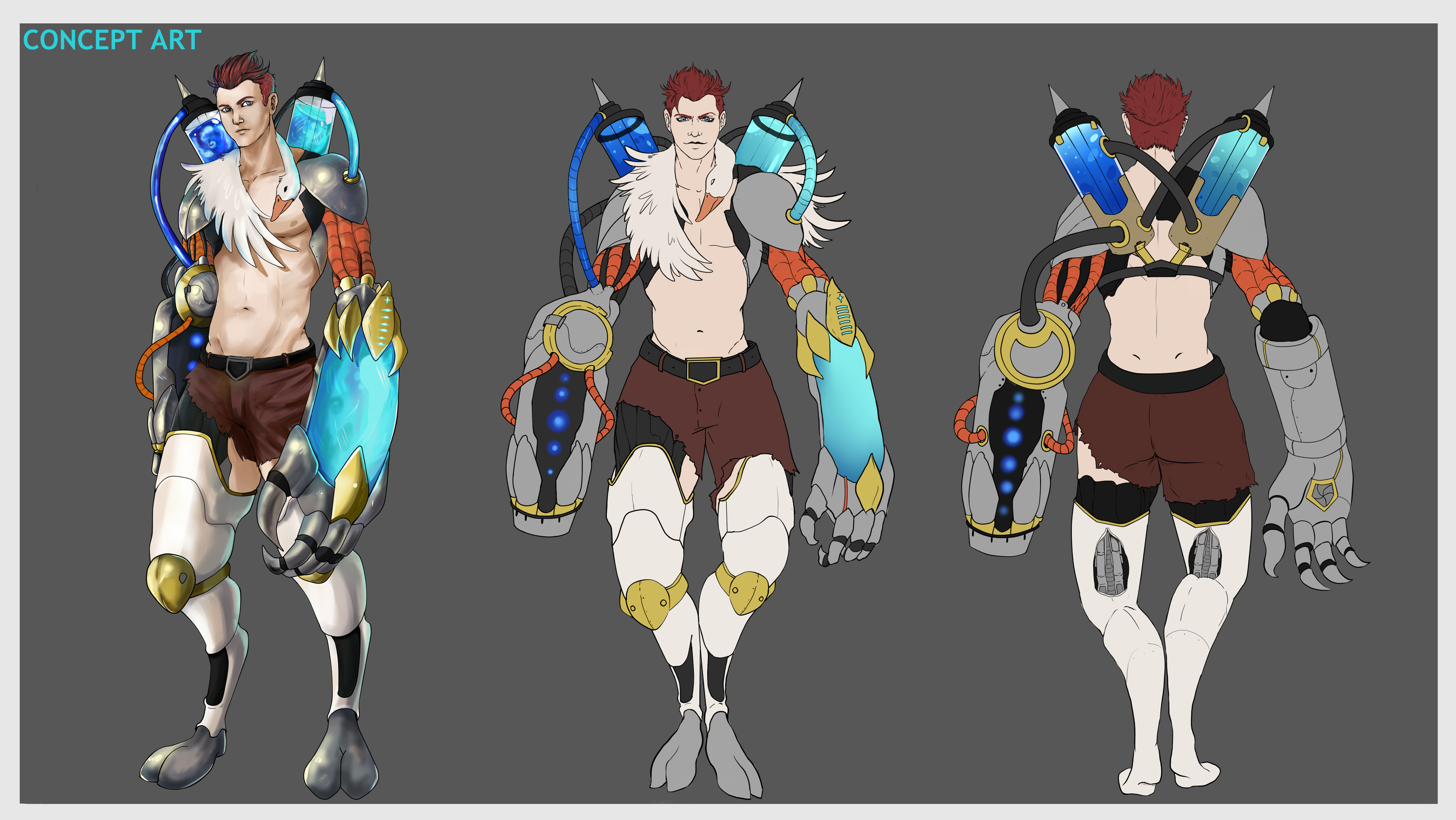
@PeterH Ohh, that idea is very good!
I had thought to make the soul of the person being absorbed but I am going to do some tests with your idea because it is very good!


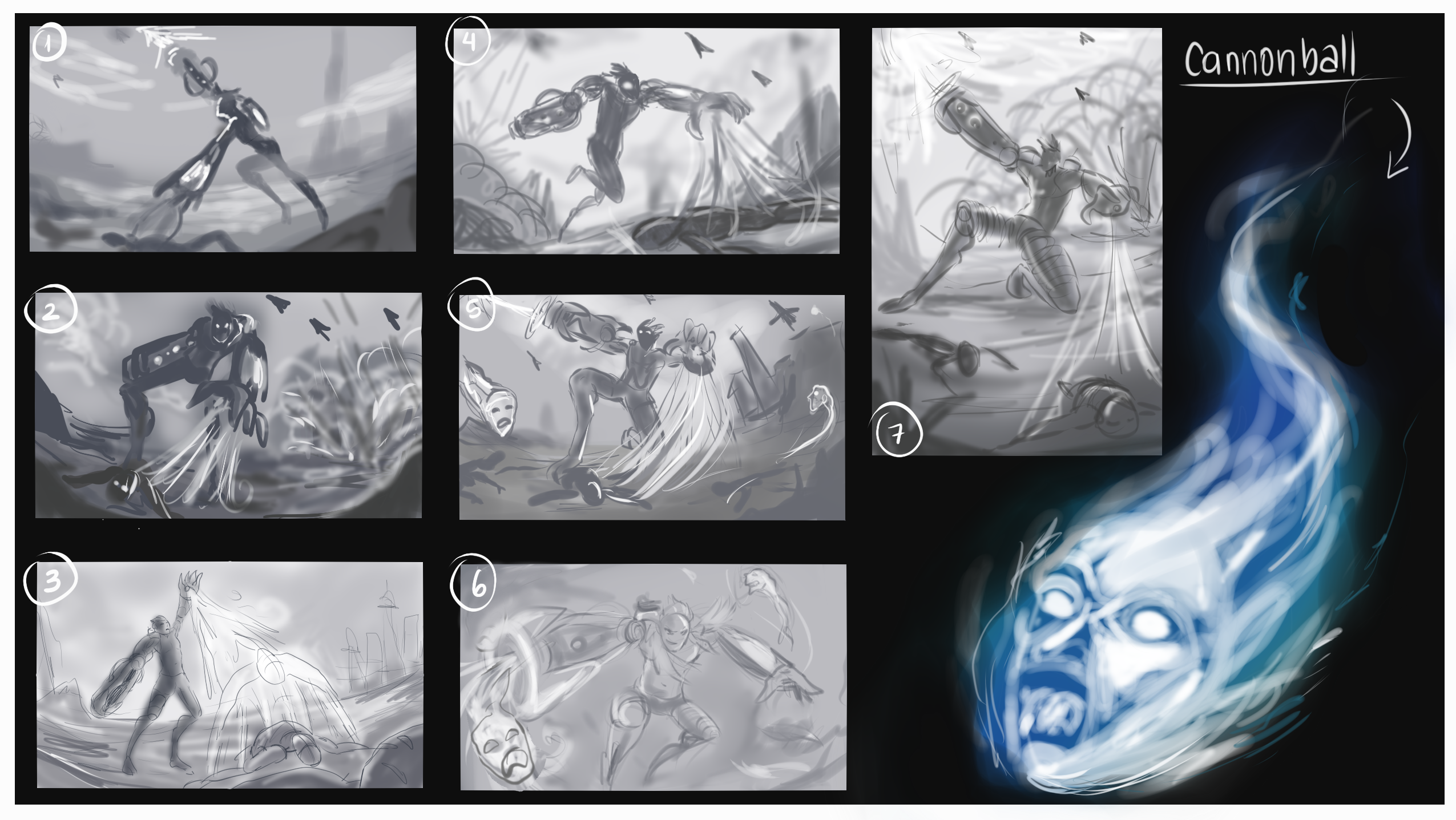
7 or 5! I like the megaman cover vibe on those ones.
On 1, 4, 6 the use of his two powers at the same time feel a bit forced.
2 & 3 might work better with a vertical composition.
That was my two tokens.
@innocent I thank you very much for your comment, it helps me a lot! ♥
@mr_dessin thank youu!! 
The truth that I liked more the 7 haha.
I will make some changes, very few but that will be the end.
thanks for the comment, I appreciate it very much!
I will soon upload the color of the composition! 
I really liked 2! It really shows off the villanous aspect as it's the most intimidating
Maybe 2 with a mix of 5 having him capture souls whilst shooting someone on the ground or causing that explosion behind him.
I also liked the 1st a lot too but it probably doesn't show as much of the character traits as it should
Really good comps! congrats!
Best of luck and see you at war? 
Heey @edenriquebq it was a good idea!
sorry I read it late T_T
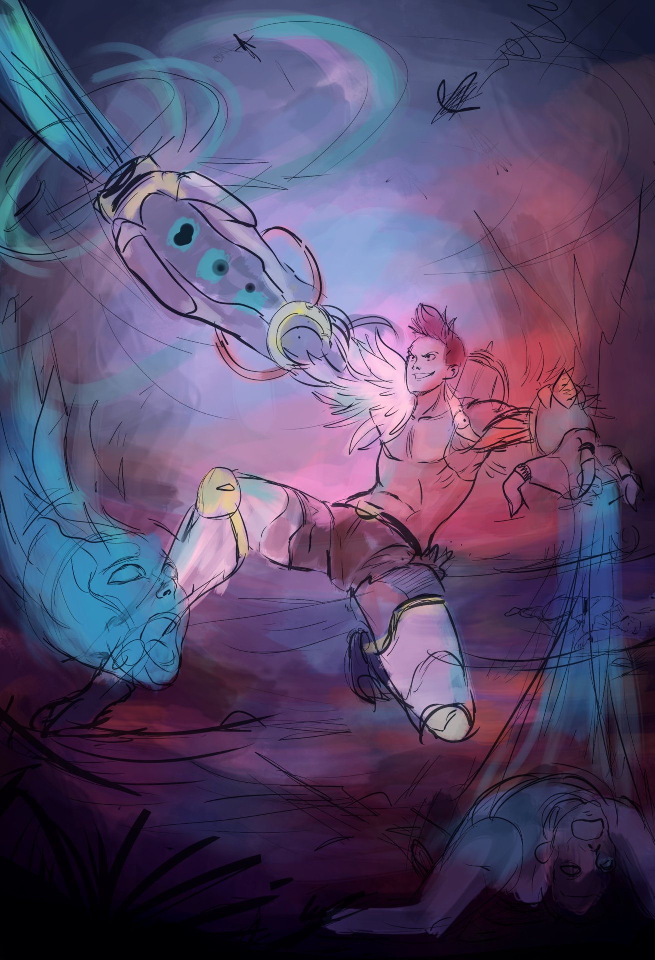
I decided on the 7! and add some souls circling haha
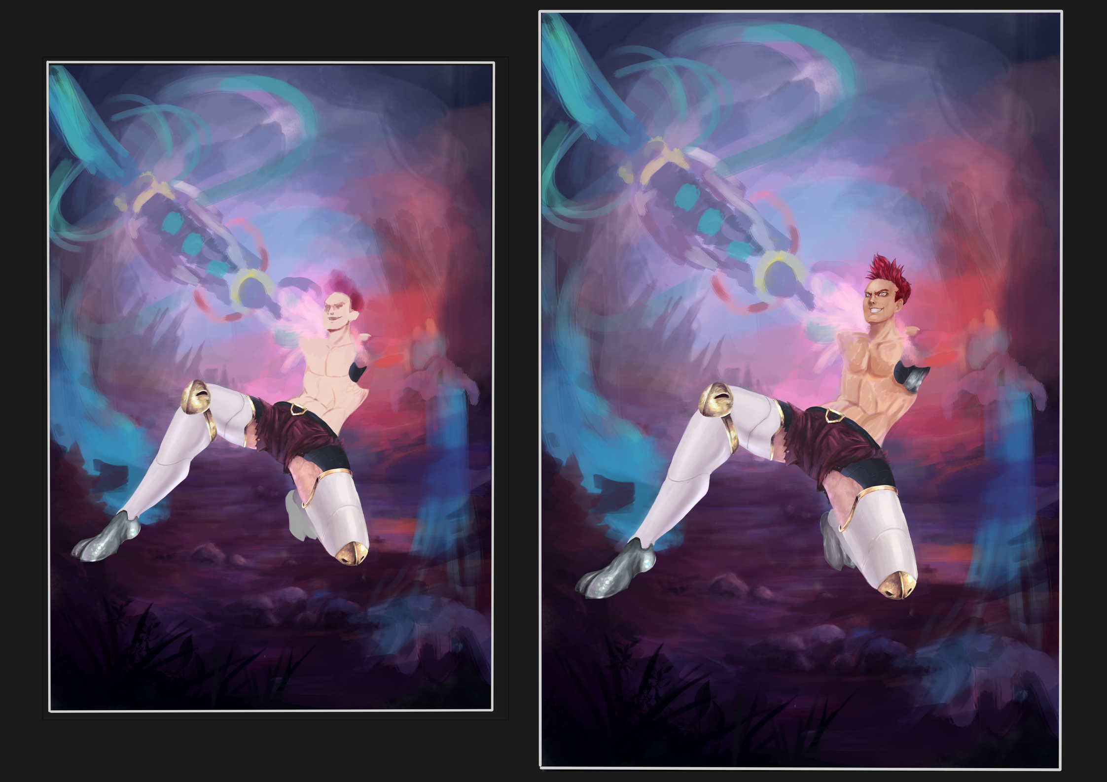
now I did a color test
and the great dilemma, which one did I choose? Hahaha
See you in the war, comrade in battle 

Its a bit normal, but I like 1 the most, even though the later images look a bit more interesting color wise. Perhaps pushing 2 a bit more might be a good solution, it just feels like he needs to pop a bit more in that one.
And I agree that 7 was the best choice.
@PeterH At the moment I'm trying to make a mix a little more interesting with the test 2 and mix the 1 vary a bit more the color palette
See what comes up
I'll upload another version soon
Thanks for your comment, it helps me a lot!
@mr_dessin
haha yes! I like both of them!! If I had time I would do the two versions hahaha.
Yes, I also think that version 2 goes more with a bad character, but I will do another color test a little more contrasted (I like the effect of cold colors with warm colors)
soon I will upload new versions (and I hope they are the last ones ... I'm running out of time D: !!) 
Thanks for your comment, it helps me a lot a lot
Always glad to help !
You're welcome ^^