Shonen Lighting user


https://www.facebook.com/MalcomNYC
https://www.artstation.com/phantom_mjp

Was going to to 3D originally but changed my mind

There are 50 replies with an estimated read time of 3 minutes.

Personally I liked the 5 thumb as it looks pretty intimidating and moody, keep the good work!

Still cool? Is looking amazing! I'm not great at illustration or composition but I think that the legs in the thumb were way more dynamic, but I really like it.

Thanks for the feedback. Point taken.

I love how this is looking so far, although it seems the characters are all competing for space in the image, I agree with alexisarroyon7 in that the thumbs were more dyamic but I really think you could push the composition itself more, or even use a different angle of the character shown against these other foes to make it more "fight scene". As it is the finished sketch you have is a little bland, it's head on and like I said it doesn't have much balance! I look forward to seeing what you produce though

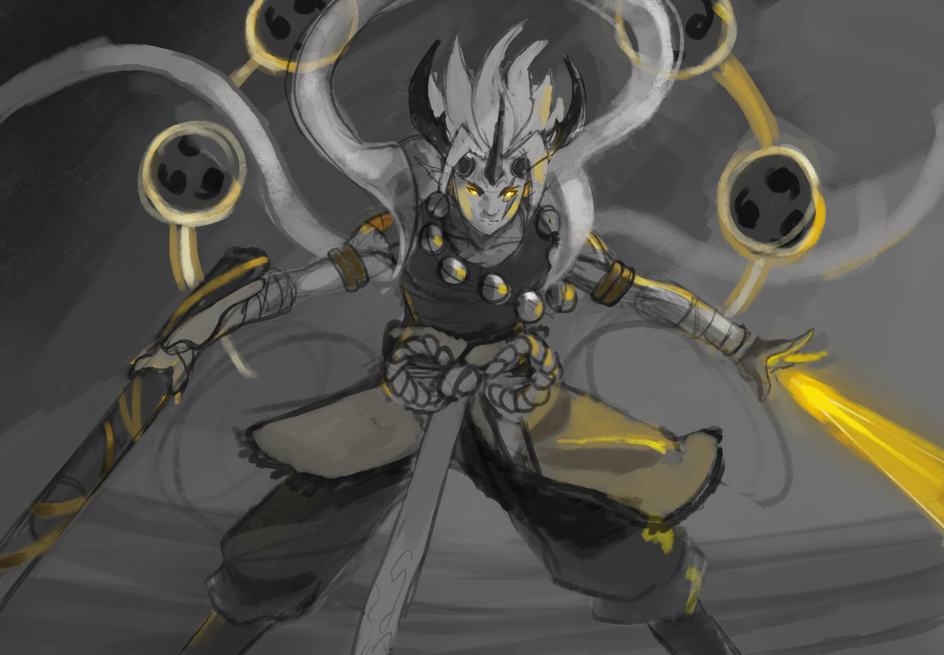
The solo piece is way stronger than other one, it focuses on his power and shows how formidable he could be, i think go with it :smile:

I agree with yazzi that close up is more powerful but in concerns to the newer version of the piece it does already look better. I'd put more distance between the characters and exaggerate the perspective, even make the angle more of a dutch angle and play with the composition

@yazziixx thanks for the feedback.
@nesokaiyoh I think i'll be going with the close up shot for the competition and as for the battle scene I'll recycle it for another piece that I have in mind with the feedback that was given. I like the idea of the dutch angle idea as I've never heard of that before and after researching it, sounds like something that can be really cool. Thanks for the feedback.

Just messing around and having some fun with the design. Saw that other people had a similar hook so I'm changing things up a bit. These aren't final colors but I like the purple background and yellow electricity color combination.

I like the lighting potential for the more monochromatic thumb above. With the light from above (the sky), some bounced light coming from the ground underneath, and a different color light coming from the spheres and the sword, this could end up being really dynamic.

Are you referring to the battle scene or the solo piece?

ah ok. I like that idea. I'm personally not sure what color I'll do for the spheres but I'll play with a few variations. Time to attack this thing some more to prepare it for a clean final illustration.

Hey! Glad to see you're still here this year too! :smiley:
Great work so far!!!

Still working on the design a bit as well as the color comp. I feel like i'm almost there before everything kinda clicks. Feedback always welcomed though.