Océane Roh
oceane.roh@gmail.com
Artstation
Instagram

Hey !
It's a pleasure to meet you. I'm fighting for the earth element with a flag bearer, feel free to leave comments and suggestions :smiley: I'm always happy to read them.

Current stage

Heylo everyone !

So first real post for this challenge; I want to make something I can really be proud of, so I've decided to take my time and I made some reference sheets wich I share with you there.

I have some pretty good ideas already and I can't wait to draw them !

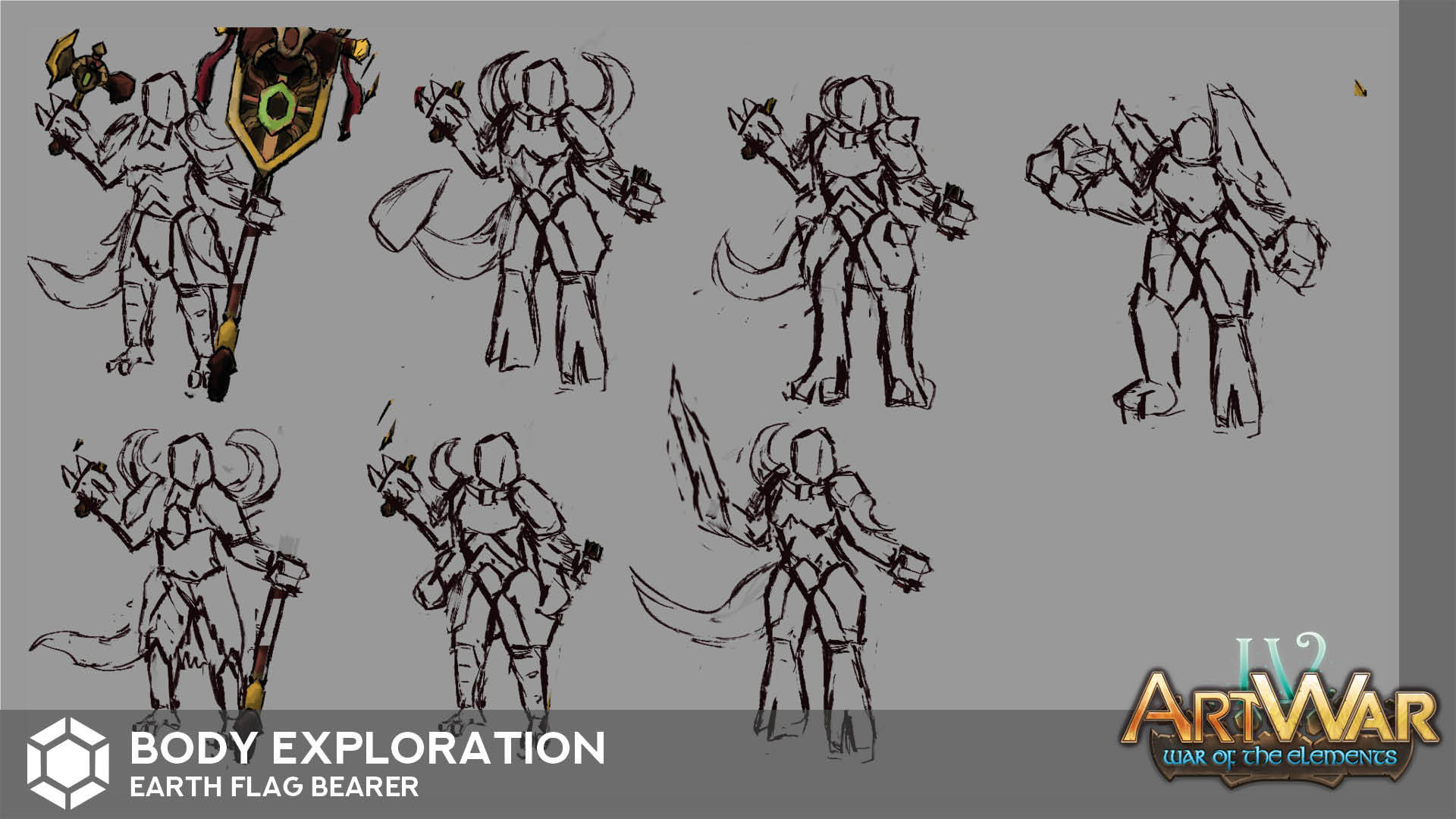
My very first rough sketches,
I'm exploring various directions, I don't exactly know where I'm going.
I guess my favourite are the 7 and the 8, I also like thebanner of the 3.

What do you think ?

I'd say explore mixing your favorite pieces of your rough sketches. Do about 3 - 5 of them and see what you like best and let us see those until you get a good design you want to make?

Strong start otherwise, hope it works out in the end.

@3dc thank you !
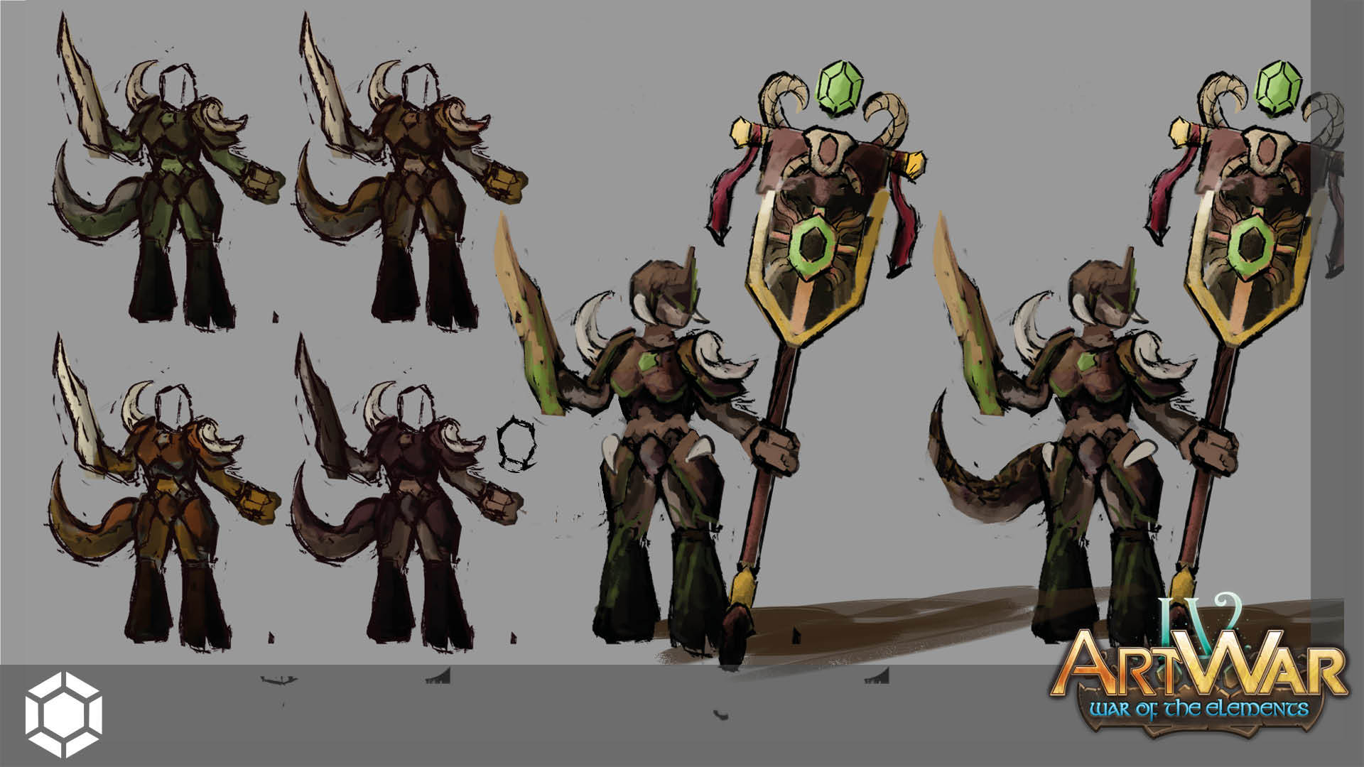
I've tried to explore some bodys and I'll stick with this one. SO I'm going to explore these a bit further. I need to make the relation with the earth a little bit more obvious I guess.
I also made some banners reserchs and end up with this design.

Hey !
I've quite finished my charachter concept, I'm not shure about the tail and some proportions but the main idea is there !

I used the new celebrations as a total break for this contest and design. Then this evening I asked myself, if I was the great power of the Earth, what kind of herault would I want to annonce the approch of my army.
With this statement, I found my design pretty "meh" and unconvincing for that purpose. If I was the great and big Earth, I would love to have something bigger, heavier and more frightening to announce my army.
Then I came up with the idea that I should create something only for this purpose, not a humanlike creature with a banner. So I keep the idea of a magical like floating symbol and build a gigantic golem to support it.
And it's cool, I like it a alot. :smiley:

I just made some compositions tests. I'm not sure if the sketches are clear enough but I don't want to polish them too hard. I personnaly think the 10 is the best, and I could roll with it, what do you think ?

Hey !
Here is where the real fun strat !
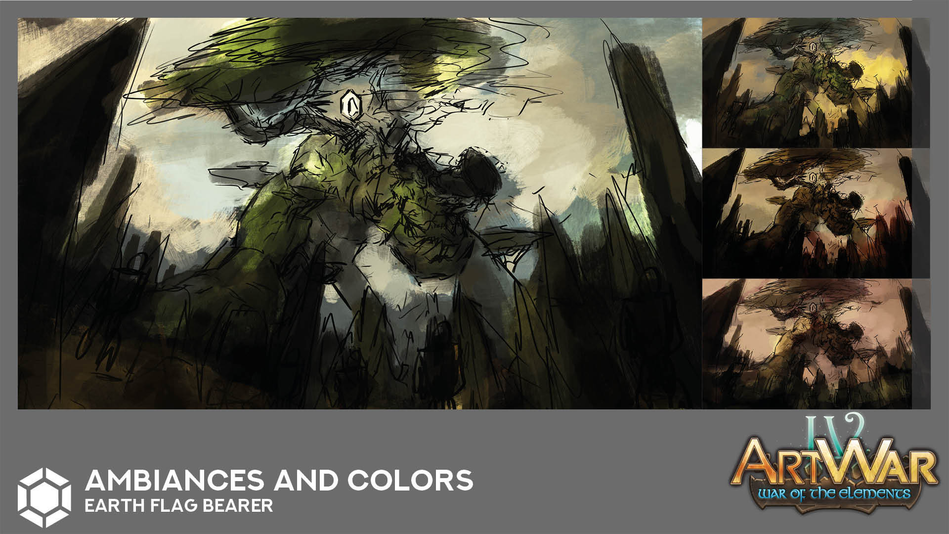
I've been messing around with some colors and ambiance, and this one particulary please me. I think it just need a bit more of vibrations, the color palette make this already stable composition really quiet and I don't like that much (it's war isn't it ?).
So my next step will be to figure out how to add a bit a dynamisme with the color play.
If you have any suggestions, about anything, I will be more than happy to read your comments !

First update on the illustration itself. I'm feeling like the more aggressive sky was better.

Secpmd work in progress, I've decided to push the top of my creature further in the distance, and to keep the sky less charged.
I'm also trying some new render techniques, we'll see.

This looks pretty great! I like how the sky is looking, i think it looks better this way than having it charged, brings more focus to your character