Ahh this is awesome! And honestly I'm glad you had a change of heart with the design. The first one was pretty alright, but bland and to me looked like a soldier in earthly uniform. This is amazing though, and the sense of scale and power really comes across as something of nature. Probably one of my favourites so far honestly I'm excited to see more!
@nesokaiyoh Oh god, your comment warm my heart thank you so much !<3
I'm glad you like the new design ! I have the same feeling about the old one
Keeping the render process, there's some parts a bit messy because I was not convinced by what I've done so I went back on the previous version.
Hey !
@nesokaiyoh es sure, the spike at the front will no be rock or mountain but spruce/fir. I also want to add more small (in comparison) earth golems to bring more of the war aspect.
@darthmorpho That's a very nice idea, thank you for the suggestion
New update for my illustration.
I've made some improvement in the render, made the trees and foreground. And I've roughly added a bit of storm in my side clouds.
I'm not sure if the current state of the tree doesn't flood too much my creature, I've a lot of work left to do with the values and contrast of this area.
Then I need to put some basic and smaller earth golem/warrior and figure out some things for the overall render, to bring the illustration together.
Also, thank you for all your support and kind messages, when I've entered this challenge I was far away from expecting that . If you have any comment/critic/suggestion feel free to let me know
Wow this is really coming on, I didn't reply last time but it does look better with the trees. I think you should try adding some colour harmony though, it's all green and a tiny bit of blue and not much else. Adding a complimentary or even analagous colour will help the piece harmonise and give it a bit of oof in the focal department! great job
Thank you for your comment !
You are probably right I was feeling something like that too. I think it's time to tweak a bit my illustration. In the first place I was tempted to add a bit of pink/red to add a bit of vibration to the colours so I'll probably go back to that.
I have a few idea for that and I will roughly edit my image with them but if you have any suggestion, please let me know !
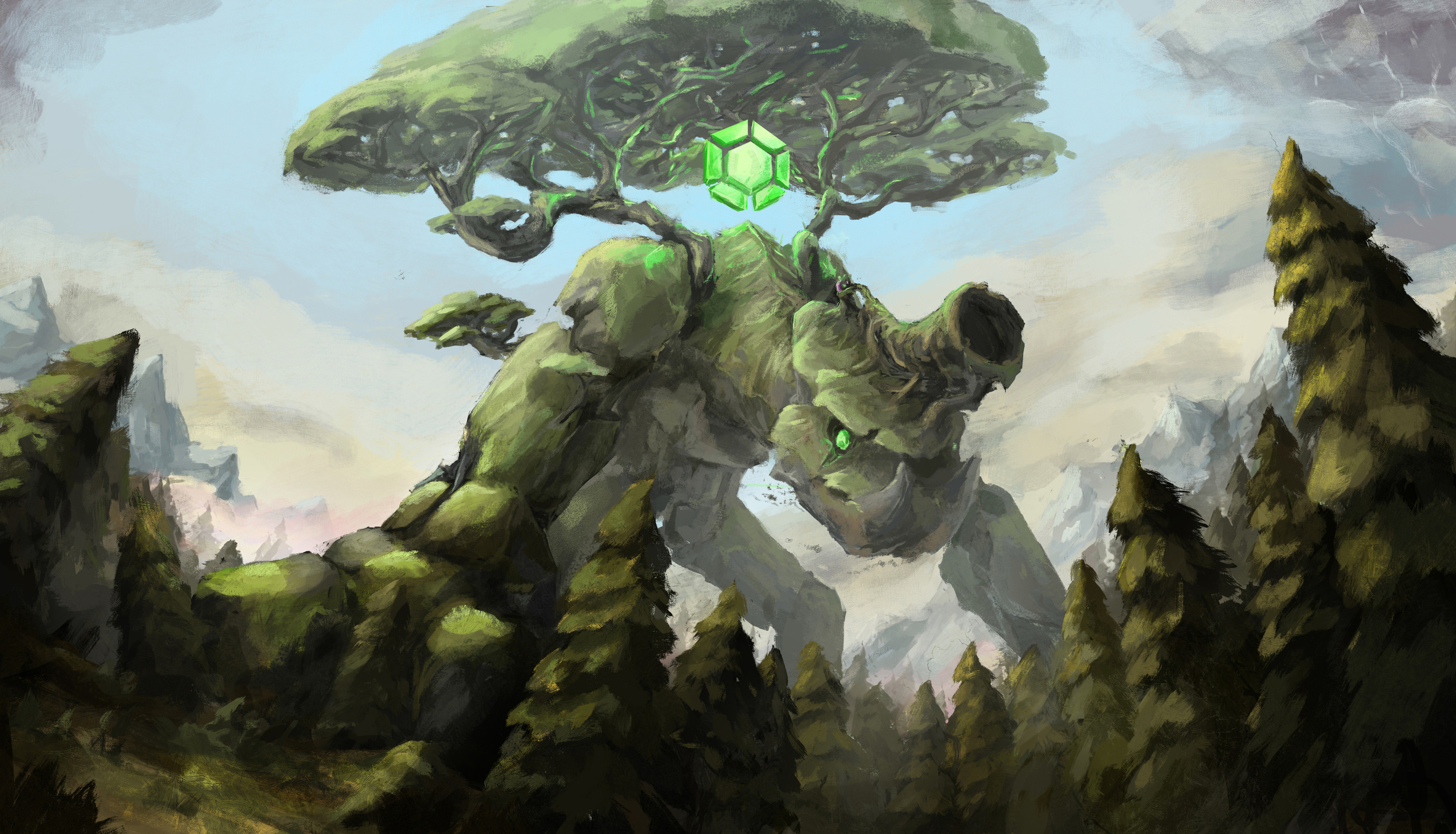
Imo if I was painting this I'd go for a sunny day theme, it could leave a huge shadow which would have cooler hues, and the sun hitting the creature and trees would leave beautiful sub surface scattered greens and oranges. You could make the rocks slightly cool grey in tone too, and because the creature is so big there would certainly be some blue (just a tad) in the atmospheric perspective.
Here's an example,
https://www.artstation.com/artwork/rRXO4J
It's a mostly green image but there are stunning deep blues in the shadows and lush bright greens and yellows where the sun hits the plants. Like this too, you could even have some cloud passing over the legs in yours to show a bit more depth!
Agree with nesokaiyoh about adding more to the color scheme.
On top of that, I feel you can add or tweak the areas around your creature to make him feel bigger in size. At the moment, I feel the size of the trees in the foreground make the creature feel smaller in comparison. Maybe shrink the trees in the foreground or middleground. You could also add things like tiny birds flying in the BG to increase the sense of scale. Otherwise I like how it's going so far. Keep it up. ^^
@nesokaiyoh Thank you for the feedback and the reference. This would certainly be helpfull
@tj-works I agree with the three I think they don't really hit their purpose right now.
I will make some attempt today or tomorrow. Thank you again for your consideration <3
I like the design of your monster a lot, and the composition is strong.
I agree with the above comment that some small bits of complamentary colors would help liven everything up.
To me it looks like the monster just put his hand down there on the ground to keep moving forward. Maybe you could have some bits of dirt and dust flying up?