OOoofF/ph
You made this tough, even if i like all the examples and explanations.
Tbh its too hard to pick one of these it would fall under preference to the individual / or / imaginative game this would work in.
I was a tank in the old wow days, a gnome tank at that, i thought it was funny this little stocky guy taking on all the baddies. (tank in wildstar also, same deal chua.)

If i went on that and on color 3rd one makes the most sense to me.(green environment) but atm my attention goes to the middle one, element choice is 3rd one.

Otherwise cool.

Hey 3dc,
Thanks for your answer, I really appreciate!
I think that today with a fresh eye, I will go for the "C" option, the orange can be close to the fire element since it looks like a burning stone/ volcanic stone. The green also improves the effect of earth so I'll go for this one!
Thanks again! Next, I'll create some compositions before I start doing the illustration. Stay tuned!

Hi there!
I hope you enjoyed your holidays and I wish you an happy new year to everyone.
Here is my first composition, it's showing the construction of the mask in the foreground. I hope you'll like it, I'll create 3 more so stay tuned.
Thanks for watching!

Hi there!
Here is my 2nd option for the final illustration, I'm not sure about this one to be honest, i think it's a bit classic. And there is not much story there. Tell me what you think about this one, i would really appreciate.
Thanks for watching! Stay tuned!

Hey,
Here is the 3rd option! The 4th one is coming and then I'll post all the composition in 1 image. Stay tuned!

It's time to take one of them and create the final illustration! What do you think? and what do you like the most? It would help me a lot! Thanks for watching!

So i just had a quick 5 minute thought about this as a whole and wanted to share with you what i thought might look neat, its based on the 3rd one in the thumbnails above this post.
You stuff with slight alteration on view angle
^So that but at a different angle than the 3rd one ( C ) posted above.

You can of course do what you want i am just throwing ideas out here. (for me it took a while, i thought that was her back viewing the camera on the img i linked, then i saw she was bending over)

I like her using the element and her sticking to the wall, everything going on in the img i link i like except it taking a while to figure out how she was standing (could be a me, problem.)

The A is really cool, there's a lot of feeling and story, but if you don't know there's a mask in the story it become very confused.
The B is probably my choice for the moment, it could be interesting if she has kind of a dialogue with the mask like he is proud of her or something like that.
The C could be really nice but I feel like the big arm cover too much of her body and the whole composition is jumping to the right. I could be (my guess) better if make her left arm the stone one like on your base design.

Aynway I love the way your illustration is going, keep it up !

Hey 3dc, Thanks again for your answer and the time you've spent showing me what's not good!
For the (C) option, there is definitely something wrong with her and I totally agree with you, the pose is a lot better on the thumbnail than the composition. I'll probably not spend time to redo that one because I'm not a big fan of that direction anyway. It could be worth it of course but I'm more confident with the 3 others for now. Thanks again!

Hey Oceane_Roh,

Thank you very much for all your feedback! I think everything you said make sense, and i will take it in consideration on the next step for the final illustration!
By the way the C you're totally right, i failed on this, the idea is there but not correctly done.
Thanks again!

10 days later

Hey there!
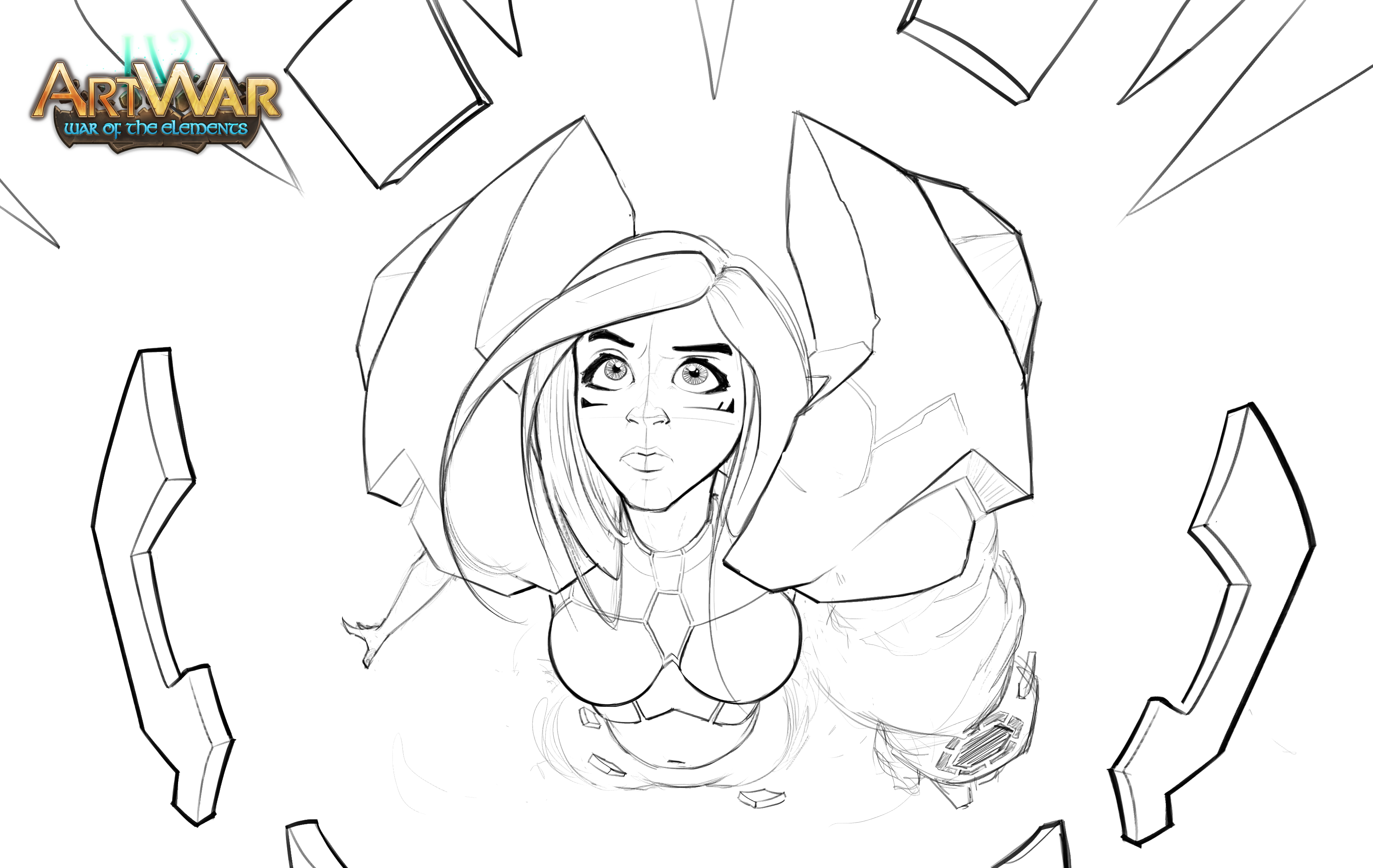
It's been a while now. I had a lot of to stuff to work on and still but I'm gonna finish it, there is no other way! So, here is my sketch for the final illustration. I'm gonna start painting very soon. End is close!!
Thanks for watching! Stay tuned!

Hi there! here is my first pass on the painting! I hope you're gonna like it. More coming soon, stay tuned!
Thanks for watching!


New update! I think that i still need to progress with the colors but i have a direction i guess! if you have any feedback I will take it! :smile:

It's looking really good! She remind me of KaiSa from Leauge of legends. I really like the angle of the camera in your illustration! Great work!

Nice, realy appealing face and expression!

Looks cool and dynamic!

Thanks a lot for all your comments! I really appreciate :blush: