You mean the spikes could interfere with flight? you can maybe play up the spike on the wings?Looks good so far, keep it up

This looks really good so far!
The composition you chose has a nice flow and makes your character look really imposing and powerful. Although I would play a little with the proportions of the guys in flames since there doesen't seem to be a clear hiarchy of importance. It still looks amazing though and might not need any changes at all if you tweek color and lighting
I am looking forward to seeing how your Illustration is going to turn out!

I think youre right with the big spike being a bit impractical but apart from that I think it looks great so far! Really intimidating and the yellow parts of the horns add a nice touch of color saturation to his design!

I'm excited to see this in full colour! I love the colours on the heads and I think it's going to look epic in the final piece :smile:

@griasnoggal
Thank you. Yeah I just trew the guys there for now to get "full picture". Next step would be to refine the lines and then see what to do with the guys in the foreground.

@elin.giger
Thanks Elin, always loved warcraft style pauldrons (big bulky ones) but they are so impractical most of the time :wink:

@hayley.zeller
Thank you, going to spend some more time on the sketch for now so I might have less headaches laters. That is if I can stay away from going full colour mode long enough :wink:

Refining the design and some linework
sign and

Got to the point that I was ready to put colours in. What do you all think of the blue flame sword? :smiley:

Blue sword looks good. Green would stand out well against the warms reds as well.
It seems like the fire should really be coming from his palm, not the mouth with that pose...

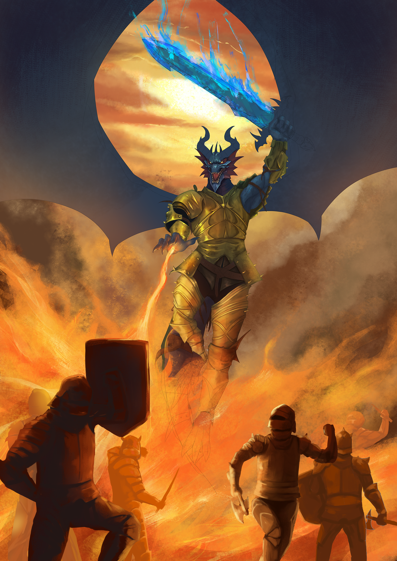
looking good! Making me wanna root for team fire. I believe moirae has a good point about the fire coming from the palm instead of the mouth, mostly because of how the palm is facing and the dynamic of the pose. Emitting fire is probably no easy task, and probably requires a lot of force to produce, and the pose you have hear seems to indicate more force coming from the palm than the mouth. Whenever I imagine dragons breathing fire, I imagine them having to lean into the action with almost their entire body, much like how you would have to use force handle something like a fire extinguisher, otherwise the can would fly backwards with a lot of force without a firm hold. (I hope that comparison wasn't too confusing >_<)

I also want to suggest maybe having the soldiers in the foreground cowering in fear and hiding behind their shields from the massive blast of fire to make it seem even more terrifying and dangerous. This would make your dragon even more powerful to behold!

Keep up the great work!

@moirae Thanks you. Yeah the flame thing.... gotta try to change it up a bit to see whats best.

@obsidanite Thank you. Yeah gotta try to mix that up to see what looks best. Regarding the soldiers you are absolutely correct. I'm working on it.

looks really good! I love the blue sword and light that it casts on the dragons face. It makes him stand out a little more.
Regarding moirae's comment, I have to admit that I am not quiet fond of the red green combination since it always reminds me of a christmas tree … but that might only be me … anyways, keep up the great work!

Alright! got the do some more work and finetuning. Still got alot of things to do :smile:

Loove the blue and orange complimentary here. Nice balance of values too. The figures at the front are a little stiff though, especially the two guys on the right. I know running is a hard thing to paint/draw lmao

That is a really cool design! I love Anthropomorphized dragons! The fire coming from the hand is a good change. Can't wait to see this finished!

Your metal texture is phenomenal.

21 days later

Alright... it has been a while since last update.. Too much things to do and new puppy keeping me busy..