Hmm they're all quite striking but I'd say 2 has the most contrast. 3 is my favourite though I'd say
Damn they look pretty good !
I say the 2 as well because the colour balance is well done and the value bring the focal point to your character head, as well as adding depth. (And the contrast is really hot)
8 days later
I like 3rd 
They all look interesting 
I think the middle one pops a bit more, and the third one is more angelic
thank you all!  I am very grateful for your every replies and choice, it really helpfull to me
small update of illustration
need to hurry up, not much time left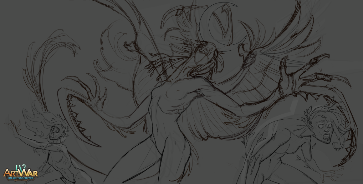
You're welcome!
Looks amazing!!! So much dynamism here! Great work!
one more update
added gold jewelry area and for a long time could not decide to make the main character a cold or warm tone. Chose warm
Beautiful! The colors are perfect! It gives a great contrast!
Ahh looking great, almost thought for a sec you abandoned your thread!

Ahh I understand. I thankfully quit my regular job just a few months ago for art so I've been able to work on mine quite a bit more frequently! I wish you the best of luck though, and we've only a couple weeks left xO

I know this is madness , but I'm still trying to finish the drawing on time! 
Nothing ventured, nothing gained! I hope you finish!