So went with this...burgundy rather than red and an orange light as the other light was a bit on the yellow side. 
Blocking in colours
I like these colours that you went with better than the red and blue you had in sketches 
Pottering along...

Potter...potter...potter...

...pottering...
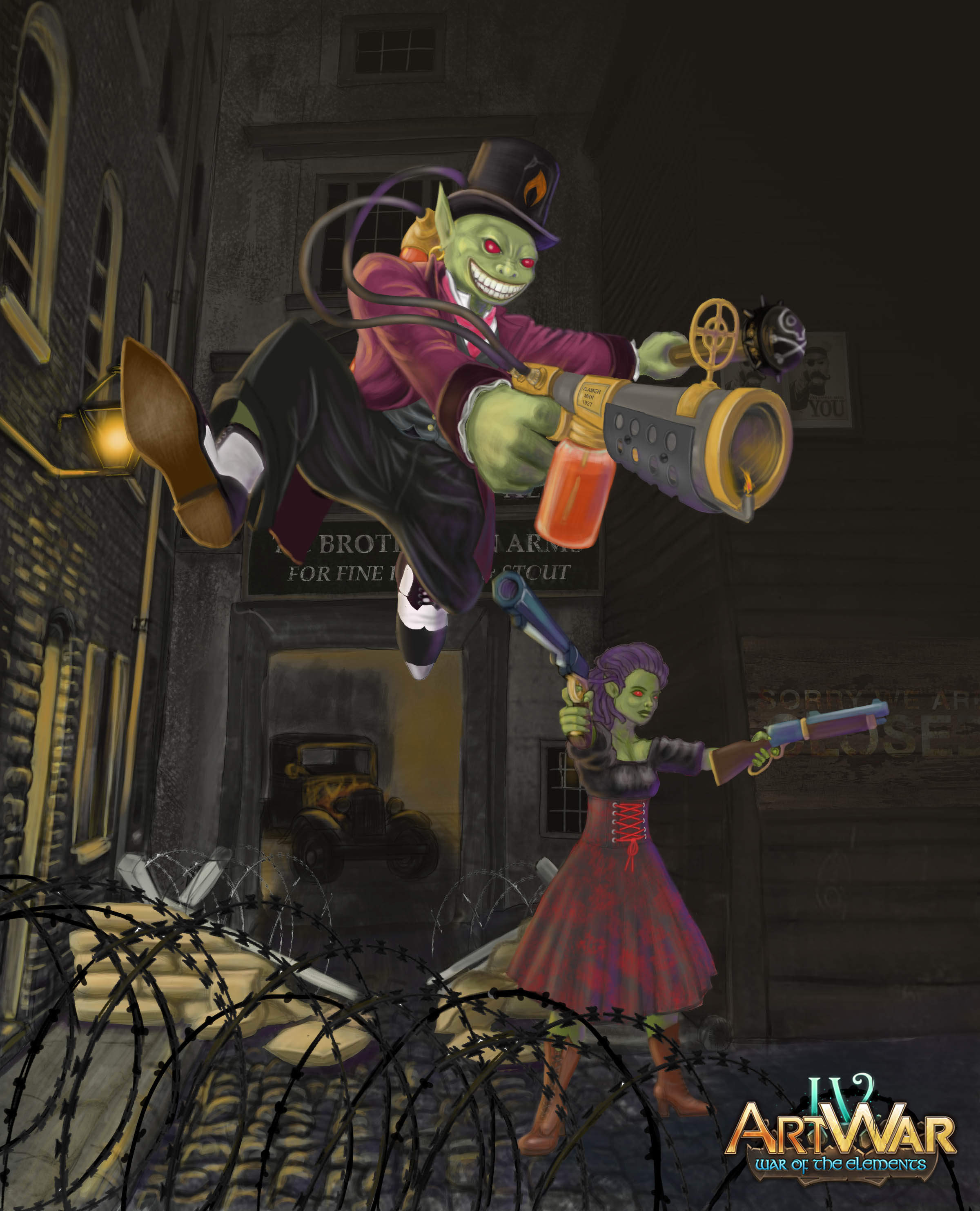
You should work on your perspective, right now the perspective of the background doesn´t match his dynamic perspective.
this could help:
@wienkind ... you are right! It seems to be the barrier and sandbags that are out of kilter. I checked the remaining background perspective lines and they are about right. Now I just need to work out how’s to fix this issue....much appreciated advice. 🙏
@wienkind
Thanks for the feedback...I have enlarged the sandbags and fixed the perspective...plus had to get rid of the other side so I will have to have a think about this a bit further. I also picked up the vehicle in the background and changed the perspective and light around this. Tell me if I have missed something 

Tidied a few things up. Might have a break for a little while and come back to it with fresh eyes.
I'm a bit late to your party here, I didn't really understand what your element was at first, if you painted some fire in the image it would definitely read better (considering the only indicators are the gun and hat) but saying that it's a nice refreshing take which I haven't seen in any of the others yet.
@nesokaiyoh … good advice … and thanks for the comment. I was trying to do something different. Here is the before and after of a quick test. Obviously changes the lighting...which I will get to. Let me know what you think.
Are you using refs with the fire? I'd suggest you look at pictures of fire and paint what you see! As it is, it's not very bright, you said you haven't painted in the lighting for it yet but it will affect everything quite a bit, especially when it's dark out. Try to use more chisel like brushes or just some harder edges to get some fiery shapes going, then blend those flames in with each other to create an organic affect!
The piece so far looks great, but something feels off with the lighting. Based on the background it looks like night, but the sides of the characters not facing the light are not dark enough. Another example would be that you added rim lighting on the left side of the goblin (his right), due to the lamp and fire in the background. However, the lady behind him is not as brightly lit even though she is closer to the light source. If the yellow lighting on the goblin is from the flame thrower, I would move it so it is more in the middle of him. Hope this helps a bit.
Good points but I guess what isn't obvious at the moment is that I have another gaslight in front of the goblin (off canvas) which is illuminating his face. I have made brightened the female goblin a bit and added more shadows...I'll post shortly. Thanks for the advice...much appreciated.
@nesokaiyoh @tobiasrafaelb
Thanks both...here is some before and afters...assuming the third one looks alright I'll add a wee bit of detail.

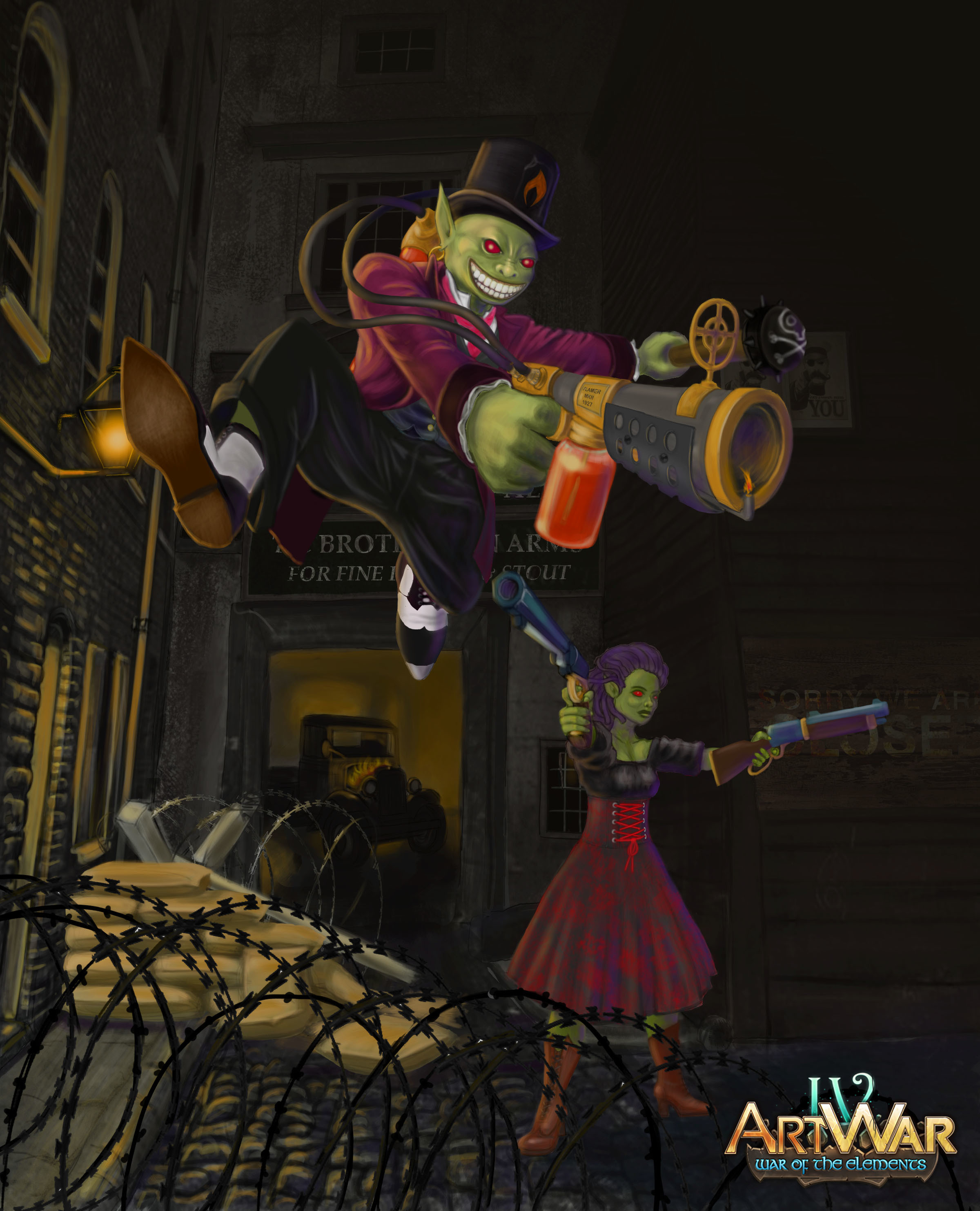
Yeah I definitely think there is a lot of improvement in the last one. Also because your highlights are warm, it may add a lot to your piece if you make the shadows cooler colors (right now they are warm hues). But it looks great!
Edit: it might also help you to go into the image adjustments and mess with the saturation/contrast/hue, this may make it pop more.
Yeah this already looks a lot better. Tobias is right though you could make the shadows a bit cooler in hue just so they compliment the fire and help with overall colour balance. Adding a warm soft, vibrant glow to the fire too and bump the saturation around the edges somewhat could be something to consider as well!
@nesokaiyoh @tobiasrafaelb
I am a bit of a noob at this so I have no idea how to mess around with the adjustments at the element level  but I have had a go at the whole canvas level...thanks again both for the advice much appreciated.