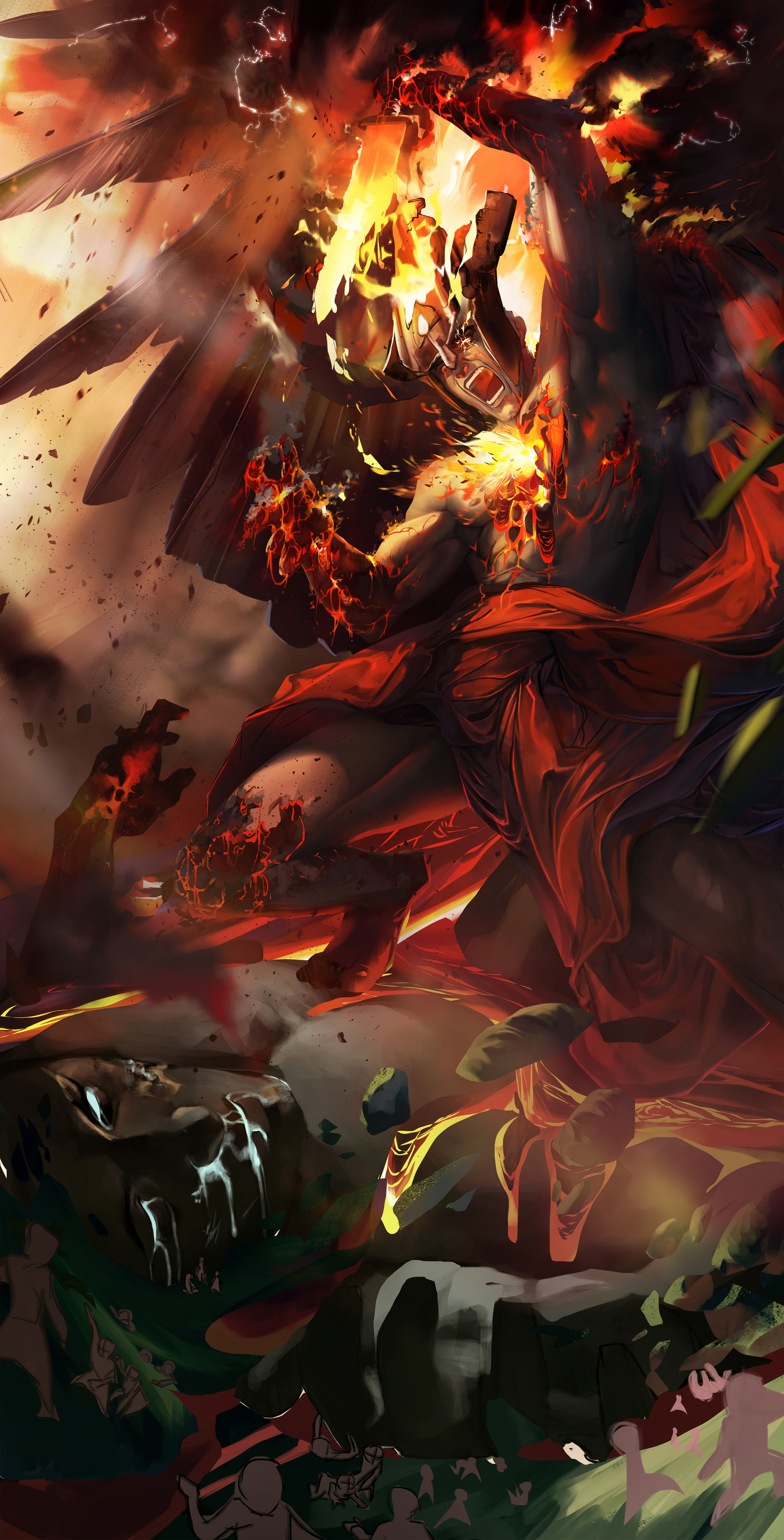
Alright so, I've been deliberating on the lighting for a fair few hours today, going back and forth between all the feedback I had, messing around a lot and also trying some new things. Some things worked, some didn't. I am a bit happier this time around though, and I want to thank everyone for showing so much support when i felt down about it. It helped, a lot. So I'm back to working on it, haven't done any rendering today, mostly just wanted to get the lighting out of the way as that's really what I'm struggling with. I have a few different versions here again, a bit of a mix of feedback as well as just my own experimentation. I merged a lot of layers, deleted layers, generally cleaned things up and it's made things easier too - for me and my dear computer (I do have a pretty beasty pc btw it's no old thing)
So let me know your thoughts once again, and I can come back again around tomorrow and work on it some more - hopefully having finally decided on the lighting!
Oh and I wanted to mention, I will be borrowing some things from your edit @moirae but I quite like the dark greens/blues in the corner where Idatrus is, I like how it goes with Phae's reds, so I probably won't implement that. Final colour will be changed a little in post editing anyway, so for the most part I just want an idea of the colour setup I want going and then I can work on it afterds
1:

2:

3:

3 is a little bit of everything with some extra things added. I like the idea of the smoke in the bg, and it helps with the lighting I think. Let me know your opinions! I like all of these, but 3 is my favourite