I'm more with the bottom one too, mostly because of the direction. But also because of the "I'll protect you" part which is represented better (for me)
But these are really cool, you can really feel the power of the golem 
thanks to your opinions, I decided to go with the bottom one
just a quick & dirty blockout of the scene

Thank you!!  I hope it will
This is gonna look so cool I'm so excited for it!
thanks!! I hope I can meet all expectations I'm also very excited for your final piece!
Update!
Hey there!
so here is a update of my golem.. I changed a lot because things didn't really work out the way I wanted and I got stuck. By changing the angle I wanted to give the viewer an understanding of his proportions (espacially compared to the girl)
There are still a lot mistakes and very rough parts in it but it's the progress
Not sure about the warriors on the right yet.. will try some different stuff tomorrow
Let me know what you think
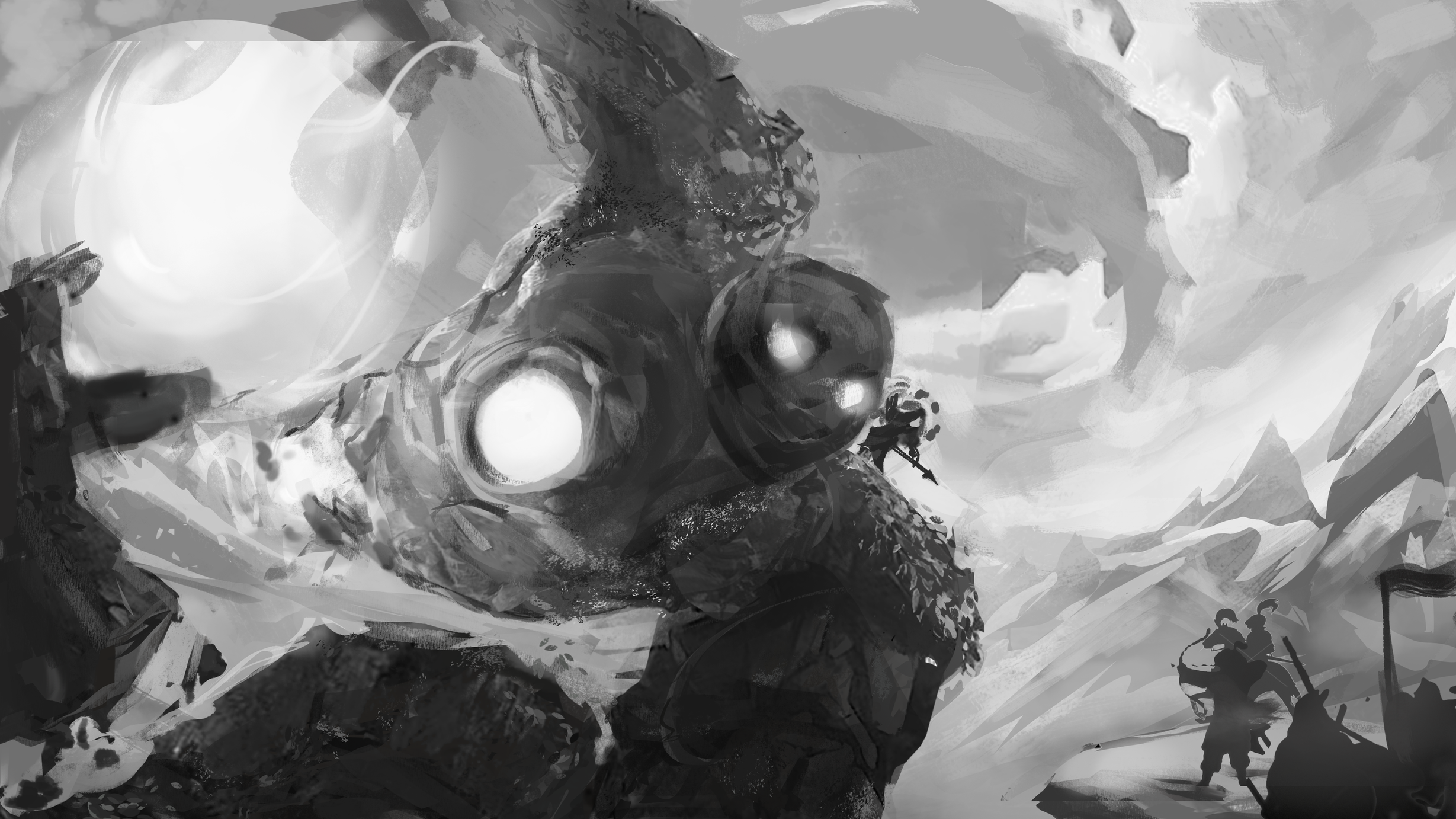
changed the size and the background.. now I'm excited to start with coloring and rendering 
blocking in some color 

Whoah amazing! It's very dynamic
thank you @nesokaiyoh !!
started to render her a bit more and changed his arm because I didn't like the shape of it
close up
Update 
another update! did some clouds and shape defining 
uptade:
Changed the background and his body. I also cropped the whole image a bit to center them more. I'm not really satisfied with the sky yet.. will do some variations tomorrow. And the emblem ist still missing 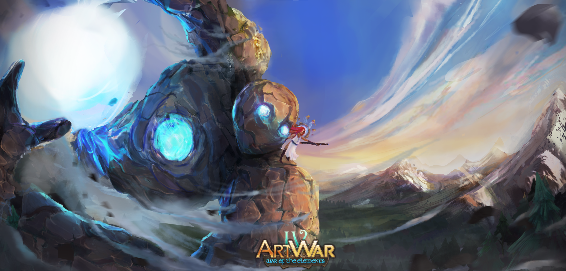
Definitely dynamic, love it! I do have a few bits of feedback though if you're willing to change much. Firstly her balance is really off, when you consider the possibility of just how fast that rock creature is moving, she doesn't match it or even look like she's on the same plane as the bit of shoulder she's standing on. The actual form of the same arm doesn't fit completely into the perspective you've chosen to draw it into and this makes it look just a little flat! Your detailing is fantastic though, and the blue between the rocks leading to the ball of power is really well done, lots of variety in value and colour and it works well.
I personally think more could be done with the ball of power itself, incorporate more of the blue or give it some texture, it does look somewhat unfinished compared to the rest of the piece and for me lets it down a little. The clouds, dust and atmosphere over that forearm is really really well done however and works well.
Overall the piece is honestly so good but just needs a bit of tweaking to be amazing! Good job on it, you should be proud 
Thank you very much for your feedback!
I'm actually considering to remove her completely as I don't have any more time to fix all those points and render her after that..
I haven't touched the ball yet so right now it's just a big white dot
But thanks for letting me know! your feedback helped me a lot and thank you for your supportive words
If that works better, it would be nice to still have her there but she's so small and it does seem like she hinders the movement of the piece a little. Whatever you decide it still looks amazing and you should definitely be proud!
you're right! she definitely hinders the movement. Thank you!!