Haha sorry!! They were just saying that it's a good historical background and research, and I replied that I'm working on it! I'm glad to reply to people in any language as long as I can speak it, but of course I will be posting everything in english  . Thanks for your comment! Will show you all that I've been doing these days soon!!
I loved reading your research into the topic. History was always my favorite subject!
Happy new year everyone and here we go! I can start showing some designs.
Thinking about my character La Maja and according to all my research, she has to look powerful, breaking stereotypes related to the “correct morality” for women, and also, being a Spanish independence war’s soldier. I normally hate designs that represent girls as tiny, thin and weak human beings. My image of a perfect woman goes more in the direction of strength and beauty rounded shapes/muscles. When I find the occasion, I tend to exaggerate those shapes a lot. This was one of those moments to let my hand do the anatomy thing.
I started with some gesture drawing, trying some dynamic poses, in order to choose one and develop some designs.

So, what I have focused on this stage has been the mixing outfit. Majismo and soldier´s uniform, with sort of a sexy looking in the end. Tried to use almost all of my references to take the right choices. It hasn’t been that easy to be fair. In fact, I ended up doing clean up linearts that I’m not even gonna use at all in my final designs , but somehow I needed to know what were the shapes I was looking for. I have wasted a bit more of time than expected at first just cleaning lines. Will keep on with volumes, color and light next time, hopefully.
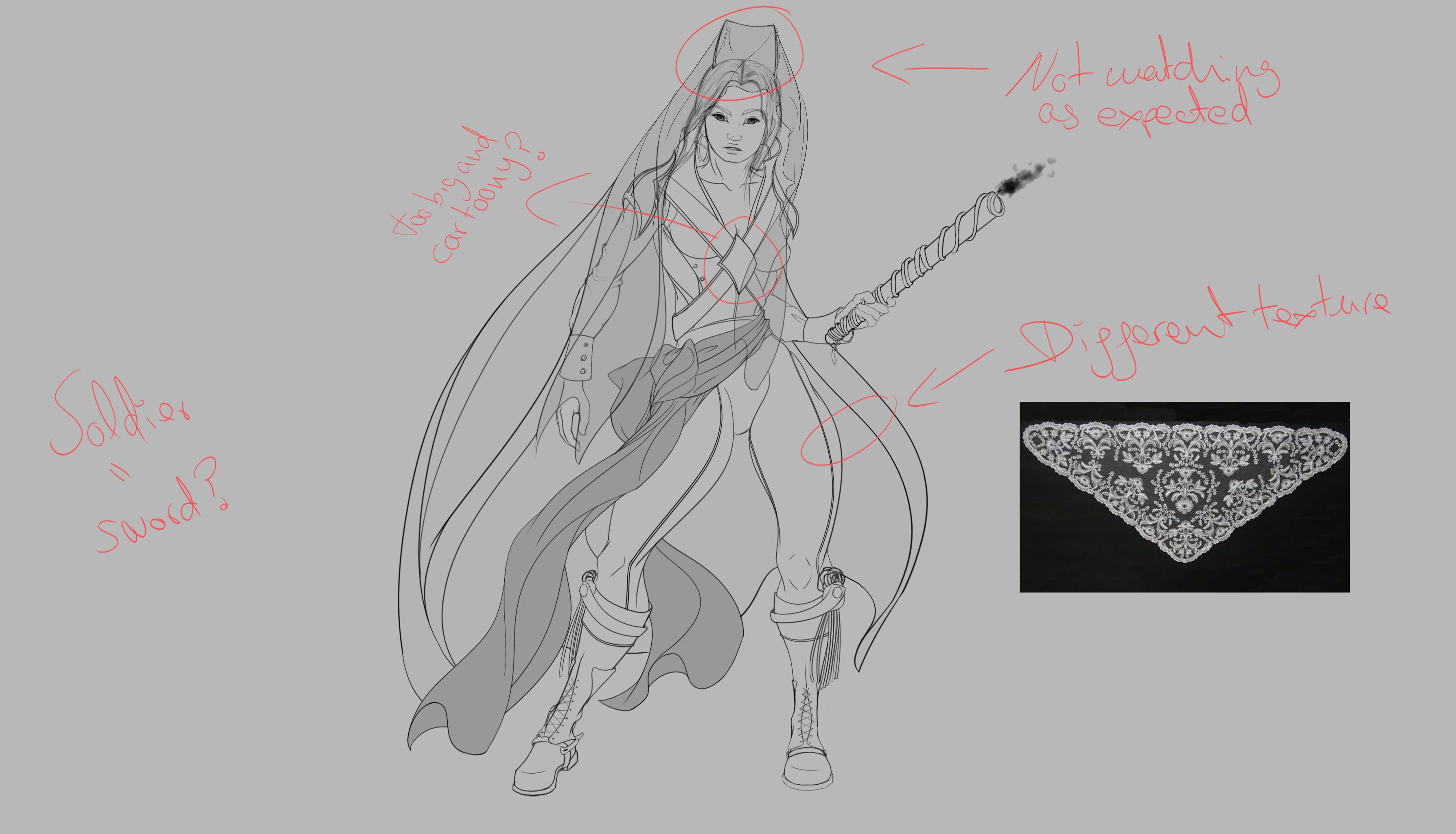
Well, there are many things I would comment about all the accessories that I added. At some point, I stepped back a bit from my screen and analyzed what changes the design needed. I’m going to try another texture for the trousers, as the one I did is from the soldier’s uniform and my idea is pushing it to the majismo trend. Don’t know if it will work yet. And of course, I've got other accessories in mind that I'll add to the design as well.

But the main problem was the Spanish mantilla. I did the shape of a basic one (although in reality there’re many and some are very different!) but it just didn’t fit the way I wanted. So I had to give it another go pushing my imagination forward. Tried a soldier’s hat and half of a cannon wheel.

The cannon wheel mantilla is what convinced me the most, but I would like to know your opinions and feedback!
And this is pretty much it for the time being. Have to do facial expressions with color and light to give her the right personality. Just one thing else, she’s not coming alone on this adventure, but can’t reveal more for now hehe.
PS: La Maja has already an official OST. Been constantly listening to the album El mal querer by Rosalía. Funny the fact that it's inspiring me with this design 
Amazing design going on here! I like a lot that cannon wheel influence, it's SO unusual and iconic! Thanks, I'm very inspired now!)
I thought that too about the cannon wheel! And planning to make it look gorgeous, a bit more of a crown without loosing the feel of a wheel  but so far I'm choosing it for the final design.
I like how you're going forward with the La Maja concept, it's really interesting background research. You had the "too big and cartoony?" note on the second picture and I kinda agree. That X-Shape seems unrelated to the references you posted in your first post and might be too cartoony since the face is realistically proportioned.
I'm liking the belt as a visual element and the texture looks cool. I'm interested how you'll further develop this character and it already looks quite solid!!
PS: thanks for recommending ROSALIA  I'm really digging her music
Hi! Finally starting with color and light! I have used my first close up design for it, and took the final decision of choosing the cannon wheel as the official Spanish mantilla for her. Apart from designing, I needed to write down a narrative behind my character in order to keep on creating, and it has become a some kind of war tale.

I have been seeing the submissions and I can tell my approach to the meaning of “war” is different for me. Some designs are awesome, but I’m surprise with the fact that we have normalized that these characters enjoy battles and wars within the narratives. Some characters even smile while fighting, and out of here, I can find a million references with the same fact. For me, war is tragedy. It is something that would freak me out, and gathering the courage to face war is what I believe is the real epic. But it is only my point of view and being realistic after all. Within the context of La Maja’s story, and happening in the bloodiest episode of the modern era of Spain, she has no choice and has the duty of becoming a soldier, forced by her thoughts of loosing everything she owns in present, and the possible future that would not occur. Because war is death, and again, it's a tragedy. I want her to represent that meaning. That has driven me to draw her sad, crying even, because it’s her duty to enroll in war to achieve freedom for her people and future children.

I had to upload the png file, so right click to open it in another window if you want to see it in detail. The jpeg file seems to show the colours more in a grey hue, and those aren't the real ones 
On the other hand, I would have never thought that the Spanish flag and its colours would match soooo well with the artillery theme! They are perfect to represent cannons and fire. Also, I think red represents very well a powerful bloody drama, plus, it kinda makes the character more passionate about it. And red for make-up is also sexy. Yellow works well too as highlights, contrasting with reds.

Will work more with the concepts 😊. By the way, this time I listened a lot to the album Los Ángeles by Rosalía. Highly recommended haha. All that text that I wrote above about war is also inspired by Rosalía’s lyrics, as the entire album is like a sad story of death, or seeing how life is ending. Although this time I listened to The road to el Dorado’s OST by Elton John, casually about two spaniards in the 16th century haha.
I...am speechless haha, That is wonderful!
20 days later
Hi! It feels like an eternity since my last post. This design has taken a lot of my time to have it done, but I can say finally that I have my front view fully designed! I’ve been struggling way too much with details, adding way more than what I had planned in the beginning with the lineart. Sadly, I have been able to spend only two/three hours per day recently, after I finished my Christmas break and came back to work.
The goal was to mix the Spanish soldier outfit with the majismo trend, and the process became madness with so many patterns! Don’t even ask how many layers I used. I could not respond accurately. Even so, I enjoyed the making a lot, although I admit that I’ve suffered a bit with some of the details. There is a song from the 2000s, by a young spanish singer that says “antes muerta que sencilla”, which means, rather dead than simple. Many of us have grown in Spain with that phrase, and I had it in my mind with every single stroke of those trousers and veils!! Like, she is going to war, but hey, don't forget to dress up with your best clothes because you worth it girl

Well, I’ve done a shot breakdown with the progression. I couldn’t divide it in more shots given that my file was way too messy as I mentioned before!
First, I did the textures and solid colours, and then, I started with volume, light, adjusting final colours and made sure everything was set in its right place.

I have added some accessories that I have found doing a bit more of research from that time in Spain. One of them is a necklace with medals and symbols that were quite traditional. On the other hand, I found this amazing good luck charm that children used to wear on their hip. As soon as I saw it, I knew La Maja needed to wear it too.
So, this is the final result.

And this is a test, again, with a background and the colours around representing Spain.

Hope you like it! Remember to do right click on the images to see them bigger in another window 
Next step: back view (I’ll take it easy this time), planning thumbnails…and…another surprise I hope I can show a rough concept of it this weekend!
Well, I couldn't do as much as I wanted this weekend as I thought I could, and next weeks seems to be busy for me. But I'll do my best with the updates, sharing at least some little progress. I think I should explain a bit more of my last post, going through some decisions that I had to take according to the period of time and trends. They might not seem a lot once it's done, but I can tell they gave me some headaches to be accurate.
I have designed a profile view. Having some other views will help me better with facial expressions in the near future, and thinking already in the final illustration

Can't wait to see the final illustration, keep it up!
Hi! As promised, here is another post explaining a bit more about some relevant details from my front view design of La Maja, aaand…revealing the surprise in the end (bit by bit!).
Well, as you have seen in my other posts, I kinda planned the mixture in between the soldier outfit and the majismo trend. But I realized I was introducing more the soldier outfit than clothes that could represent the majismo. That happened especially with the trousers. Firstly, jacket and trousers were inspired in the soldier uniform, but then, also the boots, and the sword…and it was way too much from my point of view. The only clothes that I had representing the majismo trend were the mantilla veil and the red cloth on the hip. I went back to check my references of majismo, and even if they had a looooot of detail, I knew I had to do a flower pattern (similar to the trousers that Rosalía wears in her videoclip “Di mi nombre” and that it is inspired in Francisco de Goya’s paint “La Maja vestida”). So I went that way, but definitely that wasn’t my first option. In fact, in the beginning it was planned to be fully plain, like a horse riding trousers and taking references from the cavalry soldiers. In particular, my favorite brand for this sort of trousers is ZALDI, and for me, there are some simple designs that I consider “classic”, as I have been wearing them since I can remember, since I was a child. So my instinct was to make that same design in La Maja.

And final decision, as I mentioned, was to change it to a closer look the majismo trend.

Let’s jump into the boots. A very funny thing happened during the process over here, and thank god I realized in time! I was designing boots with a zip. It might just sound such a normal thing, but the truth is that I’m designing a character living in the beginning of the 18th century and, according to Wikipedia, zips were not invented until the 19th century. The zip that we currently know was invented in the 1913 by Gideon Sundback, born in Sweden but emigrated to Canada. So, I re-made my design and used a shoelace instead, adding half chaps (they are my fav also for riding a horse, very comfy and cool to wear) and a couple of spurs, but the normal ones just for a better contact with the animal, not the cowboy with the spiky stars. They hurt  . And, back to the fact that I needed to make it look more spanish, I had to use the leather straps that are sooo traditional in Doma Vaquera, what is called as a discipline and culture here in Spain. Quoting an article to explain it better, it means the following:
“Doma” means “dressage” in Spanish, and “vaquera” means “western.” So doma vaquera can be loosely translated as a Spanish version of Western dressage, similar to the American Western riding that originated from the fieldwork in an open space around cattle.
The foundation for doma vaquera is classical dressage. Doma vaquera horses show everything that dressage horses show: shoulder-in, half pass, pirouettes, flying changes, collected canter. However, everything is performed with more speed and impulsion than in competitive dressage. Horses are expected to break into explosive gallops from the halt and do extremely quick stops, rollbacks (half turn on the haunches) and pirouettes. If dressage is ballet for horses, doma vaquera is flamenco!
In Spain, doma vaquera is also connected with the art of bullfighting. Both the work in the bullfighting arena and with cattle requires speed, quickness, agility and a high degree of collection from the horse. Unlike in dressage riding, where riders ride with one (snaffle bridle) or two reins (double bridle) in each hand, doma vaquera requires the rider to hold the reins in one hand, typically the left. The right hand must be free for work, such as holding the garrocha, a long pole designed to distract the bull. The discipline of bullfighting from a horse is called rejoneo. The horse for rejoneo is a doma vaquera horse that performs movements such as piaffe, passage, terre-a-terre, jambette, pirouette on three legs, etc.
As I have researched, this discipline was official in the 19th century BUT it existed already since the 15th century in Spain. In fact, my first contact with horses was through this discipline, as my family was also educated and grew with it as our culture and like being part of us. I do admire which is the dressage bit and I find beautiful all the horse equipment designs, but I reject the part related to the bullfighting issue, so I don’t practice this discipline and I do another instead, which is non-harming at all 😊.
Back to the boots, I used the leather straps that you can find in the Spanish bridle as an accessory, and also, added this detail from the soldier hat, so I would not loose that feel of the Spanish independence war. Also I substitute that kind of feather that some hats had, and attached a rose, which is a flower that has also a lot of history in Spain, within legends, famous characters, etc. Of course, again representing majismo with this.

At some point, I thought about adding roses on the trousers. It would have looked like this:

I discarded this quite soon after a few tries.
As for the jacket and the X cross belts, most of it is the soldier uniform, but I included again a flower pattern to make it look, again, a mix with the majismo trend. Added a jewel in the X center, to make the aesthetic match with the earrings and the mantilla cannon wheel too. Shoulder pads were adapted again to the Spanish bridle and leather straps…but trying to distinguish them a bit from the boots, and these would look more like fur.

I guess those are the most relevant things that I had to explain, as maybe it was not clear for everyone taking just a first glance.
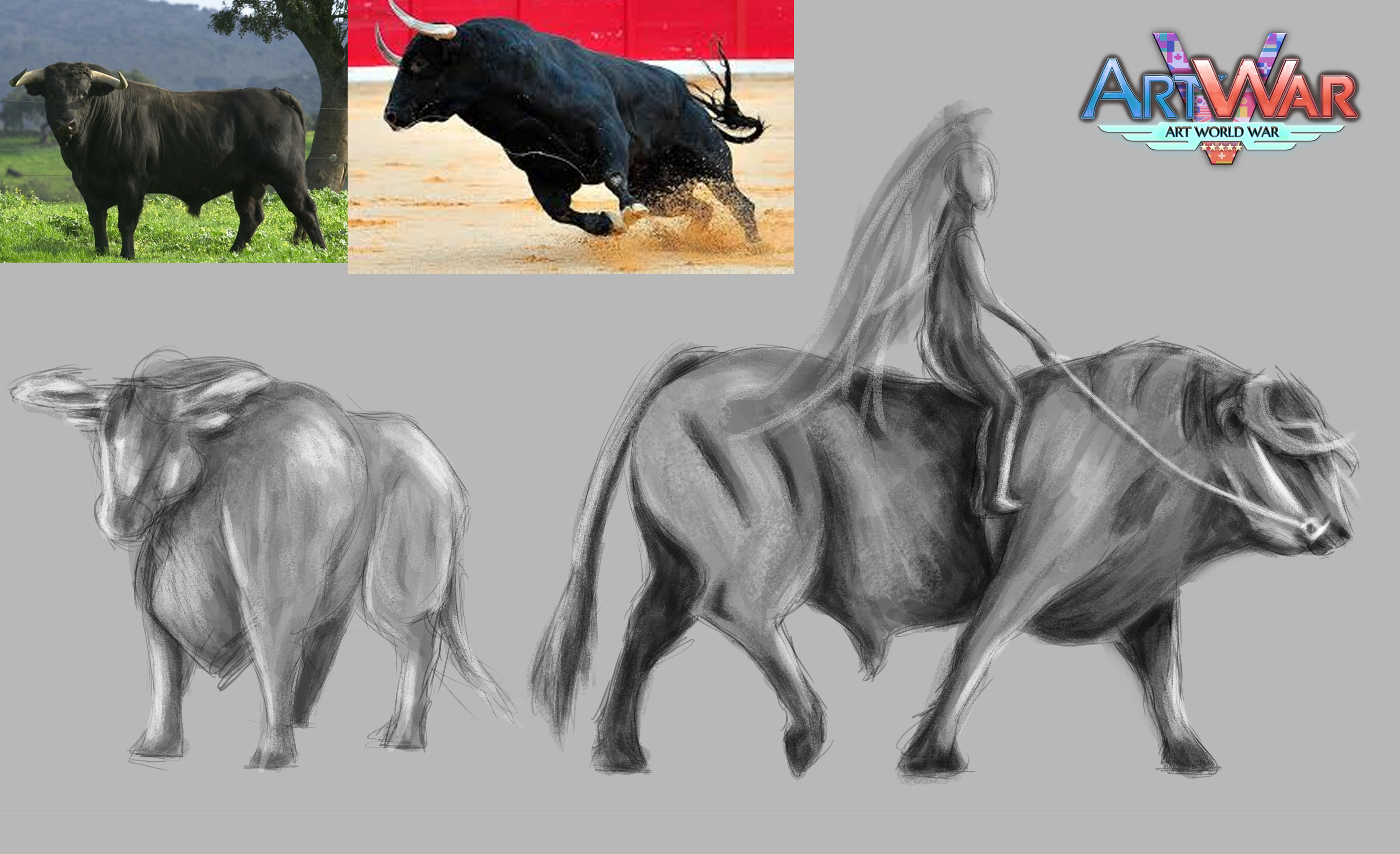
And...surprise revealed. She is coming with a creature. Of course, IT HAD TO BE A BULL! Changing a horse for a bull on this occasion was a clear decision for me from the start (also a challenge), because obviously I’ll magnify him. In English I know it is only called fighting bull, but the real name of the breed is “Toro de Lidia”. I love these animals and, sadly, hate the bullfighting tradition. They are not dangerous at all. In the contrary, they are as noble as horses. A bull is a Spanish iconic, and I think that all what it represents and its tragic life (due to humans and its tradition), matches perfectly with my character of La Maja (led to war, also provoked by humans). She can’t ask for a better partner to go to war.
I only have two thumbnails yet to check the proportions between both characters, but I’ll develop it soon.
wooooow this is looking awesome!!!! such nice colors and design
que lindas referencias, que lindos colores! exitos! muy buen trabajo