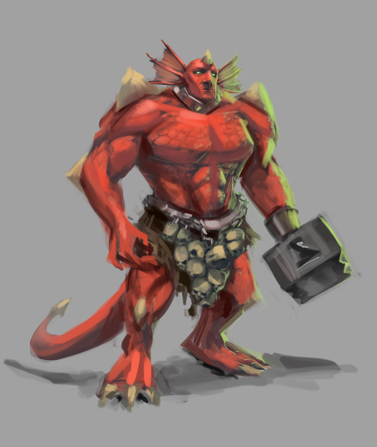
Hey man, neat design! : )) I did a quick paintover, I'll try to explain it- so first thing that pops out to me, are the desaturated colours. I would add a brighter red and definitely darker shadows, which will add more definition.
Next thing is the anatomy. His hand and leg positions are off, the empty hand looks a bit awkward and his feet pointing into the same direction looks weird. Also, I buffed his chest and shoulders a bit! 
Lastly, the hammer hand's perspective is off- we can't be looking at the top of it, without him being placed in a top-down perspective as well. I'm bad at perspective myself, so I would suggest maybe take a photo of yourself with something similar to figure it out. : )
So, to show the form better- anatomy, perspective, lighting.  Hope this helped, keep it up!

p.s I would leave this as a character concept, and make a new, full illustration with a bg and everything using this character ; )