Haha, a statue is not necessary... unless it helps with those zbrush skills 

However I do really like the idea of those pages and pages of work 
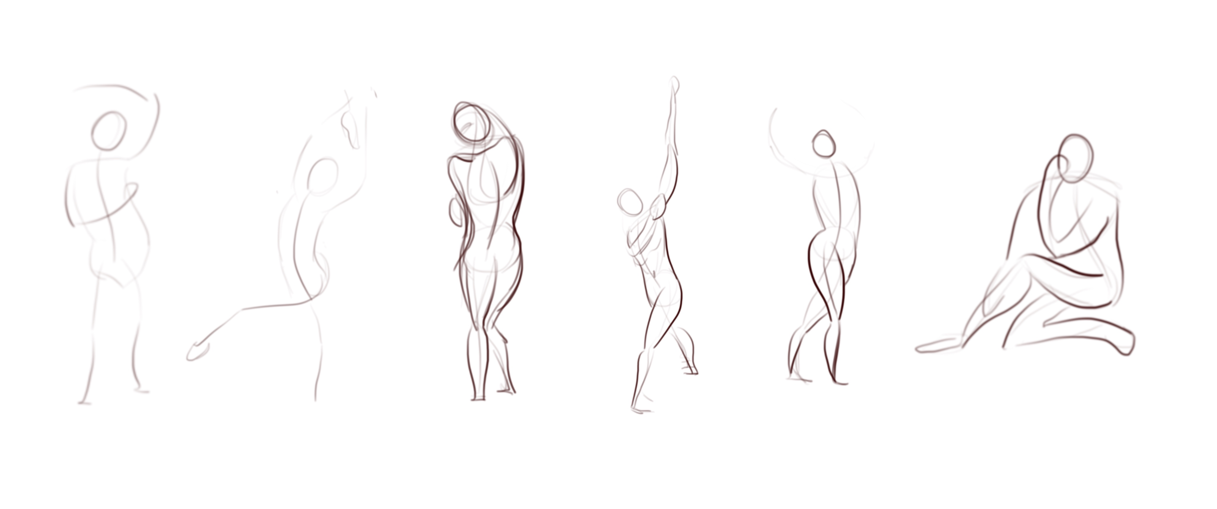
Really liked the way the figure drawing turned out! Such clean lines. Congrats 😬👍
Great figure drawing, chiara!
I like how you just used gesture lines for the 30s attempt. Your line quality gives it a cool flow!
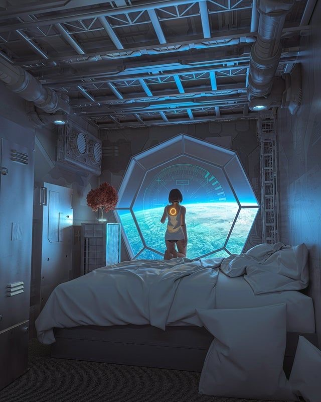
The idea and execution of your perspective assignment is also very clean and the shading looks (from my point of view as a beginner) pretty accurate!
Correct me if I am wrong, but I always thought that cast shadows (as with your bed and the little cupboard) "should" be drawn as harder shadows... Or does that actually depend on the light source...
I'd like to hear your thoughts on this!
Keep up the great work! 
Mau
Hi @mau.wamp!
First of all thank you for your kind words, I really appreciated that  .
.
Second I have to say that I haven't studied cast shadows yet so maybe my opinion is not really correct 
I agree with you about the fact that this tipe of shadow is really hard but in this case (I put below my reference) I think that there is another dim light source from behind, tell me if you agree.
Maybe in my drawing I could have avoid it to have more attencion from the principal light source. Tell me what you think!
Have a good creative day
Today I started with a revision of figure drawing, even if I'm not feeling to have an improvement I have to say that I'm becoming more confident with this topic.


Than I worked on the assignement of photoshop 2 creating a character and the front side of the game box.


I thought about a 2D game with vector landscapes. The idea was about this alien animal that is escaping in the woods (effugit means escape in latin) because men want to catch him, pretty simple hahah I have more ideas to implement but I want to keep it simple for now.
I didn't decide the color palette yet, the black and white is not the final result (even if I like it )
I would really appreciate what do you think about the idea and the drawing itself, if is something that could work or not.
Thanks in advance  Have a great day!!
Your figure drawings look really good, the shape and line choices are good and make it feel like a solid figure. My only critique is with the gestures, some of the lines look a bit hesitant and the proportions are a bit off. Looking at your past work though you have definitely improved and I struggled with those things a lot too (there are still times that I struggle with them).
Your game sounds good and the art looks nice. I think the animal could be a bit darker to stand out a bit more and the text doesn't seem to match the mood of the rest of the art. I like the animal design, it has a very feline look to it that could lend itself to a lot of clever mechanics.
@MattD Thank you for your advices! Yes I'm still struggling with gesture drawing even if it's better and better with practice, but I have to work a lot with it I try to use S and C lines but I still hesitate, maybe I'm not so sure if what I'm doing is wright or wrong
I really appreciate also the comment of the other work, I'll try to implement some changes and then I'll repost it
Love your way to draw the gesture drawings For the little criature I only have one thing to say. In a first seen to you drawing i just feel that the light we're the eyes xD After a second look I figured out that is some kind of light in the front. In general, I love your idea!
Maybe I am wrong with the light/eyes, it is not my intention!!! xD
Hi @mbarrasa16 thank you for the compliment! 
My intention with this character was to draw a gem in his front but you're right, it seems like an eye hahah I have to develop it better And for the lightning I used the same layer styles for both characters and I let the light come from above, but it seems a little bit glowing so it's not clear where the light source is hahah
I will try to fix it, thanks a lot for the advice
Hi everybody
Today I want to post some of my gesture drawing because I like how it's turning out, even if I struggle with 1 min session because I do too many lines, I think that it's a luck of confidence. Any advice is appreciate
Than I started yesterday the anatomy 1 lesson and I want to show you some facial features. I'm really happy about the ears but I know that it's the simplest feature The nose is more difficult, I still struggle in shading complex objects but I will have to practice, practice and practice hahah


Sorry the quality of the last one is orrible  hahah
hahah
Last but not least I want to thank all the people that helped me with the character and the 2D game project, all the comments are really helpful also because it's a early stage.
Have a good day!
Hi! Today I've done my first portrait (self portrait ) after finishing the relative session. I was so nervous about it, I was constantly thinking that I will have failed but after that I am pretty happy about that! Tell me what you think

WOW!! For being your first portrait it is really really good!
Hi! This week I want to work on perspective because it's my weakest point so far So I upload my 1 point perspective study of today.
I admit that I want to use cast shadows but I didn't studied the theory yet so I just watched my reference to draw it, I'm sorry it's really off 

I didn't put so much detail in this work but I hope you'll like it.
Sorry for the request but I want to ask you a thing: Do you use the art study schedule? I downloaded it but I don't know if I have to finish all the terms before or, I don't know Thank you in andvance for the answer and have a good day
First of all, I like your work so far! Your gestures looks very nice with flowy lines.
Well you can use the schedule if you want to as it helps give a bit of structure, but you can do alright without it too. And while the course has a nice progression in the way it's presented, you don't have to always follow the term order. Depending on your level, there might be some of the later terms that would be more useful to you. And even if you get to later terms, you can also always go back to earlier ones if you think you need it.
Hi all! In these days I was a bit busy but today I tried to do another portrait, tell me what you think.

In this particular moment I feel a bit blocked because I don't like anything that I create  Do you ever feel like this? How do you face this state of mind?
Have a good day
Hey Chiara,
Great work on that portrait, it's got solid values and accurate lighting to show the volumes.
I'll give my two cents of constructive advice if I may, because I feel like you're showing a lot of willpower and willingness to do what it takes to improve. I love that!
In a context where we're learning, it's important to be able to paint like a sculptor. This means seeing a drawing in terms of volume rather than contour, having a good understanding of where the planes of the face are, and understanding how they catch the light. Most importantly, you need to know where the hard edges are (the "cuts"), and where the soft smooth transitions are.
Your choice of brush, i.e. a soft airbrush with a very feathered edge, is not helping you learn fast now. It's great if you want to make easy gradients, but it's not helping you make clear decisions. It's the rendering equivalent of making little scratchy line segments instead of a single bold stroke of the pen.
Pick a solid brush, round, square, does not matter for now. It just needs hard edges. Make a conscious decision to block out the planes of the face with the right values, then you can smooth out where the transitions are soft using pen pressure and color-picking. Not only will this likely improve the painterly aspect of your paintings (getting rid of that plastic/artificial feel of the airbrush), but you will learn much faster. You've totally got what it takes
I feel like over time we get to incorporate the airbrush for specific tasks like smooth color corrections later in the process, but it's not a good base to start a render with.
Good luck, and most importantly have fun!
HI everyone!
Thank you @ghostmonst3r I appreciate your kind words
Also @Vonschlippe, really really thank you, your words had a really big impact on me and I don't really know how to thank you.
Today so I started studying figures taken from "anatomy for sculptors" (pinterest reference) and trying to understand how volumes works and the light behaves.
Than I shaded and add details but not very successfully, but it was not what I wanted to achieve today, I focused more on the basic elements.
Also because I have not flip the canvas until the end result and I just realized that it has a really strange look

Of course It's not really amazing work but as a first study I understood so many things today, even if doesn't look good
I really want to thank you all for the support so far, this forum helped me as much as the Marc's lessons.
Have a good day guys 
Hi! I'm sorry I have not posted for a while.
But, here we are Today I started the clothed figure drawing. It's just a start, I like how the folds turned out in the first one and in the second one I like the values, I have to mix the two things I think 

Than I worked on 4 point perspective character, before a quick study to understand how it works and than I went to a real character.
I want to ask you if it seems done properly. I like it but I'm not sure that it follows really good the perspective because I used liquify a bit to make her look better, let me know what you think.
Than I tried to color it but It's really just a start, I don't like how the electicity and the background turned out but overall I'm pretty happy about that.


looking good on the folds sudy. 