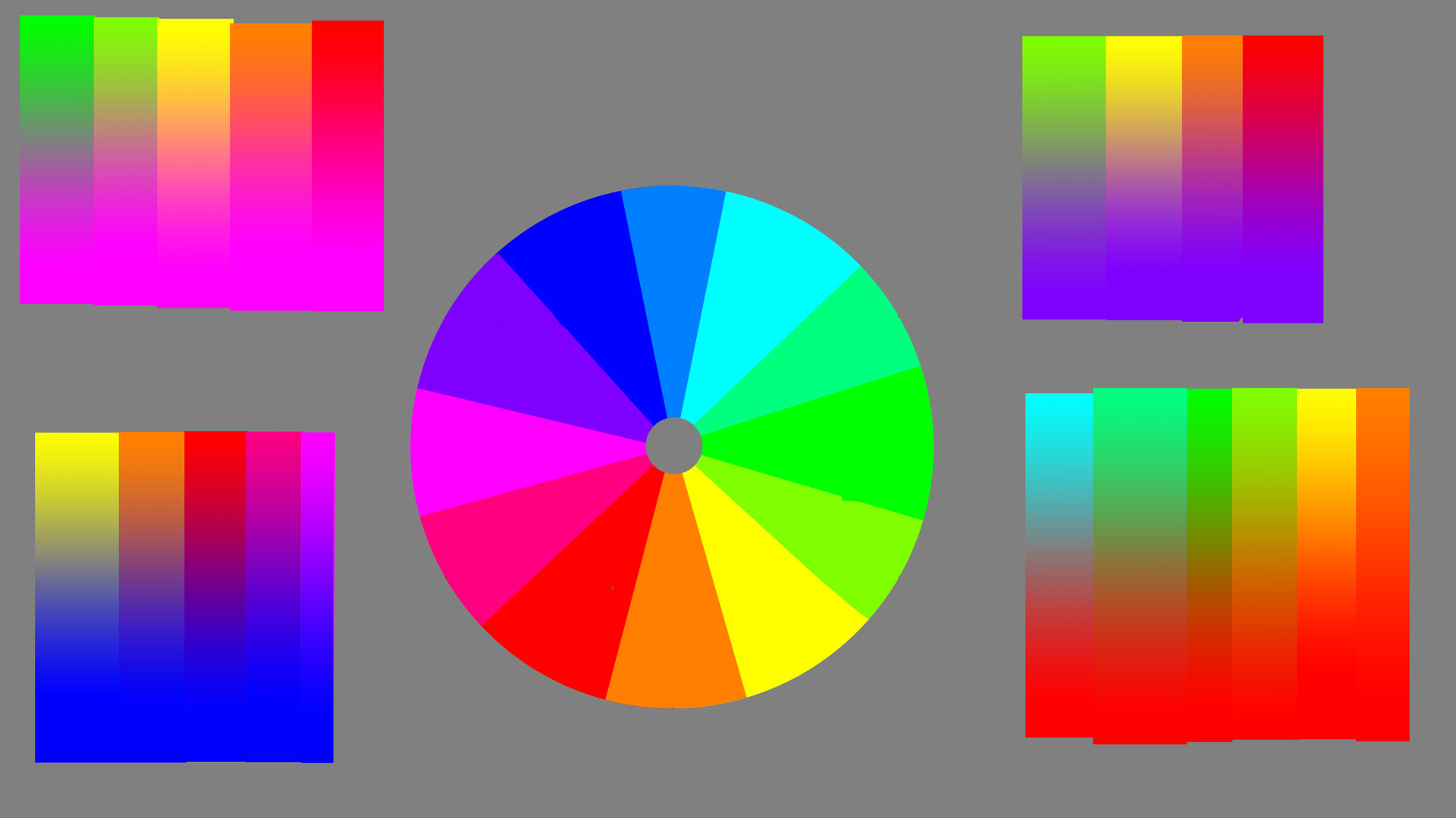
I've been trying to understand color and I've noted the RYB, RGB, and CMYK color circles.
I've also encountered artists teaching to use complementary colors, and some refer to the RYB wheel, while others use the RGB...
Well, considering the complementary colors are supposed to make Grey, I've been playing with a self-made color wheel and Greys only come from the RGB wheel. One would assume that because monitors use RGB, this might affect it, but I don't think so, because the gradient algorithm is blending the colors based on the math, not my monitor's pixels.
So, essentially, the old fashioned way of Red to Green, Yellow to Purple, and Orange to Blue is basically... wrong. Those are not complementary colors.
However, the classic RYB "complimentary" colors do look good because... well... it seems that using the colors right next to complementary colors actually generate better results. Purple looks kind of like ass next to Lime Green, its complement... but it looks good next to yellows and oranges, which are slightly offset.
I remember reading about offset complements in James Gurney's Color and Light, but after experimenting, I think there is an actual science to this.
Thoughts? Also, here is the wheel and some of the gradients I was testing with the color picker. What is interesting is that colors directly across have a center of 50% value and 0 saturation. But as you move notches over, it creates a consistent pattern in the color picker tool until about 3 to the side, and then the saturation stays max and the value only changes (for example, Red and Green dont make a Grey... not even a 99% saturated grey!). Another interesting pattern was that CMY colors once 3 over stay at 100% value but slide across the saturation with the gradients, whereas the RGB slide across value at 100% saturation.
