Thanks @mitsuki-youko @patrycja.lerch @uggievang @gregorya and everyone stopping by!
Been having a LOT of work lately. 16 hrs over the weekend by my estimates, long shifts before and after, not necessarily company work, but individual programming service and other things. gona need a bit of a breather, probably tomorrow or the day after. Already missed client calls due to oversleeping, but it was worth it.
Still got some progress done though.
Term 4
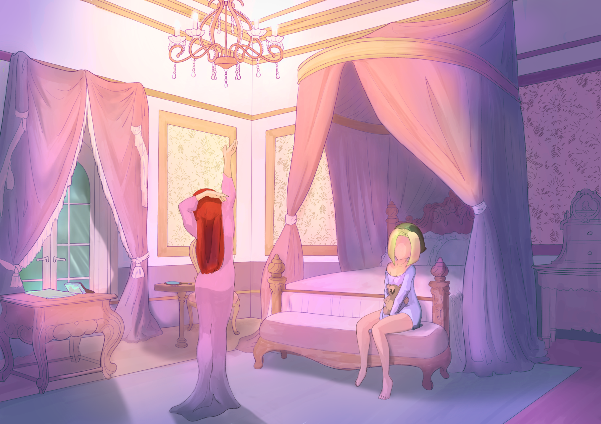
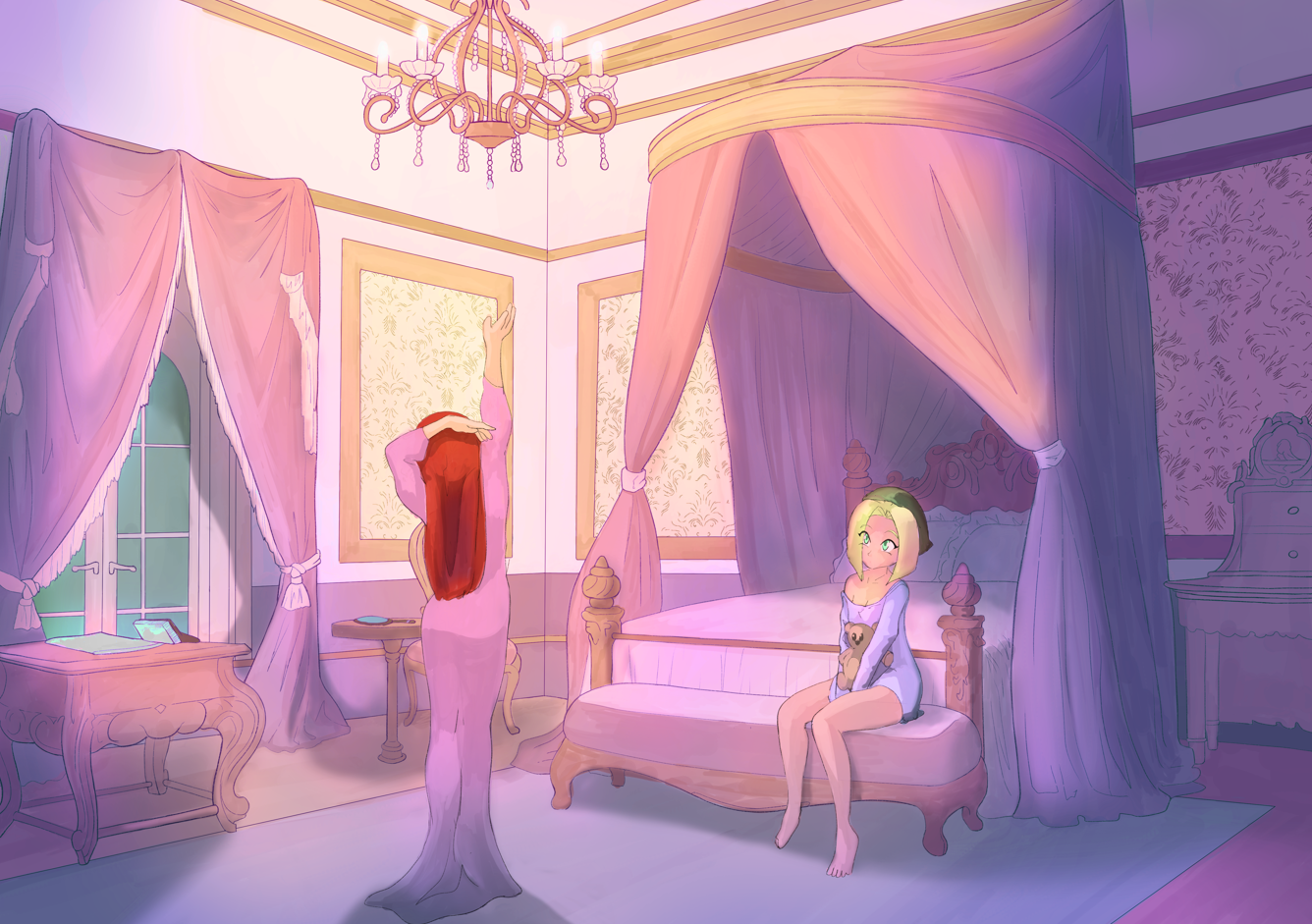
Still working with environments! did a few adjustments to the bedroom based on feedback, though they were minor touches (some shadows, girl face, some other retouches). I'm pretty much done with it by now, time to move on.
Next is a piece from a proper artist. I was looking for something like "medieval rooftops", something like what you see in attack on titan. I found something similar to what I had in mind in the game store:
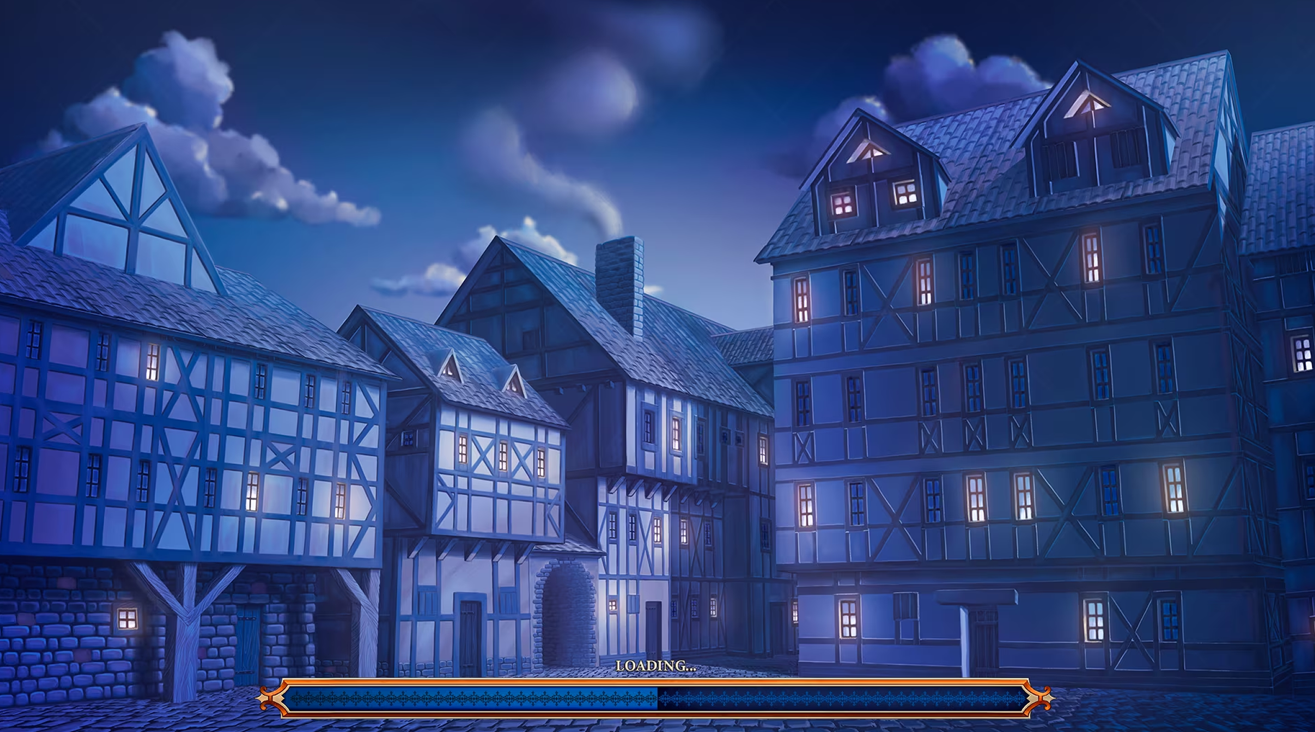
In the end my main objective with environments is not necessarily art pieces, but to be able to create backgrounds for comcis, manga or stuff like that, so this is really close to what I had in mind, and looking at it closely I can tell it was indeed made by a human xD.
Just sketching things out and drawing lines, still need to clean things up and work with the color and tones, but it's starting to come together.
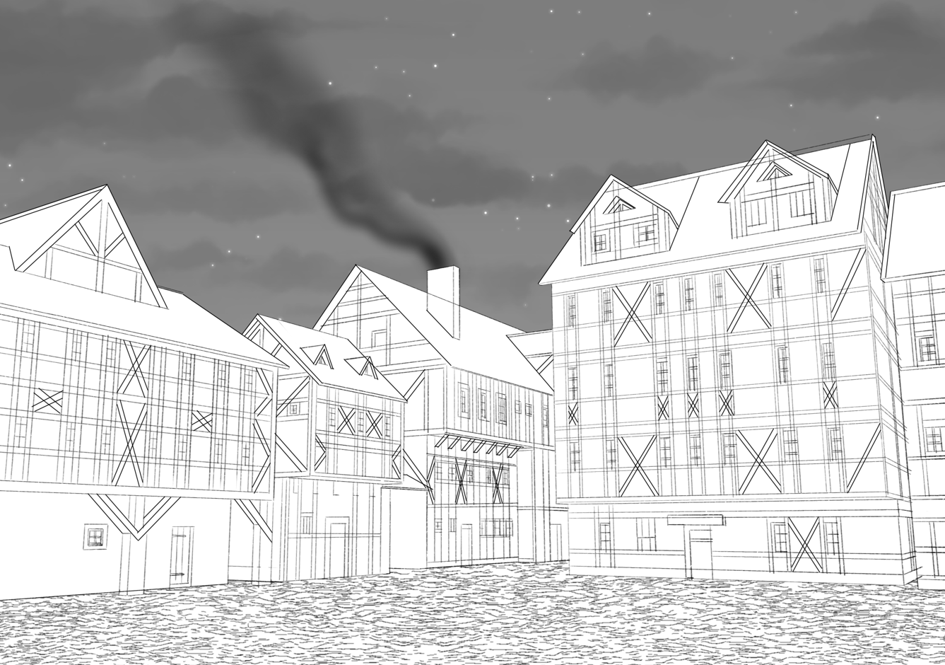
Line weight still needs to be fixed across, but there's progress.
While working on it I realized a few things:
1) The artist took some shortcuts. Things like the roof tiles or the ground are clearly textures with an angle (no bump mapping, so it's more obvious), so I set out to do the same. I've done similar stuff with my own backgrounds, and it really saves time.
2) The whole perspective "copy" was the biggest takeaway for me. As I started the first thing I did was set a 3 point ruler to match the reference, which in turn led me to appreciate how the vanishing points and perspective was used here. Once the ruler was set, honestly, drawing the buildings was farily straightforward since they're pretty geometric. Still taking a bit of time, but relatively simple.
Manga
One new page to kick off chapter 30!

1) First page, so trying to set the mood with some dark humor. Poor Edward, we barely knew ye. You might recognize the background used on the first frame, it was one of the previous exercices  Characters stand out a bit due to the difference in shading, but keeping the whole thing dark helps. It also gives it that feeling of "cell shading over detailed background" animation is known for.
2) I'm actually pretty proud on how far my hand have come. they at least look decent now, I used to not be able to draw hands for the life for me.
3) There's already quite a bit of foreshadowing in this page alone, but it would spoil to say exactly what that is.
4) Overall, the point is to set a dark mood, to establish these guys can be pretty dangerous to deal with, and though the main cast of character are dealing with them in a way, for this Scarlet Fang group, the main cast of characters are just "another business" to take care of. At least for now.
5) Not to evident in this page, but one of the main points I want to work on this chapter is to expand the frames and use more real state of the page. For manga/comics, from what I've learned, it's important to stick to an area in the page, since that's the "cut off point" for printing (which I hope to eventually get into), however, that doesn't mean the frames have to stay in that limit, it only means that anything beyond those ruler limits is at risk of not being seen. So you want to keep your main focus ponts and text within those limits, but are free to work beyond them.
That's all for now! I hope to take a breather one of these days, so hopefully I'll be able to make some more progress.
Hope everyone has a great rest of the week! Cheers!