Thanks everyone for the kind words! Not really sure what else to say other than I really appreciate all the support you guys keep providing. Likewise seeing everyone's progress is just as inspiring and motivating!
The work you have posted so far looks pretty good! both in designs and drafts. The art and drafts @patrycja.lerch @mitsuki-youko and @JimSt also shared also look great (I'm probably missing a few more I've seen. You guys are already very much ahead from where I was when I did the first test one shot.
Not sure if I already shared it with you but my original one shot for testing did not look as good. Here are a few pages :


Still, I learned a lot from it and served as a good starting point.
Term 4
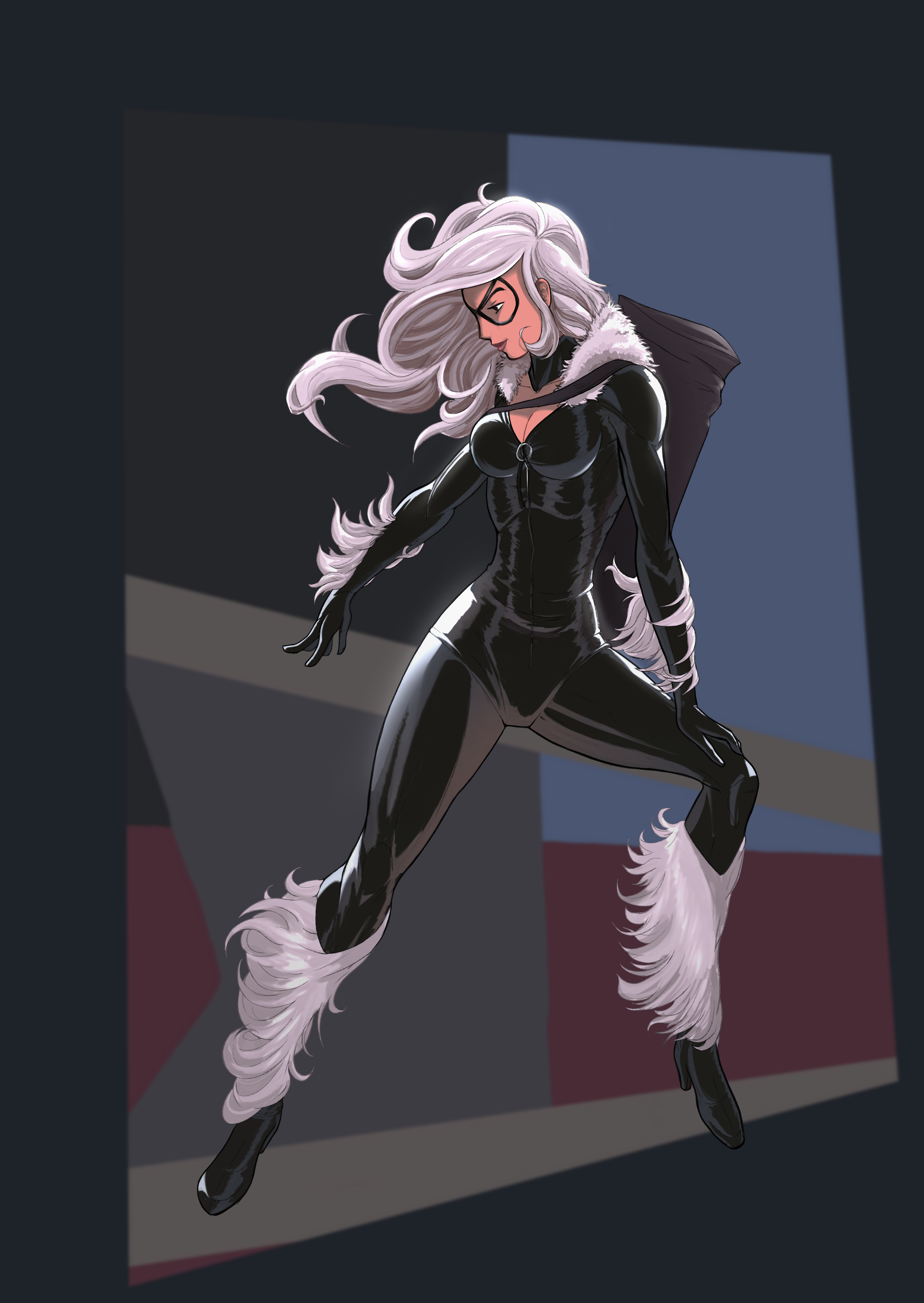
10 of 10 copy exercice. Keeping with the spider man theme, decided to go with Felicia Hardy, Aka Black cat. Girl is all spandex and muscles, similar to spider man (though not as buff), good subject to copy and practice anatomy.

For this one the major shift from other copies done was to focus more on drawing it, constructing it and rendering more on my own than trying to 100% accurately copy it. So barely used rulers, no grid, and only looked at the reference to refresh my memory on some aspects.

Decided to not really work on a BG this time, as I wanted to take things more chill. Just added some tones for ambience.

As usual, there were some key aspects I was able to learn from it. Other than refining anatomy notes (specifically those hips and legs kept giving me some trouble), I noticed rendering was mostly with 2 distinct layers for shadows and one for highlights.
Lineart was particularly harder and thicker around the edges, and smoother on the inside details. I’ve actually noticed most artists I used as references did this, most probably to have a clear outline on the character.

Relationship between colors was also interesting, since there a cold purple undertone to most shadows, including the hair, fur and spandex, no doubt taken from the environment. There’s an overall colder tone to it, even the skin color which was warmer was colder than other skin tones I’ve used.
And just for fun, here’s a small compilation of all 10 copies done as part of this exercice.

And with that, we’re ready to move to the next exercice, which is “have fun practicing whatever you’d like or working on personal art”. Got a few ideas on what to do, so we’ll see how it goes.
Manga
One more page done! Pg 11 of 14 of Chap 31!

1) Iris finally starts going on about what is really driving things behind her. It’ll be elaborated even further in the following pages, but for now it’s starting to be evident she feels the loss of her family members pretty deeply. As she tries to explain things in a manner that Sari can understand, it’s also for the reader to get some more context. The purpose not really to gain acceptance or empathy from the reader, but at least understanding.
2) There are 2 parts to the composition on the page. The screentone behind the second and fourth frames tie together frames 2, 3 and 4 (in a suggested circle), making them feel as different angles of the same scene, and also (hopefully), making it feel like things have grown still. Fifth frame has a bit of a dark effect and tone as the conversation takes a more somber tone (which also contrasts well with the highlights.
3) You may have also noticed lettering changes size to reflect the tone of the words. The first line in the first frame is obviously larger, but even subsequent lines have a very slight change in size to reflect the change in the tone of the voice. Also had to change bubbles around as the flow wasn’t working out at first.
4) Below is the intended “eye line”. You can let me know if the flow was achieved. I’ll probably start placing more emphasis on drawing the line intentionally to better decide where to add more detail, manage text and bubbles, contrast and so on.

That’s all for now! Thanks so much for dropping by! Have a great rest of the week! Cheers!