for gesture, you're trying to capture the energy of the pose while focusing loosely on proportions when you start adding mass the body parts but yours look great and they capture the poses well. also nice house in perspective. 
Thanks Kosmonaut!
I've been working on term 2 photoshop assignments, decided to inspire the logo on a tabletop rpg i've been thinking of running with my friends! 
I was thinking of putting some stars and stuff, but decided to keep it simple.
I've made the little monster too! A good and old LV 1 slime! 

Let's gooo!
EDIT: Should i upload images with lower sizes? I've tried to edit the html code that appears to make them smaller, but it did not work... 
Nice logo and monster! I like the colors on the logo and the logo itself looks clean.
Hi!
I have been practicing every day at least a little, i have been doing gesture drawings and trying to pratice perspective some more... there's nothing really worth showing about that tho, haha.
I did the term 2 Line Weight and Shading assignments.
The color blending has been a kinda daunting for me, gonna show it when i get at least a more or less decent result hahaha. 


I also did a sketch for the Vivi fanart event, i'm not finishing it for now, but i decided to post it here since people seems to like it ! I'm planning to revisit it later!

Let's gooo!
for the shading assignment, it looks like you either didn't blend the values enough or used the airbrush to try to get a more blended result.
You also may want to make the background color different from white since some of your white value is lost on the canvas, or you can use lines to indicate where the forms stop. The white values also depending on your light source's intensity and distance, if there is an almost pure white as your lighting color then I would think it would spread a lot farther and you would have fewer mid-tones and shadows
I may be wrong about the light sources but from the arrow I assume is coming from the side. like for the one on the far upper right the light source looks like its coming straight from the right but it may be coming from behind it making the lighting make more sense if so disregard the last part of the previous point. great practice overall though love your Vivi sketch.
Thank you for the advices @Kosmonaut, it was very helpful!
I was doing the assignment with a bug that was messing up my brush, i think this is why it looks like i used an airbrush. 

I didn't understant that this was the problem, and became very frustated because i couldn't do the proper blending haha. One very kind person showed me how to solve it in discord and now i'm back to full action!
I tried again with the advices you gave me in mind. I'm still having a little dificult with blending using the Smudge tool, i feel that i'm ending up losing much of the gradient previosly made, then i try to use it less and the result is not smooth... 
I'm wanting to try to do the same with a soft brush to compare the results.
I did the same using soft brushes, it was much faster... but i feel that the hard brush make the aesthetic more interesting... For now i think i need to get better at blending and making the edges... i don't know how to make them look good

That's fine then, your forms look a lot better, and glad that the issue was resolved I remember that happening in the discord but I didn't make the connection to your name though lol. Me personally I like the hard brush and blend approach when I blend colors as well. I only use a soft brush if I want to go for a specific effect though, but I like the hard brush effect better since you have defined edges, and like you said it gives that certain look, whereas the airbrush looks worse in comparison imo. Keep up the good practice!
I've finished the photoshop assignments, i think that i could spend some more time with shading and blending colors, but i really want to start doing the cool stuff and i'm satisfied for now, so i will move on to Anatomy 1 and worry about it when the problems arrive hehehe.
Color Blending Assignment:
My custom chain brush:

I've done some shapes for the start of the Anatomy class and watched some of the classes. Tomorrow i'm gonna draw some more and hopefully start making faces!

that's some good form practice the only thing I would like to point out is that the sphere you have in the top right would have that square connection also be slightly curved because it's a sphere so it follows the form unless shown that there is a flat side. overall though good practice
Thanks @Kosmonaut! You're right and i think today i made the same mistake hahaha! I'm gonna try to give more attention to this in the future!
I ended up making some more shapes and made some shading. I've no idea what i'm doing and i feel that i don't have a good understanding of how light works, but it i did my best today!
it's just a small thing so no big deal, also if I may point out something else it looks like you are doing some interactive shading but I'd play with more than three values though so that you can get a sense of where the darkest shadow is and how far away objects have a lighter or darker grey color depending on the light source you use. The darker greys could be used to differentiate value-wise from the shading color of the other form shadows if that makes sense. If it doesn't let me know I'm tired so I hope it makes sense.
I understand @Kosmonaut, i will keep that in mind, thank you very much !
I've been practicing some more of 1 and 2 point perspective in the last days, i have the bad habit of scraping things out when they don't go very good, so i don't have anything about it to show, but i will try to finish them from now on. I think i got better at it, at least i don't get confused with the many lines anymore, for me it counts as a victory! hahaha
I did some more shapes with the subdivisions this time!
looks awesome nice practice!
Today i've practiced doing the head spheres for the Anatomy 1 class! I feel much more confortable doing so now! I'm trying to get a lighter line too. 


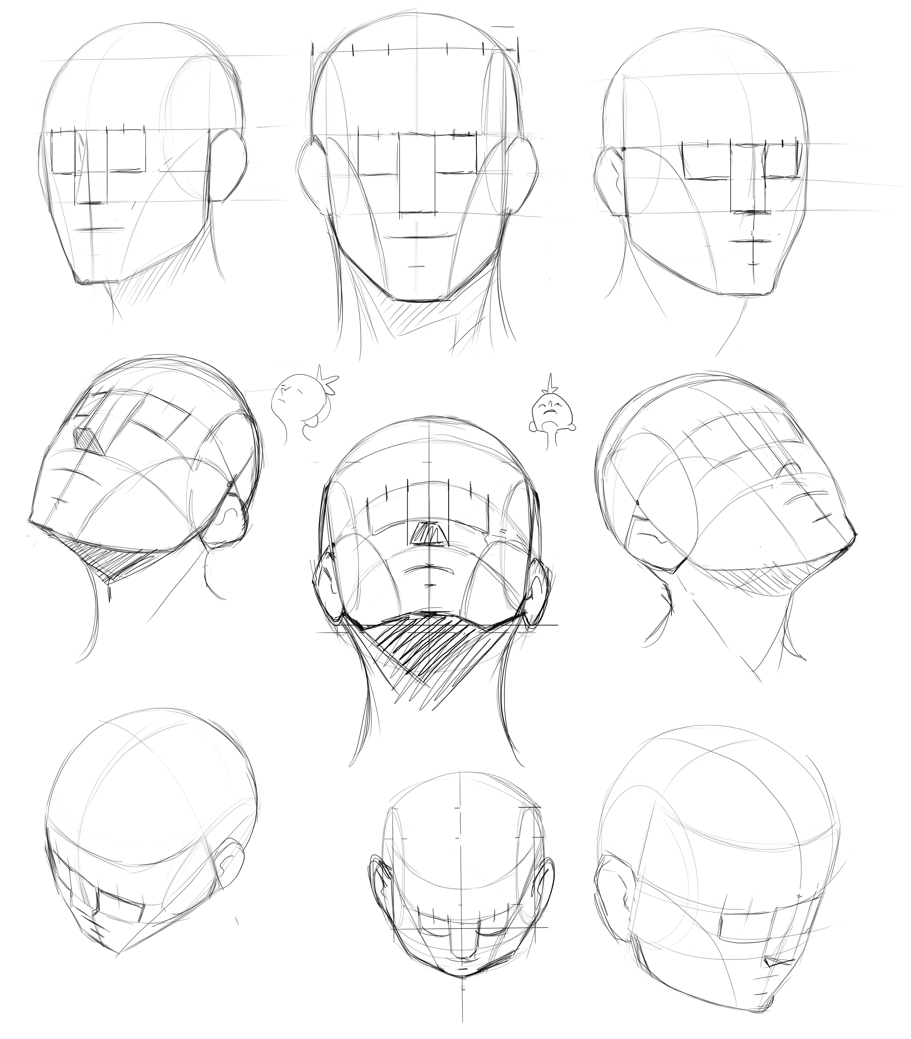
These are some nice faces like you said some of them are too wide while others are too narrow. I also think the nose area would pop out further than you have in some of these as well blocking more of the eye area. overall nice heads though.
also for extreme angles if you see yourself drawing those a lot then continue practicing those but if not I would stick to the more tame face angles so that you are really good at those and use ref for the more extreme angles
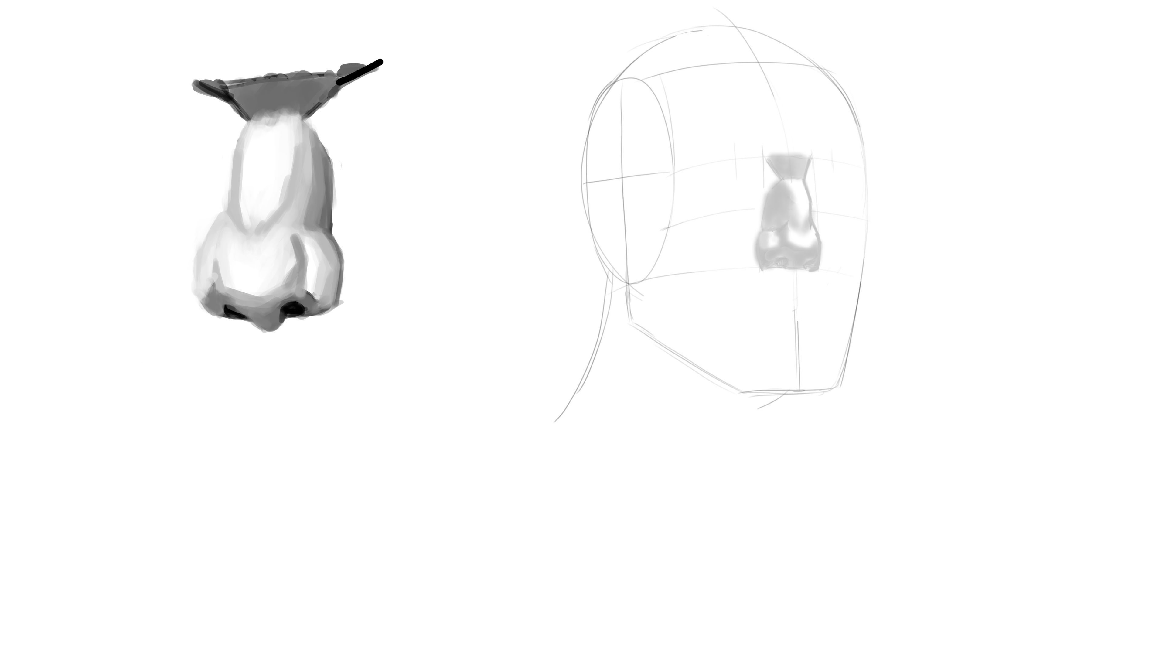
I've been learning more about drawing faces, i decided to go on to the parts and practice all together later because i really want to start rendering.

Then i tried the parts...
After this atrocity i decided to learn more about shading, so i studied that some more and i think i got slightly better.


The grind goes on!