2 months later
I spent few days at my actual job painting on my crappy laptop.
(crappy because the screen "eats" up a lot of values and colours and I cant help it)
I am not going back to any of these so I just drop em here.
this was day 1
And this was Day 2


Did another greyscale painting and decided to throw few gradient maps on top of it. 


Seems like you're getting more comfortable with gradient maps. I'd say the only thing that's bugging me is the color of the elbows. I think you could tone it down quite a bit to make it look more natural.
Beyond that I think she looks lovely 
NO, im an artist i see her elbows like this!
jk 
ye, i definetly agree.. also elbow skin is weird in general.
I wont get back to this one because i do these greyscales to figure out brushes and techniques that i like to use but I will account elbow issue in the future  thanks
Well keep doing it then. I won't stop you XD
But yeah, doing skin is dificult as there can be a lot of subtle color variations happening at different points.
I spent my weekend drawing this without any particular point or idea.
So i've started with this greyscale painting at first

Then I thought to myself: "Gradient maps, yay!"
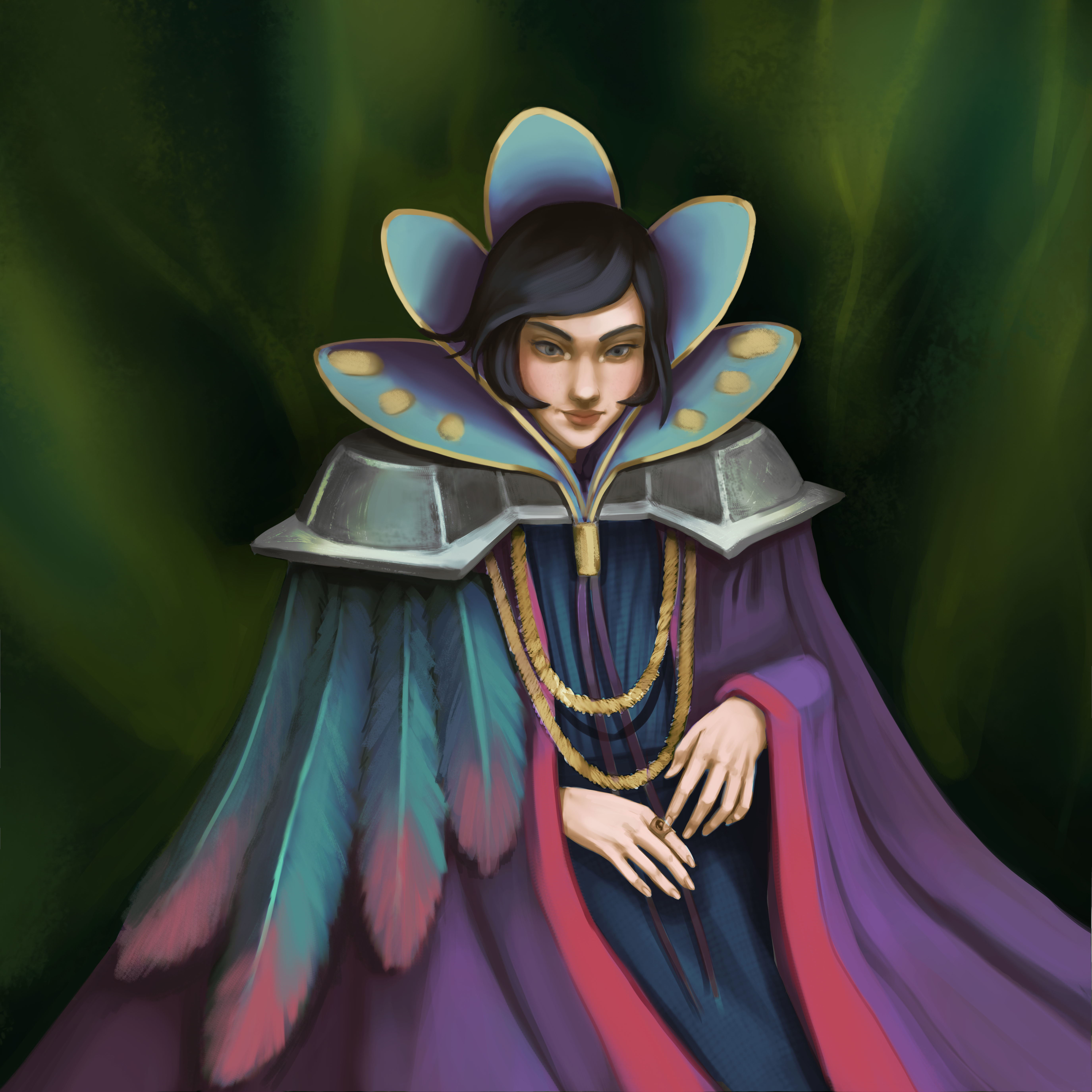
After all the manipulations I did to this image I have decided to tone down these bright colours and I painted on top of it

I hope that it turnes out alright
What really bothers me is that I think that I switch between styles quite a bit... I think the reason for that might be that I am still learning and figuring out new ways of work as I am REALLy working hard on understanding light and colours lol

Well I think I do that too and I don't think it's really a bad thing unless you have something very specific in mind.
As for this last piece, I think it's coming along very well. I like the more muted colors you're using. It feels a bit different than your other work, but it works very well. Keep it up!
ah, thanks, @cedricgo!
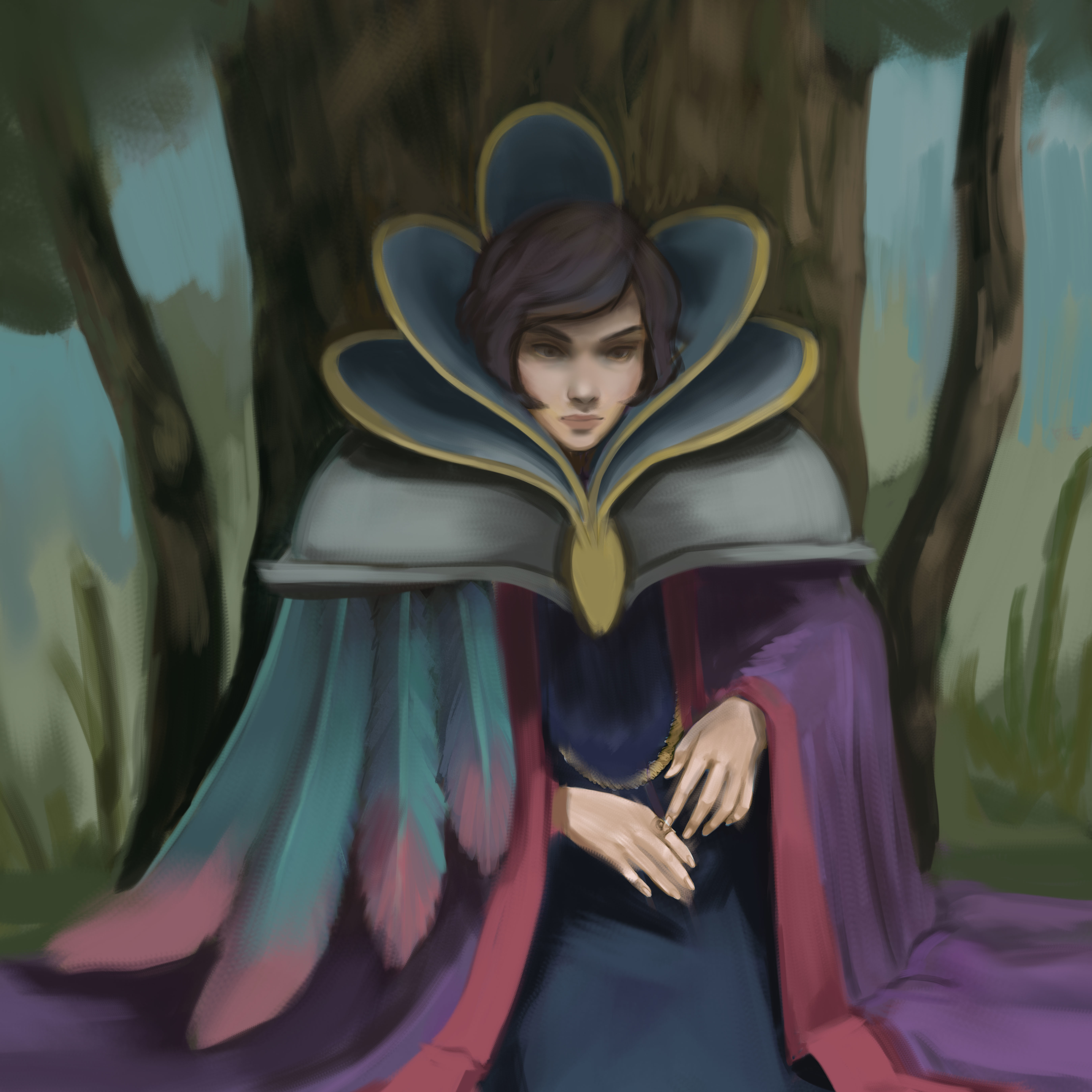
another update on this piece, it slowly moves towards the end. I am very confused by metals, I know super new and polished ones will reflect light etc..
i need to google for some master paintings that have metals in it.. for some reason i have a hard time understanding it 
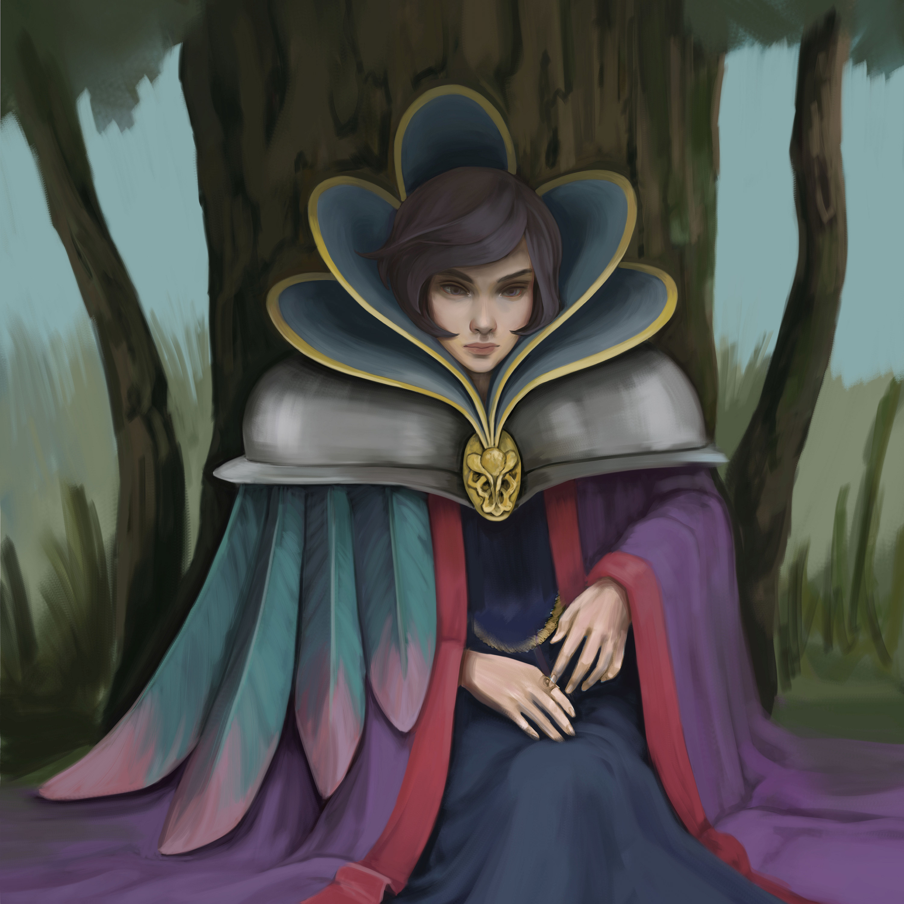
I did some studies about metals... i think this looks somewhat more metal-like haha :>
rn im seeing that the trees are pretty flat... and im thinking to add tiny details like some ring on her fingers and maybe some low hanging necklace...will see ;>