I am back, although a little late. Dad had surgery and there was Thanksgiving. As I set out to do, I practiced drawing some faces and conducted a master study of Frans Hans. I also drew a scenery in 2-point perspective but I didn't have the time nor the will to draw in 3-point perspective. I just found it plain boring to draw landscapes so imma have to think of a way to make these perspective studies fun (I think I may just progress to learn more about the human anatomy as I enjoy drawing characters, and right now I am just drawing faces). While drawing faces, I noticed my line work improved when I used the Mercury brush instead of whatever inking brush I was using before. Compare the three face drawings in one page vs. the two other ones which I shaded separately and tell me that the latter doesn't look better than the former. Anyhow, as far as the shading goes, I think it turned out alright with the first one but the second one, the Frans Hals study, the shadow family has too much contrast between the reflected light and core shadows, thus giving the impression that the reflected light is halftones when it is actually not. But please, let me know how I can improve as I find shading digitally very difficult. I have heard of clipping and using different layers but I am not very knowledge in either. I have attempted using "multiply" layers, albeit to no avail (as evidenced by the Frans Hals shading which, again, ended up adding too much contrast b/w core shadows and bounce light).

Perspective:

Head Drawings and Studies:


Next Week's Commitments:

  • Continue doing master studies from George Bridgeman's books
  • Learn to draw hair

(I have limited myself to only two commitments since last week I overburdened myself with too many of them, as evidenced by the fact I did not complete my 3-point perspective drawing which I will soon tackle)

Hope your dad is doing ok!

If you have a story, perhaps consider drawing something with your characters in it to keep your interest, like maybe if ur character is traveling somewhere, and u draw the bg for that with them in it (thats what i do at least haha)

Oh clipping is quite simple and i use it all the time: say you have a circle on the bottom layer. then you make a new layer above that, when you draw without clipping, it goes all over the page. BUT if clipping is turned on, it only colors the circle (or whatever shape or line/stroke you are clipping to) therefore helping u color within the confines of that shape

Personally i dont recommend using multiply layers until you get a good grasp of shading - using it randomly makes the colors look weird - personally i don't use it often - i just color pick the colors i want

I'll make a video of a study for you tomorrow (I hope lol - will email myself so that i don't forget.)

BTW i do recommend that if you are trying to color/shade in grayscale that you also turn the pic grayscale like it is for the second pic :smile: that helps in differentiating the different types of grey to use.

such a good idea :smile: i always plan for too many things and never get all of em done XD

btw your building/persp studies look great i think!

you also did really good on the one you drew traditionally and i think its just in the digital ones your colors are too far apart in terms of value. if you picked closer shades of grey it'd look better too.

^ I LOVE these tiny people they are SO cute XD

Note that I could be doing a better job had i spent more time but i think u get the idea XD

The steps are:

  1. Blockout (you did good there)
  2. smooth out the block out
  3. Op now its too smooth...
  4. Block out some more with some inbetween colors
  5. Smooth some more
  6. Block out
  7. Smooth gently and with smol brush size where needed

Make sure to vary your brush size as needed. Some areas need more large brush strokes with small blending strokes and some are the other way around so you just gotta experiment and see :smiley:

I would also recommend that if you want more practice but its not coming out the way you want that you could try it on smaller/simpler objects rather than people cuz people have a lot of bumps and dents esp around the eyes and just the face in general lol

Here's the study, if its blurry wait about an hr to watch it :smile: hope it helps! i just left it at real time this time and u can do 2x speed if u want

Surgery was a success. After a couple painful days of recovery, he is now doing fine. Thank you for asking.

That's a good approach although I don't have a particular story in mind like you do (and I applaud you for this). I may just have to think about the context of a drawing next time I tackle a perspective study - should make things more interesting.

I try to do this but for some reason I got lazy with the Frans Hals study, that was my bad and thanks for calling me out on this.

Lol, I am glad you like my cute little subjects.

I can't thank you for going to such great lengths to help me out with my shading skills. I just finished watching your video and I got to see you using clipping and multiple layers. Btw, you may have used these tools on the earlier demo you shared with me (the one about the apple) but I frankly I did not pay much attention as I was unaware of them atm. Anyhow, I also took note of how you use different brushes to achieve different results. I usually just stick to one brush, a hard square brush, since I don't know much about other brushes. After watching your video, I definitely will have to branch out and use soft brushes, air brushes, and hard round brushes (the last of which I just started using). Another thing that stood out to me is how you focused solely on the shading aspect of the painting and not so much on proportions as evidenced by the fact you traced the drawing. I believe you did this either as a time-cutting measure or because you wanted to show me that I can focus on studying just one thing at a time, in this case shading, therefore, being more effective, but please correct if I'm wrong. This whole video has been very insightful and I hope to soon put what I have learned from you into practice.

Glad to hear he is doing alright!

ahh i see.. in that case this video might help a bit... https://www.youtube.com/watch?v=mhvtuZIEV_Q

no problem! I am happy to help :smiley: tho sometimes i get a little lazy XD i was gonna do both drawings but... ended up doing just the face for the first one :3 if you wanna see more lemmie k! or if you like something i do and want to see how i do it, feel free to ask! i'd be happy to do more recordings for you XD it makes me feel like im good at something lmao (even tho i might not be hahah)

Haha that was me being lazy since your question was about how to shade better XD if your question was about how to lineart/do proportions, my approach would have been different XD

but yes depends on your focus tho. if you wanna purely focus on shading, you can roughly do the other aspects like lineart if you want. that's up to you :smiley:

btw its super fun interacting with u on the forum, do you have ig? :smiley: (watch i bet i asked this before and already have u on ig XD) (if u dun have ig, do u have discord or somethin?)

I will make sure to check this video out today.

Thank you, and no worries with skipping over the second drawing. One was enough to get the point across.

Makes sense lol

I don't, and sorry I didn't respond to this question earlier. In fact, I don't have any social media except for LinkedIn that I use for work. I guess I have discord, but I don't think that counts as social media. I would be happy to add you there. Let me know and I'll DM you.

Btw, here's my work from yesterday. I was really quick to sketch and ink the drawing, but it took me about an hour to do the shading. I used multiple layers for the first time. It made the shading process easier but I had to constantly employ the color picker tool and erase the shading from previous layers as it would MULTIPLY top layers, thus yielding me different shading values. I will need to watch a video about this. I also employed different brushes - a soft brush, a hard brush, and a hair brush (the last of which I didn't use that much but still gave it a go with the hair). There are some obvious places I missed shading darker such as the jawline on the left hand side but I didn't go back to it for the sake of time (and because I ended up with like a 10 layers and that was confusing lol). I employed the "selections" feature in procreate, which looked similar to PS's clipping tool, but after doing some research, I realized it was something completely different (oh well...). Anyways, I had fun :smile:


found u on discord and added u :smiley: it technically counts XD

nice work on the shading! imo i think either the rest of her face is too light or the side of the face and hands are a bit too dark but otherwise, nice work!

heyy nice studies mate, you may not like it, but I think your perspective study is pretty nice, I'd actually love to see more XD I like how you populate em - that said I also struggle to make that first stroke on any perspective or landscape work

As far as shading goes @mitsuki-youko really hit it out of the park with those tips! I'd also add that choosing good reference material is essential, when the plane changes aren't easy to note it can be much harder to paint so I recommend looking for more dramatic lighting scenarios to make it easier as you learn. For me it's similar to what Mitsuki mentioned of block in, shading and smoothing. It varies depending on the app im using, in procreate I love using the smudge brush, in photoshop I find that using color picking and opacity on my brush works better to just make those gradations. As for layers, on photoshop I do tend to place the lineart as foreground with multiply and low opacity as a guide for the painting phase and sometimes I'll fill in the area to paint and then alpha lock it (if im not lazy XD) works well for me either way as I like keeping it a bit messy, free of limitations and thus achieving a more dynamic and painterly result (at least that's my goal) . It also helps my brain to paint the background with some tone other than white, it could be the actual background color, some other color or just some gray to help me better analyze the values as I paint em

dang that was long, also, glad to hear everything went well with the procedure!

cheers!

If you're not a fan of landscapes then you could try making accessories for your characters. Could start with some simple boxes, bags, pendants, armor, helmets, glasses, weapons, tools, and so on. You could show how they function if they have any moving parts maybe. Just a thought.

I like 'Sketch Book' for drawing perspective as it's got loads of great tools for perspective drawing that work very similar to real-life tools (*Sketch Book App is free, Sketch Book pro is payed).

@snakker Thanks for sharing your drawing process on Procreate. This gives me a good idea of how my own drawing process should look like.
@br00dley I love your idea! In fact, when I first looked at your comment, I decided to study a sword from reference. I found it really enjoyable as opposed to landscapes.

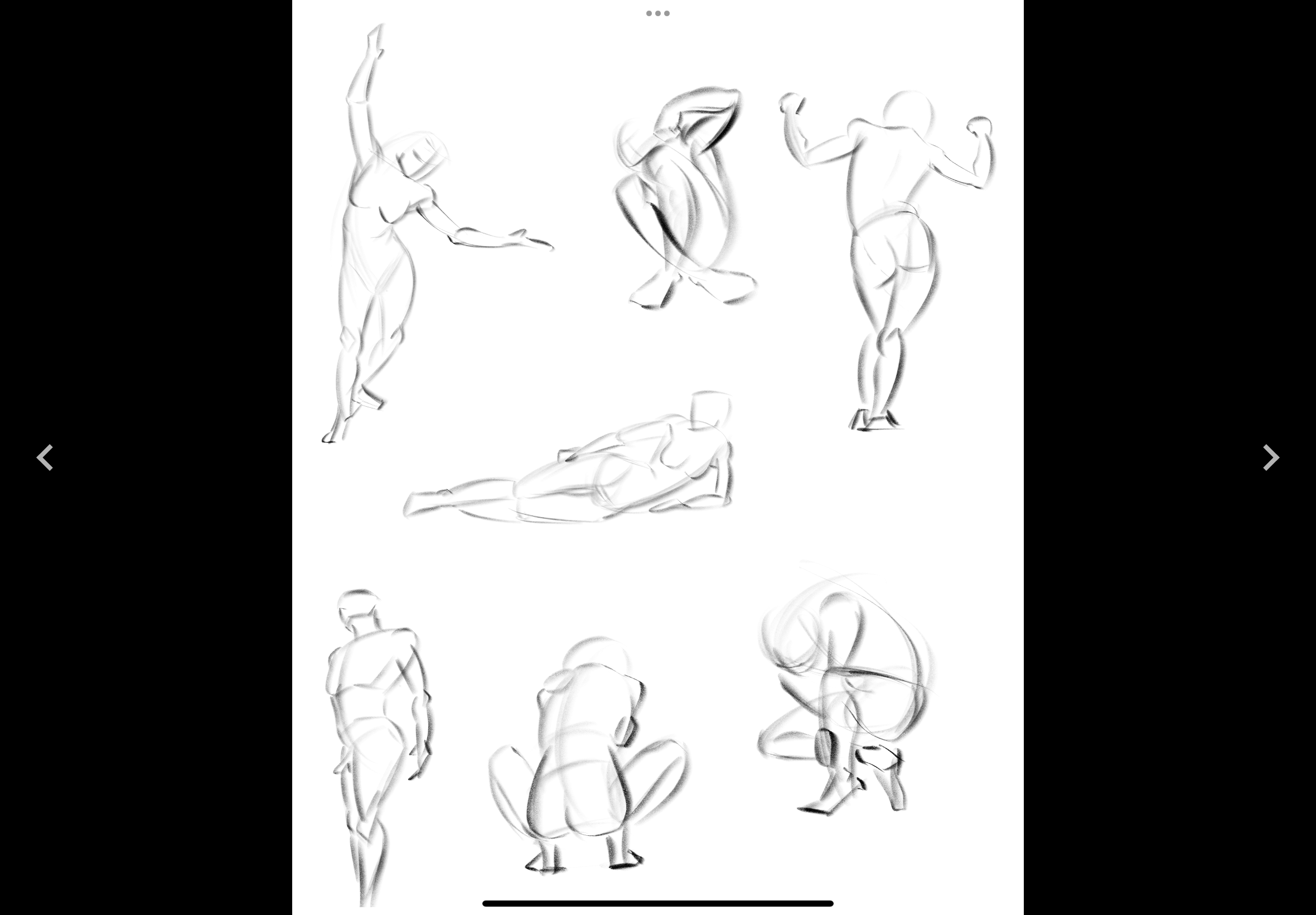
This past week has been a mess. With being so close to the end of this year, business has picked up quite a bit, and, as a result, I have been pretty busy. On top of that, focusing on more than just one goal has caused me to output work without consciously learning from it, that is, drawing for the sake of doing so. In light of this, I have decided to limit the number of weekly commitments to just one oer week as well as limit the number of study materials to just one reference per day. Hopefully, not only will this allow me to actual learn from my work but also make it enjoyable. And here's what I worked on the last week...

Gesture Drawings (3 minutes):

Head studies (plus hair):


Trad portrait:

Digital portrait (corsshatching attempt, disregard hair):

Asset studies (sword in perspective):

Next week's commitment: Study texture and volume of hair, and how it interacts with gravity

these studies look great! good luck with year end!