Thanks Guys!,
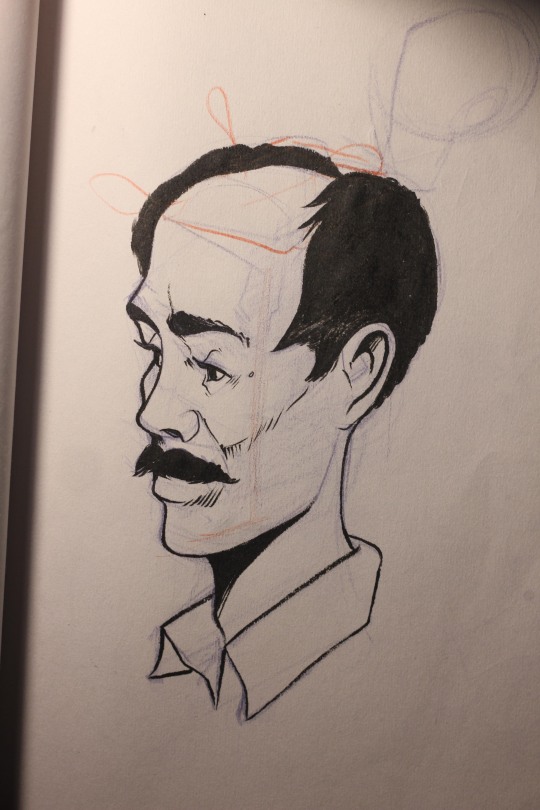
Today I inked a drawing I did not so long ago. That I liked, I did it with out refs and in an angle that I don't practice much which I'm kinda proud of 
Thanks Guys!,
Today I inked a drawing I did not so long ago. That I liked, I did it with out refs and in an angle that I don't practice much which I'm kinda proud of
Welcome! You have a very attractive style. I'll be Watching your blog 
Thanks for the kind words!
Latest head study after Bouguereau, I had a very difficult time studying his values and strokes, I'm going to make more after him.
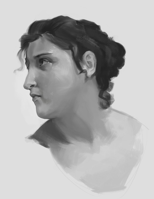
After him? This looks very much like a female to me. A very beautiful one though, beautifully painted
I think she/he is talking about the artist who originally made it
15 days later
Today I got back at my portrait studies, Here's another one after Sargent:

Another portrait studie after Sargent only 14 to go

If anyone is interest on the brushes that I use and how I used them here's a rundown:
I use the Dan LuVisi bruspack V2

The first one is called "chalk 2" this one I use the less, is a pretty texture heavy brush, I mainly use it for final details on portraits, I can see myself using it in other stuff like props or even landscapes, I think this one unifies everything with a pretty good texture.
The second one is called "Chalky square painting" this one I use the most because is has the less texture therefore its so light, I use for sketching and for blocking all the values and colors. This brush is my favorite and most used one.
The last one is called "Chalk Textured" this one has a pretty cool and heavy texture, I remember I used it on some metal once and I fell in love, I use it lots to unify the values and add and overall texture to the skin.
I also use the smudge tool with a brush called SCRATCHES_V that you can also find on this pack (set to 74% strength) However I think the most important and overlook detail that lots of people missed at the begging is to try to lay down the values to a level that it looks pretty much finished and then I go for the details, I think this is the best way to do it, there's no magic brush that will make all the decisions on values and color for you.
Here you can see an example from an artist I love (Charlie Bowater) on the left there's a blocking of color and value and on the left there's the final touches with textures brushes and some smudging, as you can see the hard part its already done. This not only yields a very good result but it also makes you faster.
Hope this helps.
Thanks for your breakdown! Yep, Charlie is such a pro ^^
No problem, She's one of my favs for sure!
Here is a challenge for you :
Brush Economy. No smooth shading. But thinking about every brush stroke you lay down. Not sure how you doing these studies, but when you zoom in on Sargents work, what makes it authentic is the decisions of each brush strokes he lays down.
I noticed, especially for digital painting, we seems to let the tools such as smudging or blending do the work for us, instead of doing the opposite, thinking about the brush marks you put down, thinking about the direction of the stroke etc.
That's a great challenge Brian, I'll definitely try this, one of the things that I love about Sargent is like you said that he only lays down the information we need to interpret whats he's trying to paint or draw. I'll try it on my studies from today, I'll take some process pictures as well! 
Here's a recent commission I did:

Here's my 12/25 Portrait study, I tried to economize my brushstrokes but I failed, I gotta keep trying though!

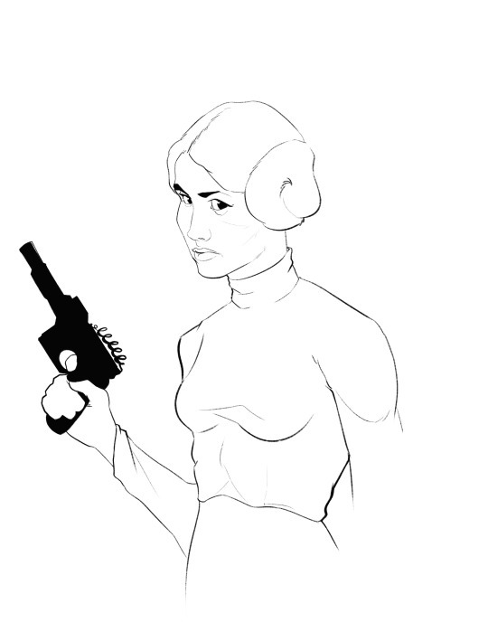
Today I drew Princess Leia
Another one

