Would like some general feedback on this please. Made a character then tried adding a background, was going for a crazy punk vibe but I think I'm leaving the character itself behind, now I'm endlessly tweaking pulling colours in and out behind and need to take a step back. The character has so many colours in it I'm unsure what to put behind him anyway. Tried putting pinks behind the green parts of him, yellows behind pinks, etc but tied myself in knots (bottom ver). Even added a hat to try and pull interest up to the face. None of this is 100% finished so am more than willing to tear it to pieces.
What can I do to make this an eyecatching thumbnail?
Also probably adding character info beneath the title, so won't be dead space.

Earlier versions

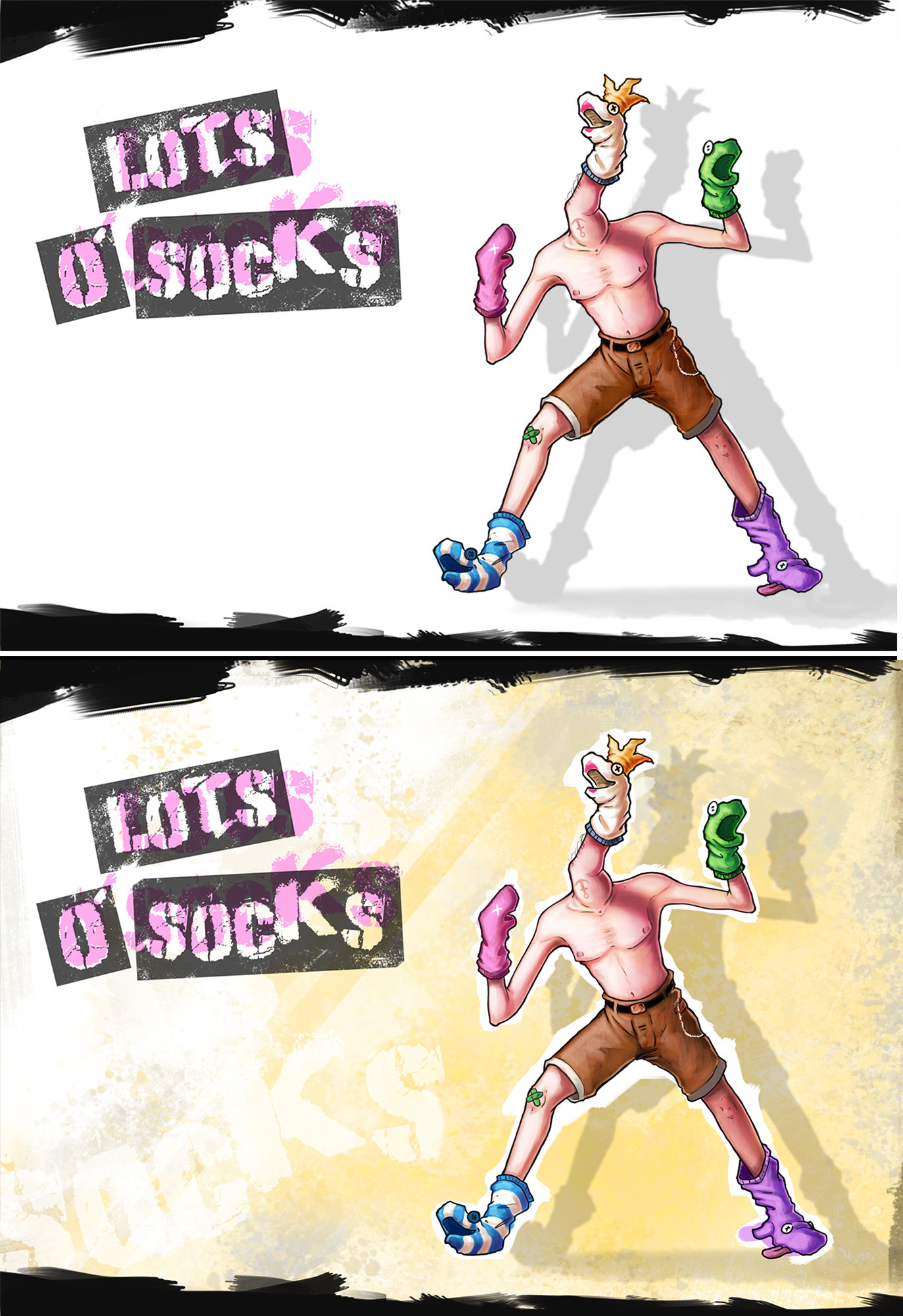
I think being bolder with your colors may help.
Making shadows black I think would be a good idea

Besides making the character have more contrast than the background, you can probably pick a neutral color and just give it a simple texture. I like the direction of the crown version, but I think you need to play with contrast more.

I don't know what you have in you reference board, but I recommend looking at graffiti punk art on concrete and brick walls for ideas.

You can give your character black shadows, and outline them in a painterly white texture and then build the other colors around that. The black shadows next to the white outline can also help us look at the character more.

23 days later

Sorry @malcom I thought I already thanked you for your feedback, so belated thank you for taking the time to critique.

Managed to get back and do some more on this (eventually). Messed around with the contrast, even tried some rough black shading and outlines but not really sure about that. Eventually just started again from the lineart.
Still a ways to go. Let me know if I'm making it better or worse!

think cool or warm -for- subject/background relationship.

The character is already pretty warm overall. The ones that pop more are the ones with a cooler background. Not necessarily “blue” simply not as warm as the subject. The farther away you get from warm will make him pop more. So think of the contrast like this with the subject and background in all aspects.

Motion or still.
Dark or light.
Hard or soft edged.
Cool or warm.

The closer they all are in their RELATIONSHIP the less contrast. The further away, the more contrast, and more garish.