Hi @leowilbur110 !
Nice! This will be sick!
EDIT: deleted section - re-read the post title - im an idiot - lol.
What style of game is this? That will help us with the design specifics and the way the character is clearly presented to the audience.
We mainly need a elevator pitch "intention" that is for the context of the game style, and character build, not just the character design and character back story.
The design we are presented with a little out of context at the moment so I cannot help as much as I would like I'm afraid. We are lacking design purpose - which is to solve problems of story telling and UX/UI for a game. Or perhaps you just want the main character art design critiqued? The high res stuff for splash art and marketing material?
We look forward to helping you with anything you might need help with. Just add a bit more of the specifics so we can gear up for the purposeful intent. (game type = character design needs)
I can do paint overs, draw overs for anatomy, style guides or just general error finding if that is what you want. All for free - but it is mainly for helping people learn art fundamentals - or critiquing specific theories or pieces based on what an artist is struggling with in their theory execution.
But I can make it more succinct for your needs if you dont want to learn any of that stuff rn and just focus on these artworks.
Perhaps is there someone who's style you find 'more interesting'? (like ) Someone we can compare to as a sort of end goal? Something we can use like a style guide for interest?
I look forward to our discourse.
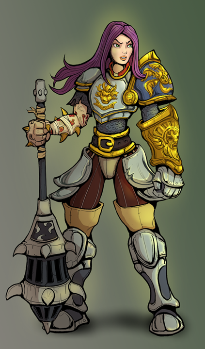
General Critique For Now - on the art presented
Perspective - The character and armor pieces could use some correction. We can fix that in the mannequin construction phase and 'eyeballed' perspective with ellipses and simple shapes.
Design - I can tell this is a custom character that has definitely got some pieces picked up form a campaign of some kind. Otherwise we would not be needing to show them off so much. The hip and leg armor design could use some thought. -- As well as how we incorporate the corruption. Overall - the design of the character is lacking a bit of cohesion. Games are going to tell a story and sell an experience.
And finally - what is she corrupted by? curse? poison? a real bad gas lighting from a besty? Or is it just the rage and guilt itself? Being specific - That could help us in the design not only for the character but for the gameplay mechanics.
Style - we have one key light source and some glow effect for an aura. Do we have a lighting guide, or style guide, or mood guide we can perhaps lean on for guidance? The corruption could be more scary and dire - right now it looks like really bad poison ivy with extra bones. Maybe it morphs her more and it is really REALLY dangerous as it gets bigger - like a resident evil character morphing out all gross, but it provides a contrasting game mechanic or time mechanism per level - I dont know just spit balling.
Illustration - Fire moves with the air, lets use that to enhance the illustration of the second piece to guide the eye of the viewer through the piece. Lets refine the linework to be less thick everywhere and only thick where we need to have the attention to detail in focal points or overlap of elements. The face needs a bit more time for the focal point of the second piece. You need to show us not tell us about her inner turmoil and rage. The illustration shape language and composition should reflect that with a dark mood, or a light mood with dark undertones. We want to sell the idea of the inner turmoil and contrasting good and evil power.
Overall - I think she's okay, or "good enough" for development phase but there is a lot of room for potential character growth, customization, and internal motivations.
What you really need is style exploration for the character to be fleshed out in their design. We want them to be identifiable on a screen that is very busy? Or very static? I dont know yet what your game style is.
As a sort of guiding rule : Characters designs are 'more interesting' when they lean towards one way or the other in their percentage of good and evil or and not so much a middle of the road contrast. Right in the middle it's rather bland.
Cant wait for your reply,
Ta for now.