Thanks Kosmo, I'll keep that in mind the next time I do a proportion study.
I wanted to start by sharing a drawing I did on Sunday:
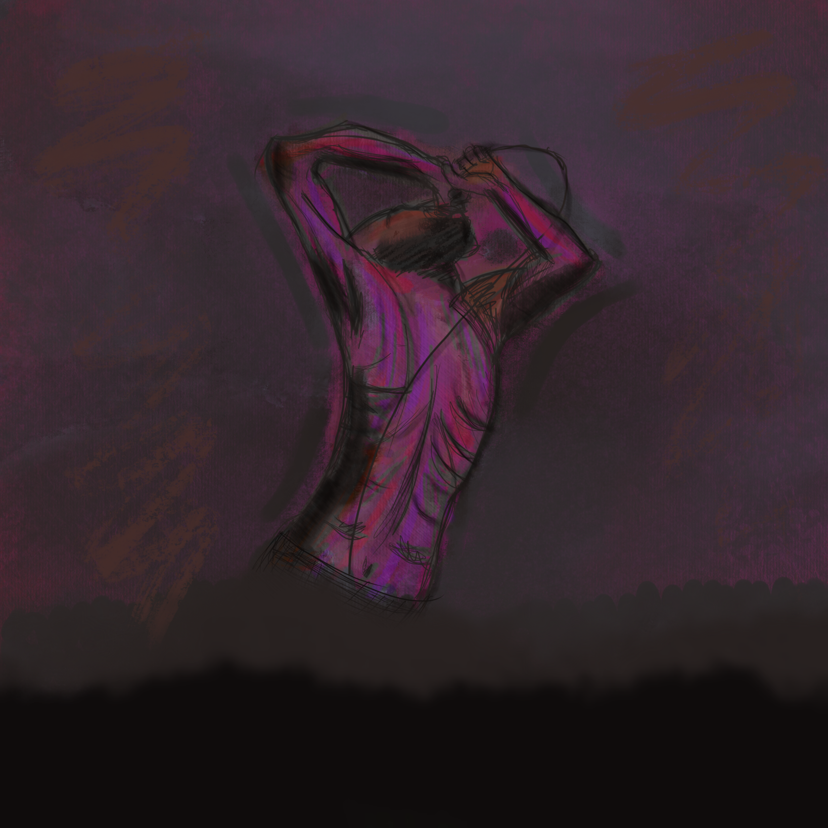
It was a a quick sketch based on reference (2/3 hours). Most of that time was spent on coloring and effects.
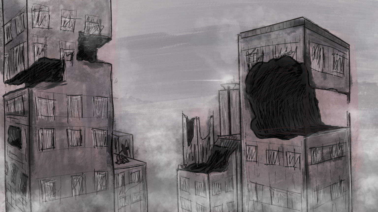
I also did a few more 2 point perspective drawings. I tried to introduce more complex shapes and some story to them.
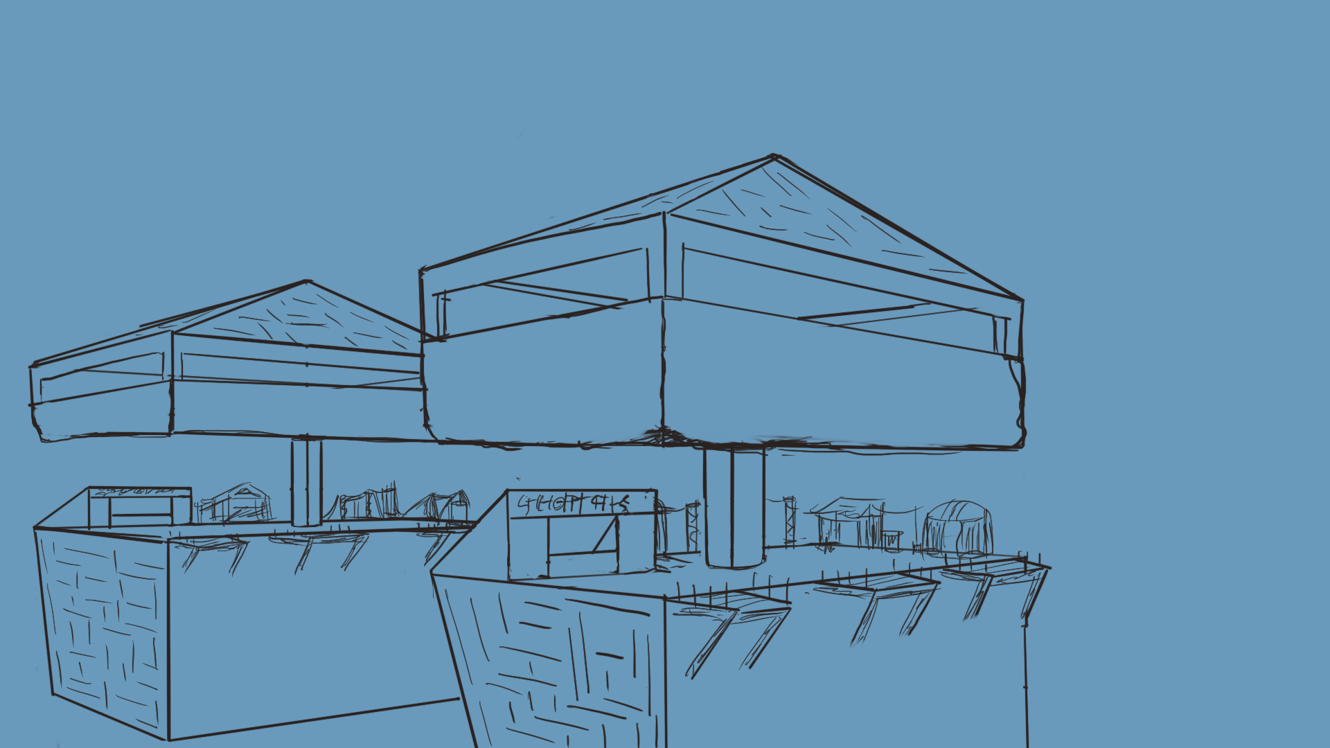
I haven't finished coloring this one so I'm sharing just the line art for now.
I have been doing some of the term 2 photoshop exercises as well:
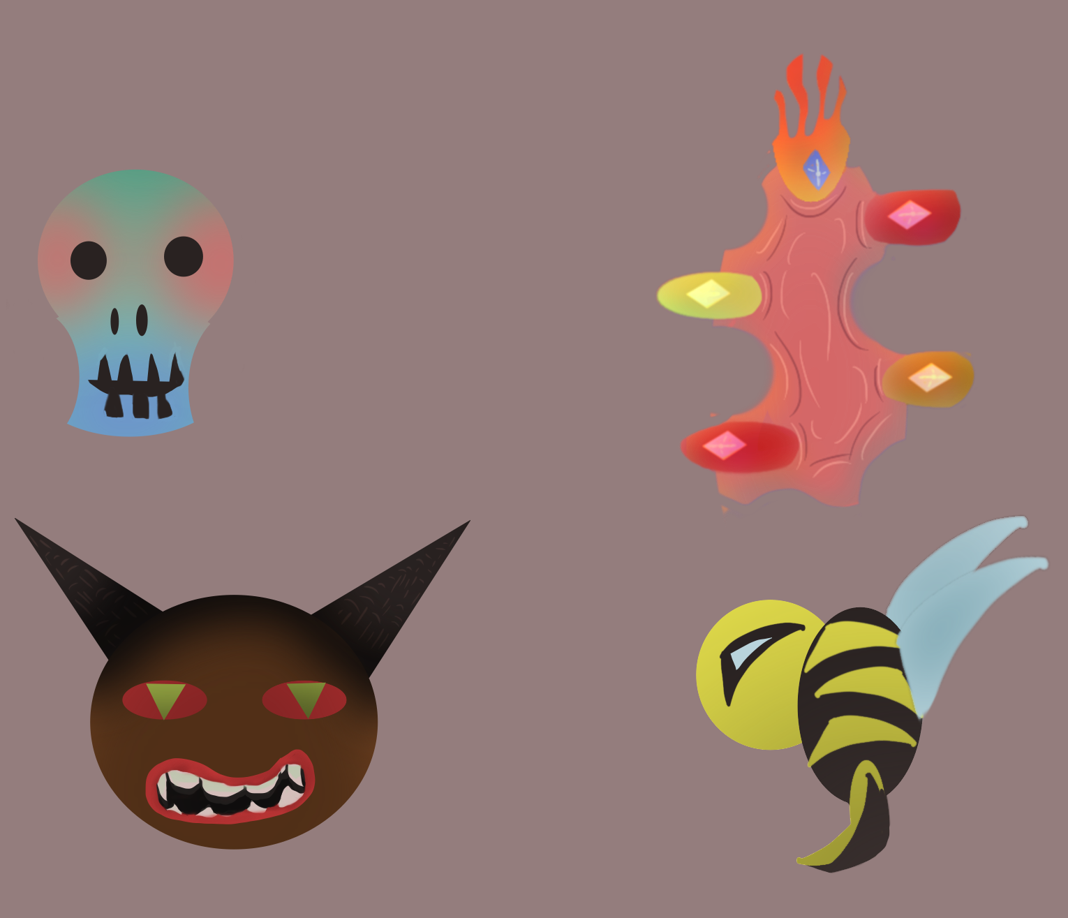
This is the simple shape with gradients monster exercise. Now in procreate it's not as simple as in photoshop. For those that don't know procreate doesn't have a gradient fill tool like photoshop so to get to the same effect I saw a few tutorials and came up with this pipeline:
- Using the select tool make a shop, fill it with the base color by dropping it.
- Then, Alpha Lock that layer.
- Create a new layer where you'll have your gradient.
- In this new layer, make a shape with the selection tool, and fill it using the Color Fill option on the select screen (or just drop the color you want)
- Use the Feather option and choose a feather amount that will fade the color.
Note: Applying Gaussian Blur/Motion Blur to this layer might also work.
- After you have your "gradient color" select that layer and apply a clipping mask.
And you are done! Now you can move the shape around and it will only show where the layer below has been colored. This is due to the Alpha lock option we selected previously along with the clipping mask.
If there is a better way to do a gradient in Procreate, please let me know!
I still need to do the text exercise! Which again in Procreate is not so simple, but I've seen a few tutorials and have some ideas on how to do it.
However the smart box art is impossible. There is no such functionality, and seeing as that is the goal of the exercise, I'll skip it.
So I was actually able to complete all the exercises on page 2. These were easier as they only deal with brush control and don't require any special features.
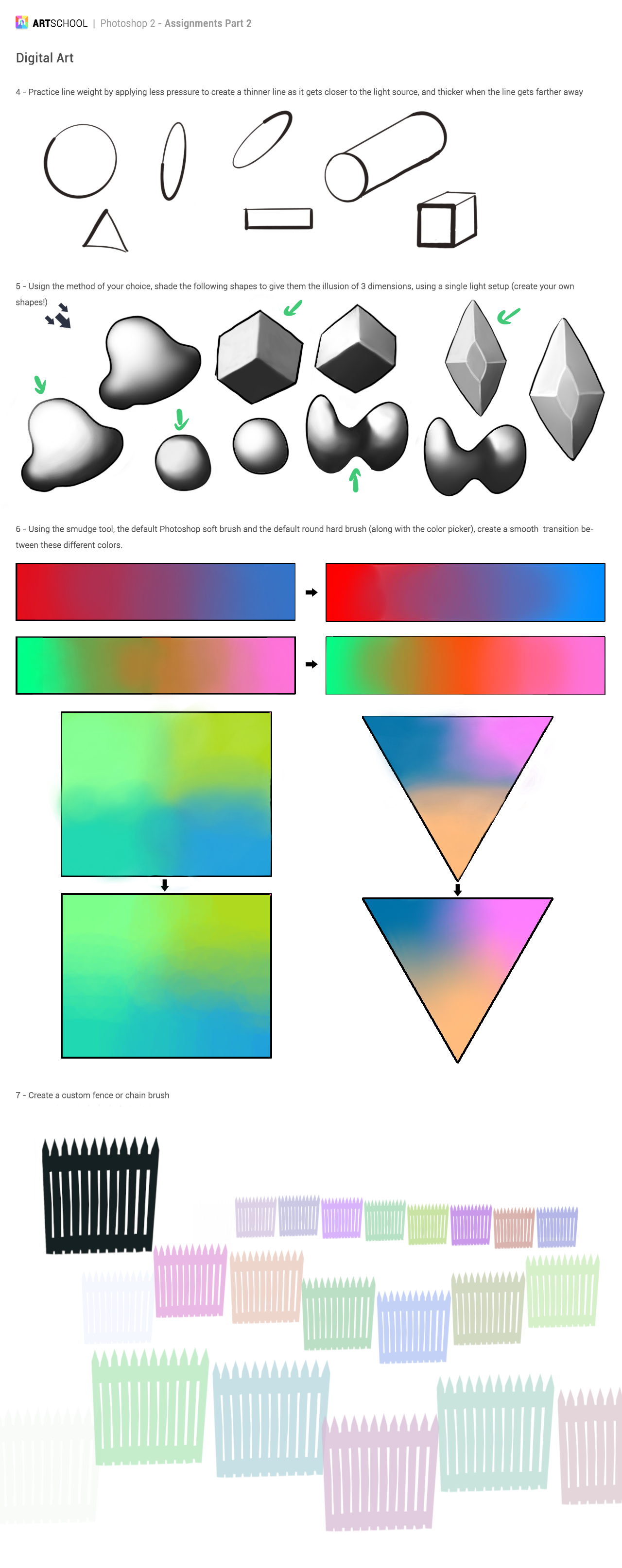
I had done smiliar exercises when I was going through Ctrl+Paint tutorials. They are always a fun challenge. You can go and color pick and correct as long as you want to.
The brush exercise was also the first time I did a procreate brush from scratch and I'm happy with the result. One of the options when creating a brush allows for a hue change with each stroke. Might not be useful but I had to give it a try!
And this is what I've been doing in the last few days.
As always feedback is always appreciated!


