Lovely work! I think the more lines that you have, especially on a a female will make it look a bit more manly. It is hard to capture some of the cuteness with just lines in my opinion. That being said I think your portrait looks wonderful and think you did a great job!
I managed to do two more portraits from the reference images provided on the left. I like how the faces came out in these, especially for the first one since I think it resembles the reference model well.
For the second portrait, I think she has a somewhat of a disgusted expression probably due to me raising her lip up a little more than normal. I decided to keep it like that since it felt more expressive.
I don't think the hair came out bad on both of them, but I can definitely see how it could be better, so I'm going to have to work on that at some point. I'll probably be working on grayscale shading within the following days for these portraits so I can more effectively capture the models' personality.
These took ~2 hours each
Any feedback is appreciated!

Great work. These drawings are very well done.
I tried shading the face of this portrait for a couple of hours and came up with this. Most of it ended up being aimless shading without any real process, so it didn't manage to turn out that well... Shading is gonna be a challenge.

Hey! I managed to do more drawing than I normally did. I decided to take a day off of trying to learn shading so I tried to do something new. I've heard it's important to do studies of other artist's work in order to improve your own, so I picked the cover art of one of the animes I'm currently watching and did a ~2.5 hour study.

I also did some portraits from reference images aswell.

Feedback is appreciated.
I was pretty lazy today, so this is all I've got to post...
I'm planning to work on shading tomorrow.

Hey! Didn't get around to working on shading yet, but I'll be doing that soon. In the mean time, I decided to try and working on an "art style". For the entirety of my time drawing, I've never really attempted to stylize anything (or maybe I have without knowing it). When using reference images, I try to replicate everything I see, but I wanted to change it up a little bit this time.
-
The middle portrait is in the heavily referenced style I usually draw in. I didn't bother putting in as much proper detail as I'm only using it for comparison.
-
The portrait on the far right is my stylized version. I gave her bigger eyes, a smaller nose, smaller mouth, and a more narrow neck and mandible. I think I achieved a cute-look with this stylization.
-
I might try something similar like this soon where I try deviating from the reference by using a different pose while maintaining the model's likeness.

This is really good! I also do the same and have the regular proportioned version next to the stylized so I can see how far I'm pushing the proportions. Keep up the good work!
These portraits are really on point! I love the expressions and the accuracy! Shading the face is mega tough, probably one of the toughest things to shade I think. I found this playlist mega helpful personally when it comes to portraits.
Ok, as an edit apparently it didnt link the playlist, but if you go to his channel then go to playlist and select the portrait section. I think those are some really good informations.
Thank you! I think I've seen this video before, but it's been a while since I've seen it. I'll go ahead and give it another watch cuz I've forgotten most of it's contents.
Hey!
It's been a while since my last post. College had started back up again for me so I kind of neglected drawing for about a week or so, but I'm ready to get back on the grind! I'll try to make a post every 1 - 3 days or so.
I did an asaro head value study to get a better grasp of the planes of the head as well as getting a feeling for paining. Marco Bucci has some nice video lessons on Youtube as well as on his website on painting fundamentals, which I would definitely recommend to watch.
The one on the left is my painting without the use of soft edges and the one on the right is after I did some edge work.
Feedback is appreciated!

Hello! I managed to do a painting from a reference model for this post. I'm a little disappointed with how it came out, as I don't think it really captured the model's likeness. I've been staring at this painting for a while now, so maybe that's why I'm not very pleased with it, but I can definitely recognize an improvement in my ability to paint, so that's an upside.
I would appreciate feedback on how I could make this painting resemble the model more. I'm pretty sure the way I painted the eyes contribute to the problem a little bit as they're not as narrow, but the rest I'm clueless on. Tips on where I could shade better / add better forms would be appreciated!

I have to say this is a very nice painting ^.^
Maybe next time you can give your painting more contrast and make the dark parts darker. Since the reference is grey scale you could even color pick it, if you are unsure :}
For the likeness, I would say a huge part besides the eyes are also the eyebrows, bc they change the expression extremely. In this case the eyebrows of the ref are more like a line (not so narrow) which makes her look more calm ^^
Nevertheless you nailed the anatomy and overall look 😄👌
Moving on to term 3 cuz I think I'm spending too much time on term 2. I'll be working on shading facing and stuff still, I just want to switch directions for a little bit.
I've studied anatomy a lot before taking this course so I think that's why this one came out good. I switched up the position of the head a little but cuz I thought it'll look better that way. I appreciate any sort of feedback!
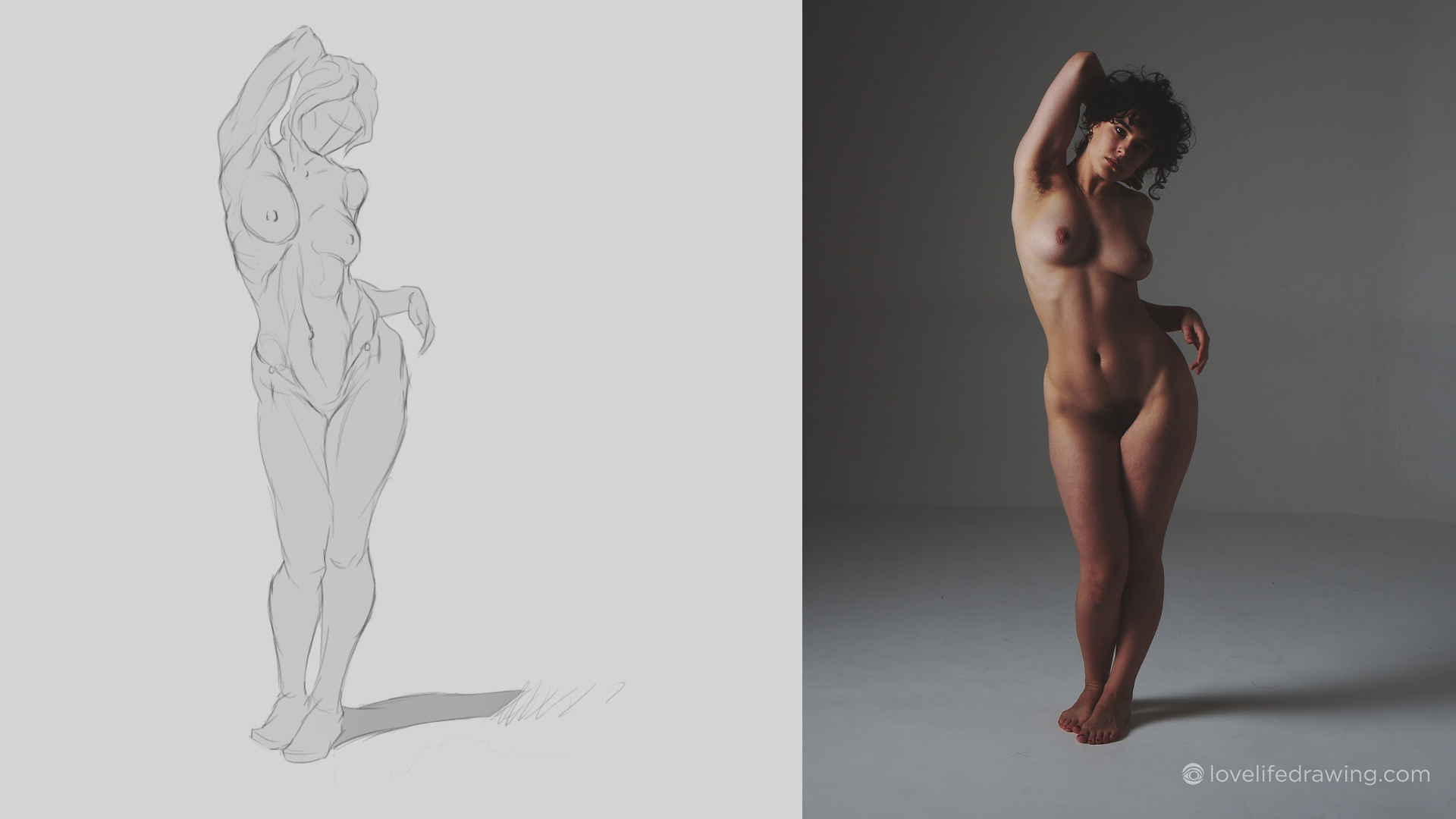
What's up! I did some figure drawings today to get a better grasp at drawing people.
The first drawing was done from imagination while the other 3 were from reference images.
I'm not sure if I did the 1st drawing (from imagination) correctly or not since I had nothing to compare it to, and it's a pose I don't ever remember drawing. I would appreciate feedback, thank you.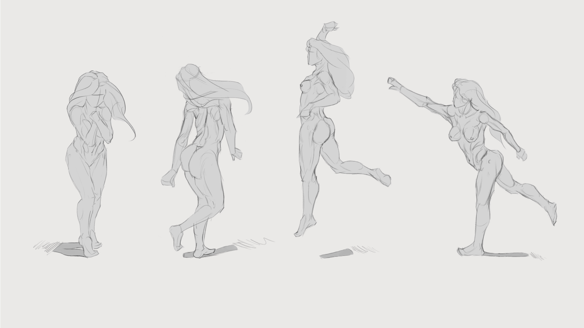
You did a really nice job with this. One thing I would suggest is to focus on the simple side of the asaro head for females. Personally I think their features are so much softer that the detailed side really lends itself more to a male face. In terms of this painting you did a wonderful job. I can tell you focused on identifying the shadow areas, light areas and mid tones. I would suggest trying a block in based on the planes and then blend them together works pretty well for me. This is how I have been starting out my faces and I think it works really well.

The only other thing I would suggest is check your values, I can tell you didnt color pick which is great! but some of the light values you have are pretty dark and some of the shadow values you have are really dark. One thing I do a lot is to squint when painting the values, it will help you identify which value is lighter and darker. That will get better with practice. In terms of likeness I was told that for every 100 portraits you do you get about 10% closer to likeness. So once you do about 1000 you should be pretty close on likeness, so I wouldn't worrying about that for now. You are doing great and these are really lovely studies! Keep it up!
Thank you, I can definitely see the difference in values when compared to my references. I feel like I get overwhelmed by all of the different values even when I limit myself to only 5 or so. As must as I hate doing these value studies because they don't come out the way I went them to usually, I'll keep on at it!
Here is my attempt at painting cloth from the reference that Marc used. It definitely didn't turn out as well as Marc's did but it at least resembles cloth, so I'll take it. I definitely need to work on my values more and adding more contrast to my painting as a whole. Some parts look as if they blend in together because of the lack of contrast...
Feedback would be nice.
Hello! I used a technique on Youtube that I saw from Sam Does Arts to make this painting. I can definitely see progress coming along, so hopefully I can keep it up!

You did a really nice job with this, Don't be discouraged by clothing, in my opinion its one of the most difficult things to tackle that relies on a ton of skills that come later in the program. Clothing is my least favorite thing to work on so I understand! The main feedback I would give for the dress is to use a darker black in the deep folds, don't be afraid of using nearly pure black in the deepest recesses it will help give more depth and volume. Also same thing with the shirt! Take a look at the armpit area on her left, dont be afraid to go really dark! I know its hard and I also have to break my habit also I do the same thing. Keep up the good work!