Lovely colors and mood! Attention to details is top-notch as well, very succesful piece, I would only add some reflections in glass because the frames look now pretty empty and that's my only critic 
that is, breathtaking haha the light makes me feel so relaxed  one strangy thing is that some elements in the background have more details than others in the foreground, like books and frames are so detailed to be far away.
But apart from that I could never be as able to do this room, awesome Lilia 
@pitrek121 Thank you so much!! Yes thank you for the idea, I definitely agree about the reflections in the glass, I think that would add a lot more believability to them!
@WeirdOwl Thank you so much, haha I spent way too long on this  yeah you are totally right about the shadows, I think that would help that area a lot, it was giving me trouble for sure. Thank you
@chiara.arcidiaco Thank you so much, that's so kind of you 
I definitely agree about the books, I did them really zoomed in and got kinda caught in the weeds I think between fixing that and adding more shadows like @WeirdOwl suggested, that would help with the depth of the image a lot!
Thank you guys so, so much for your help! I really, really appreciate it 

new figure study to work on the torso area and color, I got kinda lax with the legs/arms though ... they're pretty amorphous 
I love your version of the face  values seem really accurate when squinting but I think you over-saturated your shadows and because of that it doesn't read as well, saturated shadows are okay but it needs to suit the background and now it is pretty distracting why there are such shadows in white room otherwise very nice study!
@pitrek121 Thank you so much! Yeah, I totally see that now, that you! I'll remember your tip about the saturation going forward!
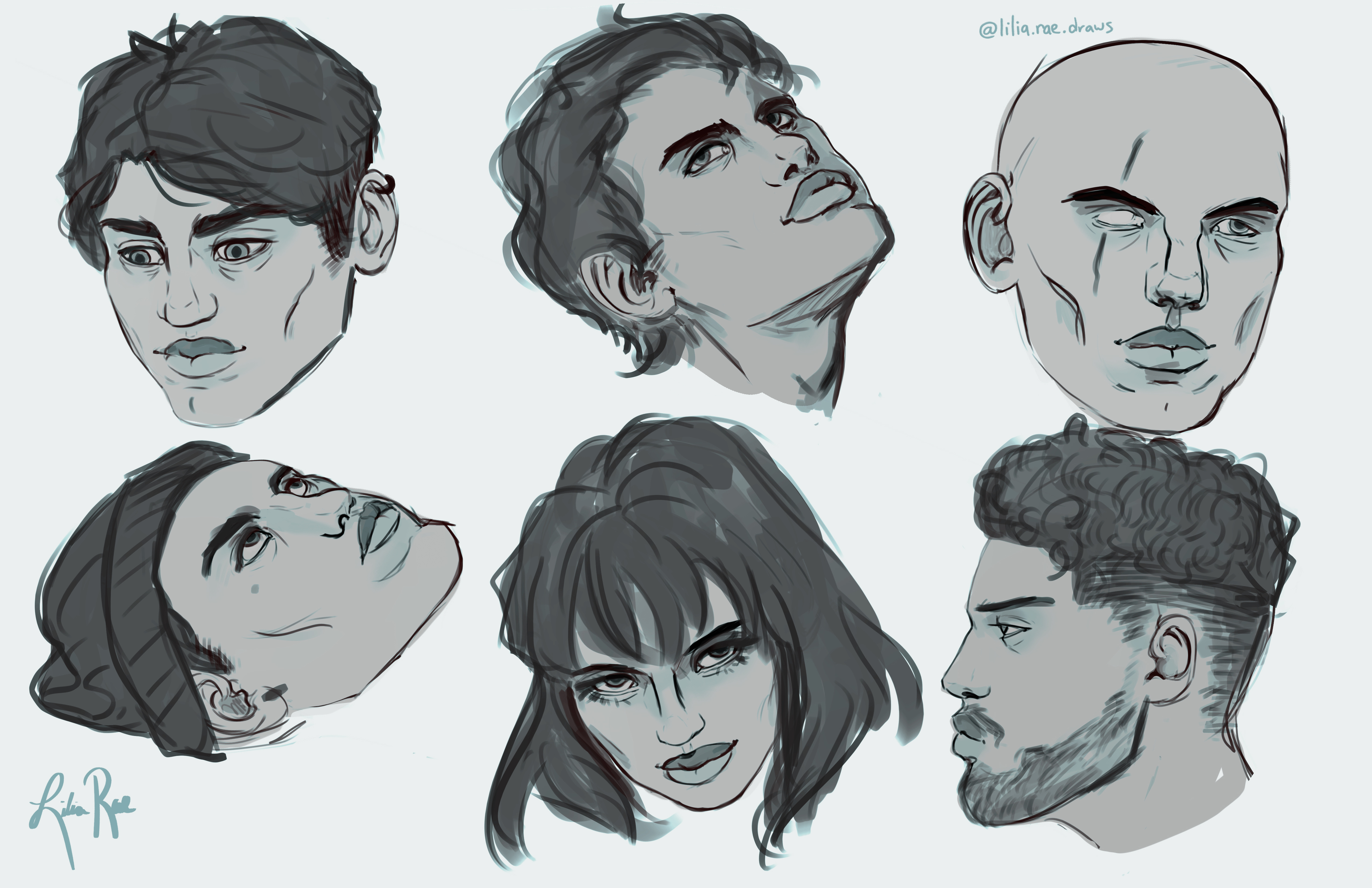
working on finishing my head studies
This is pretty good but you make childish head beacuse is is too wide for an adult, is it on purpose? Look for the result when it is just narrowed a bit:

Thank you so much! Yeah, that definitely makes sense!
Some sketches 
Lilia your pose studies are looking very good! Maybe just the green figure has a bit long torso.
My favorite is the figure on the left. Very nice anatomy.
Instead my favourite is the one in the center, even if for her skin color seems kinda dead 
Really nice anatomy studies, I am a bit scared of Marc without an eye tho, hahaha xD the guy in the top right corner looks like Marc being a villan
@WeirdOwl and @chiara.arcidiaco Thank you! haha I definitely see the issues you guys pointed out, the green one gave me so much trouble
@pitrek121 thank you! LOL omg i can totally see it
Hey guys! This is my best attempt doing the 4pt perspective figure drawing, let me know what you think! 

Holy smokes! This is one of the best ones I've seen so far. Look at that line quality!
From the glimpses I get here and there, I can tell that you are already one of the strongest painters on this forum in terms of understanding color and value. You have immense potential - keep at it!
@WeirdOwl Thank you so much! I've been really trying to improve my line quality!