Thank you so much! That does help! I will rework those for sure. Thank you!
Hello there, here is my work for the week. I attempted to correct the cones and did some lighting practice per Marc's advice. Feedback always welcome. Thank you Sascha for the help! Hopefully these are a bit closer. The rat was made using pen tool for 2d character assignment.


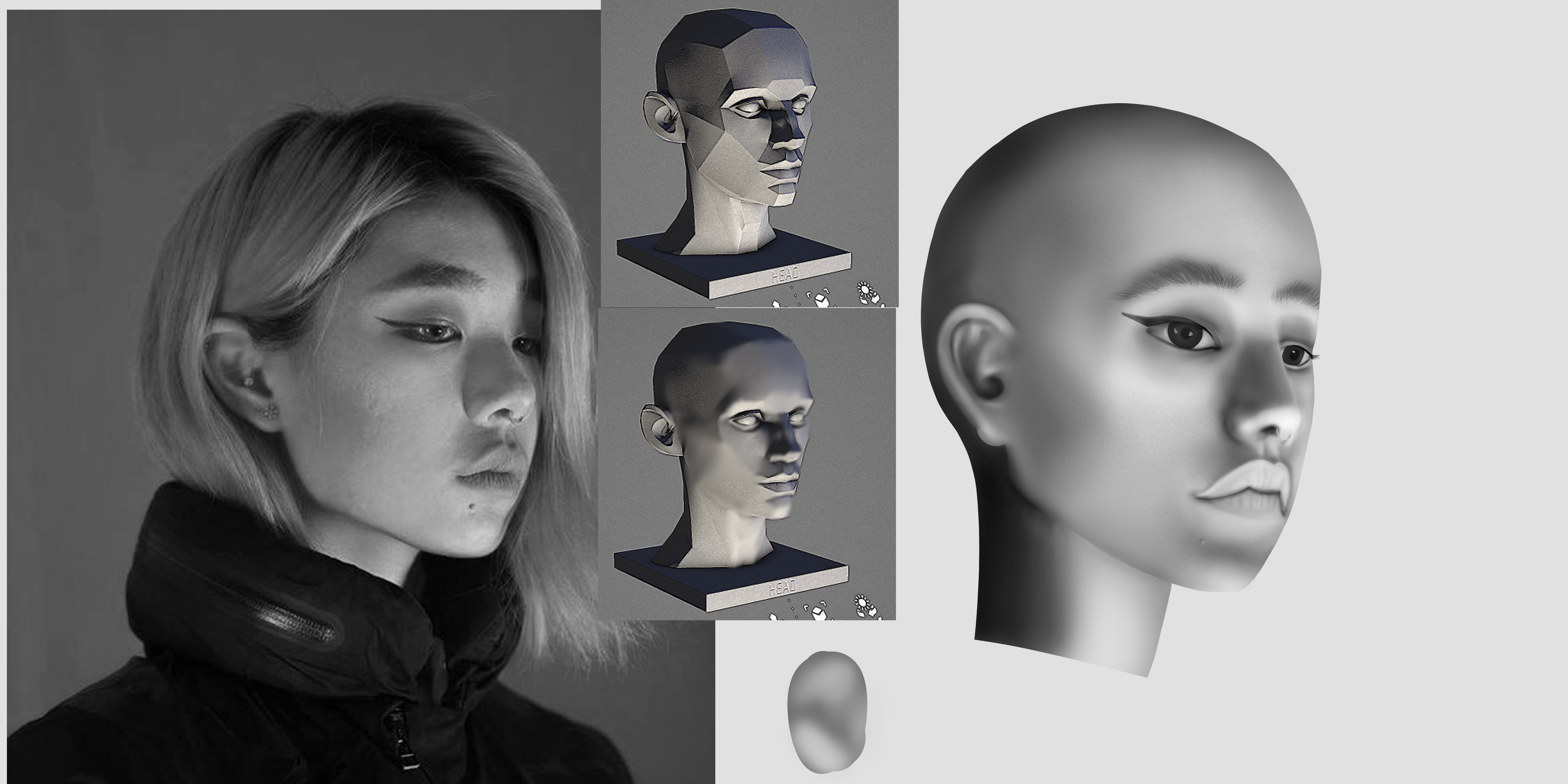
I'm not really sure how to start when shading a face. I understand there are planes, and planes get different values based on the light source and their position to it. But I am not sure how to start most of the time. I tried several different ways and was having a lot of problems. I guess I don't have a strategy for tackling it. Feedback with this would be much appreciated. Do you start with a hard or soft brush? Do you build up the values or have a different strategy? How do you block in values?
Thanks for checking this out.
Hey! Great head studies, I have no problem seeing the form and roundness at all. As for shading, I've been doing solid planes. As for a brush, I actually use the lasso and fill those planes on a layer under my lines. I keep it geometric on purpose to help solidify the big form changes in my head.
I've tried blending from there to some moderate success, but I'm still not confident enough in the subtleties of the face to render one out smoothly. I just need more practice with the planes.
Thank you very much for the advice! @Kektet I used the lasso tool for the first two. I doubt myself on these a lot because it is all so new for me. Thanks for the tips! Ill have to work on blending them in the future.
This channel has helped me a ton with faces and fundamentals. She breaks down everything so well and is very straightforward. I would check this out along with other videos that relate to what you're struggling with. There are videos on noses eyes etc.
Just dropping in to say your snake is freaking amazing
Hello Lock.. peanut here!!
you're really making a good progress, keep it up 😊
@LesleyCarol @composercookie @000_peanut Thank you so much for the video! I will be checking this out right away. Thank you for the kind words composer and Peanut. I had help with the snake from the awesome people of the forums! I appreciate you!
The top left and top middle of the heads in last picture are the fastest and most accurate ways to start so your on the right path. You can blast in values with hard edges like this and find softer form as you go. Since this is digital medium you can select and change the value range of value groups at any time. If you start like this with soft edges its much harder to group them together and change them because its a gradient. Keep putting in the hard work.
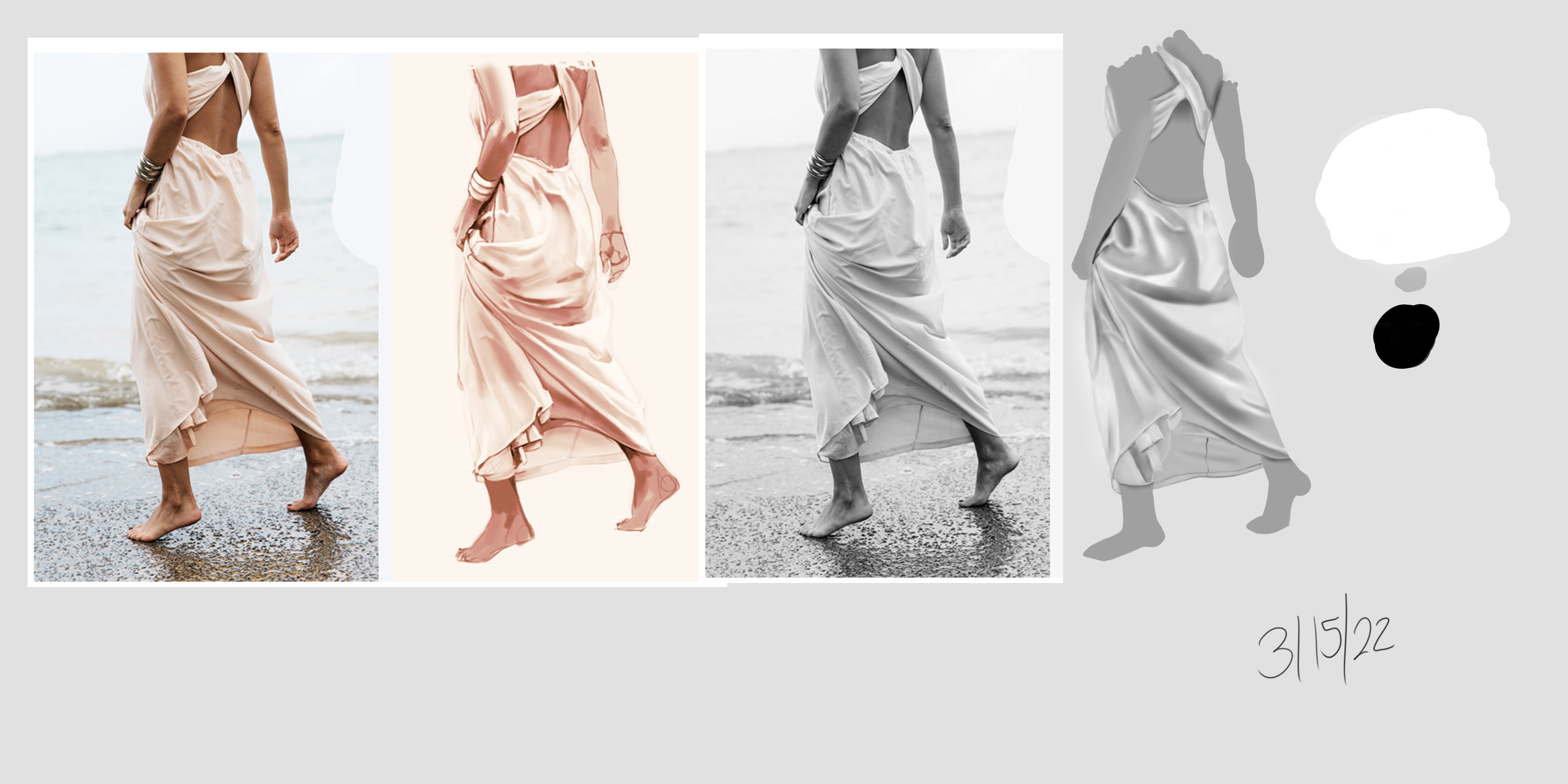
Alrighty I hope everyone is doing well. Been a few light weeks for me but I feel like I got inertia back on my side in terms of being able to focus. So I mostly focused on values this week. Let me know what you think. Need to beef up my gesture practice as well. Feedback welcome as always! I did some clothing studies and completed box art assignment in term 2 using smart objects.


Ok! I guess I did more this week than I realized! Anyways please let me know of improvements to make and thanks so much for looking at my practice! 
Those practices are really good.
Don't stress over the rendering if it doesn't turn out to be looking good, getting it to look good goes a long way.
If you want, try to experiment with the brush settings a bit and find a combination thats comfortable for you, like turning opacity to 100 without pressure sensitivity or manually adjusting the density.
Oh and:
Get a good understanding with values before jumping into colors.
If your values are good then you can do any color and it works.
If you values aren't working then it doesn't matter how good your colors are, it will look awful.
Values do the work and colors do the harmony ^^