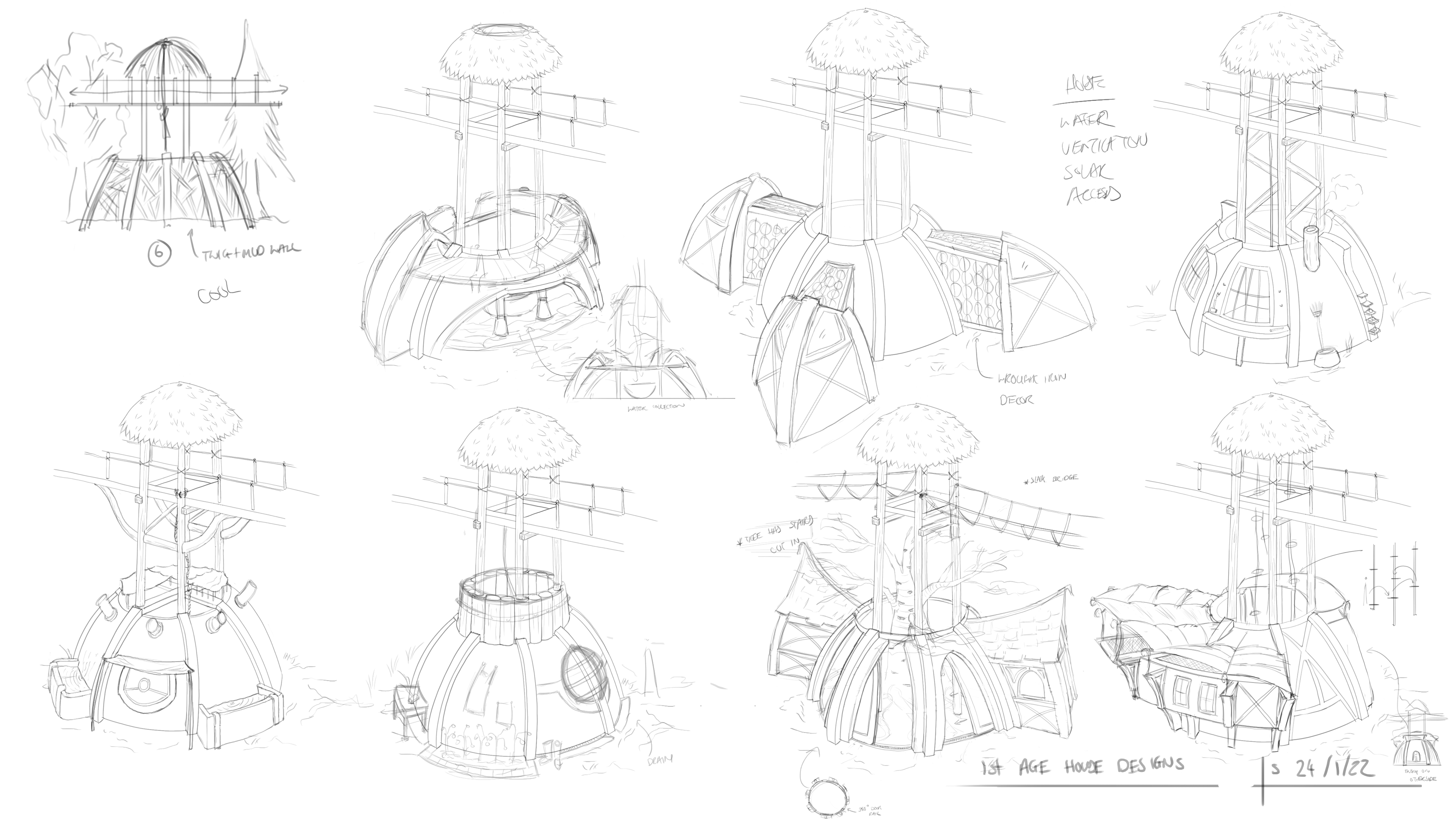
I'm loving your architecture work!
One thing I'd say just for presentation, either go bold with your shadows or leave them out of the image. Kind of like what you did for your previous wall where the shadows were solid. The structure is really nice but the shadows are a little distracting and takes away the effort you put into the perspective.