Thank you kindly for your support! 
oooh Welcome to the forum! ur art is so good!
Oh Thanks!!


Oook, it's perspective time. I've never, ever studied this. Let's see how this goes. Here's the first messy exercise, basic but interesting.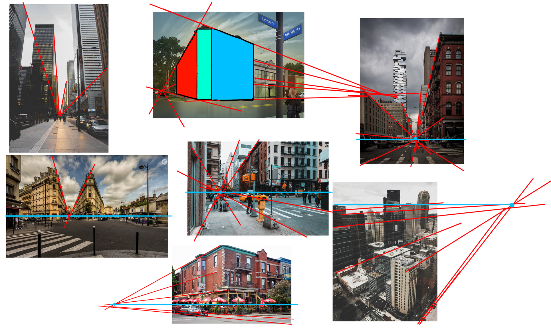


your cubes and sculpted cubes are so beautiful  love the colors!
A non-issue, but still worth pointing out: When you cut the vertical edges of your boxes, the resulting horizontal edges will still converge to a point on the horizon line.
Also, while it is technically possible to draw "correct" boxes left and right of the vanishing points, they don't make much sense in terms of physics and will oftentimes look odd because of their heavy distortion.


Uhhhh already so much detail 😲 Really interesting use of forms and lines, especially like the bed and the kitchen 😄
Thank you!  I appreciate it!
 . Let me know your feedback!
Looks very good, I don't see any issues with the perspective. There are a couple of tangents though that probably should be avoided:
The upper edge of the top left shelf aligns perfectly with edge of the wall. This makes it read a bit unclear.
The board of the bed to the right alligns perfectly with the line of the windowsill. .Moving it a tiny bit up or down would help.
The front of the bed aligns perfectly with the right side of the "carpet"/plate on the ground. I'd probably just make the carpet a bit bigger so it overlaps behind the bed.
The edge of the top of the kitchen part aligns perfectly with the lower side of the compartments above. Looking a bit closer I now notice that whole section is a bit off: The front part suggests, that the kitchen is sticking out from the wall (aligned with the computer desk) whereas the backside is inset into the wall.
For the tangent part, it's oftentimes a good idea to check over the whole image afterwards and look for such tangents. These are easily fixed and tend to either flatten the image (by not being clear what overlaps what) or draw unwanted attention.