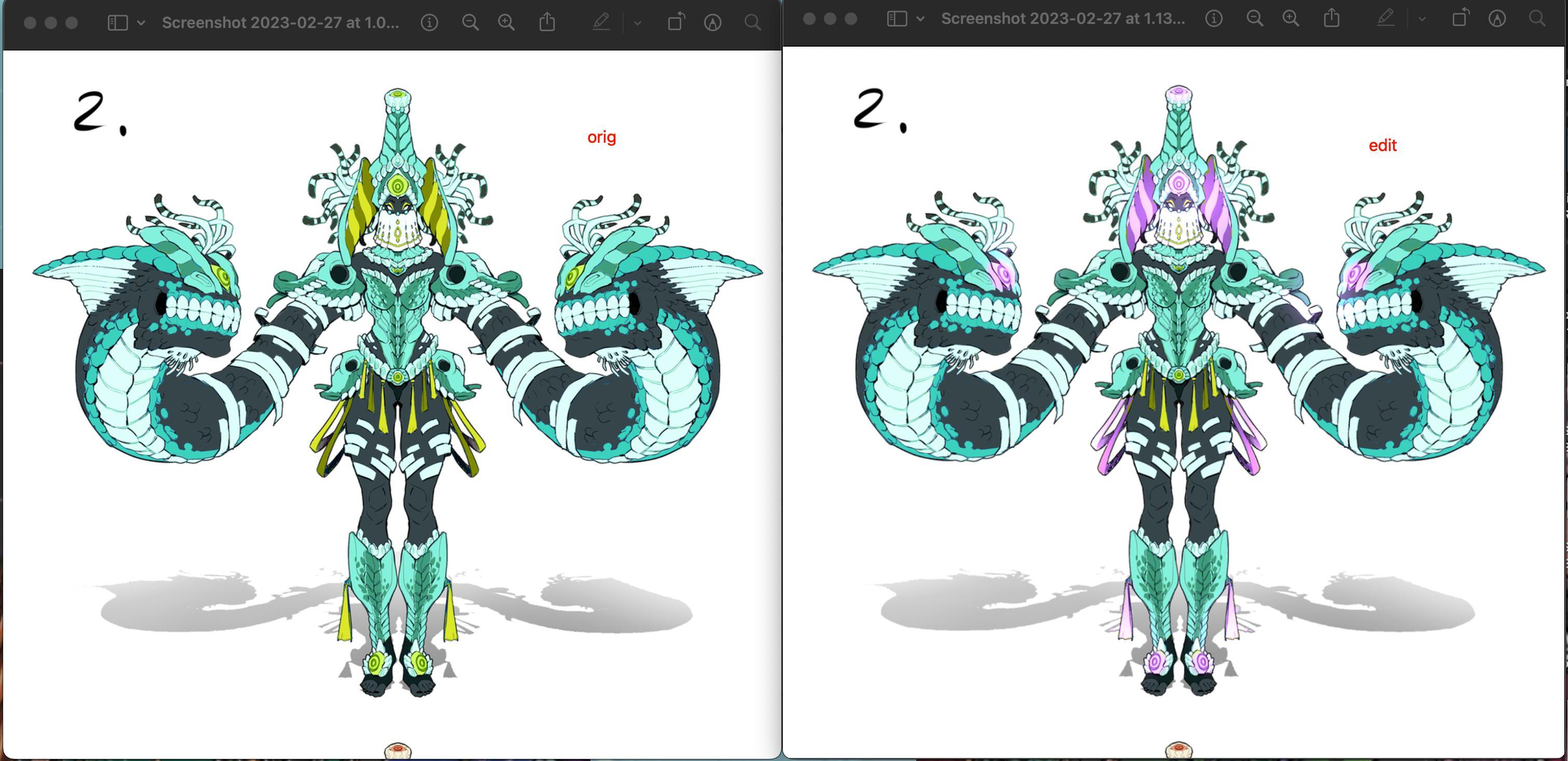
OOH LOVE the contrast!! really nice job!
i think 1 is my fav but since turquoise is my fav color, 2 is pretty appealing as well but would do nice to have some contrasting colors like purple imo:

I think 3 also needs more color contrast though your lighting contrast looks great!
4 looks good but i think the snakes should be lighter because the armor/headdress is darker so if both have the same amount of darkness, everything pops as one unit but nothing individually stands out like for example ur first one is rly good cus the blue and yellow pops against the snakes. 