Thank you so much, @OpaqueApple for your reply! You wont believe it but I just recently watched this exact video :smile: And it is a great video, Astri has such a positive mindset about the topic she talks about and her point are all really good! I'll make sure to watch it again to really get its essence :smile:

@LesleyCarol, thank you so much for taking the time to put together such a comprehensive and also entertaining post, it was great to read, so no worries about its length :smile: and also thanks for the feedback and compliment about my form studies (thanks to you they turned out so great, as you introduced Istebraks content to me and you always took the time to critique my work). I remember Ethan Becker saying sth similar about turning your studies into original pieces, which was at the time I heard it an interesting idea, but I did not quite understand how to do it. With your post, its a lot clearer to me now.

BIG THANKS to you two! :smile:

your 3d shapes are really inspiring in a sense

they look so good that they could count as an artwork themselves. I'm just starting this whole art school thing and doing those shapes is an assignment I try to motivate myself to do right now and seeing your result helps with that!

Thank you for the kind words, Nori! Happy to hear that they look good :smile:
It's great that youre somewhat motivated by my studies :smile: Wish you the best with your practise!

Here is todays practise. I thought I'd put my new knowledge of forms and value to the test by doing a study of the Asaro head. Doing a proper line art sketch of it plus assigning values took about 4hours :sweat_smile:
Though most of the time was spent copying and trying to make sense of the orientation of certain planes (the eye and mouth area gave me the most trouble), it was still fun to draw.
The values are probably not 100% correct, but its a start!
Have a great day, everyone!:smile:

This is awesome! I think it's great that you're taking the time to understand challenging concepts. This approach will definitely help you apply that knowledge to future pieces and help you work more quickly in the future! Keep up the great work!

This looks amazing! Your value knowledge is really shining here!

The main things that sticks out to me are the front plane of the forehead and the back of the head. The forehead's front plane is pushed forward too far and a little too curved. The back of the head is too rounded and pulled back a little.

Keep up the awesome work!

Thank you @afoster1138 and @LesleyCarol for your encouraging words and helpfuls feedback! :wink:

I did another one today using the already existing lineart and attempting to go for a different light setting. I might add some cast shadows later, but this is the progress so far.
I feel like I understand values in forms with hard edges a lot more now. A big thing I'll have to tackle in the nearer future is radial shading (balls and cylinder)... I think this head's eyeball shows why :sweat_smile: :joy:
Anyways, have a great day, everyone! :smile:

these are really good, the asaro head study feels so alive. it makes me excited to get onto light & value but that'll be a good while away :smile: , keep up the good work mau.

These are awesome Mau.wamp! Keep it up!

That is a really good exercise! Haven't seen many people do it actually. Getting to know the head planes is probably the number one pitfall for many artists.
You did really good with shading, I can only point out one issue: the plane on the cheekbone facing up should probably be lit the strongest as well as the upward-facing plane above the lips. I presume the light on your source photo is still slightly above the head (judging by forehead and eyelid ligting).

Thank you two @OpaqueApple and @EricjC for your kind words! :smile:
And thank you Viktoriya for pointing that mistake out, now that you said it, it's pretty obvious! :smile: :sweat_smile:

I think what Marco Bucci said when he was talking about Asaro head studies was to only use 4 values, and then use more painterly techniques to group faces and do hard/soft edges to do more than just try to copy the value of each plane. Regardless I think your study is sick keep it up :smile:

Thank you for your comment, Ziggy!
Thats a very valid point you are making! :smile: Maybe I can find that video, check it out and integrate his advice into my practise!

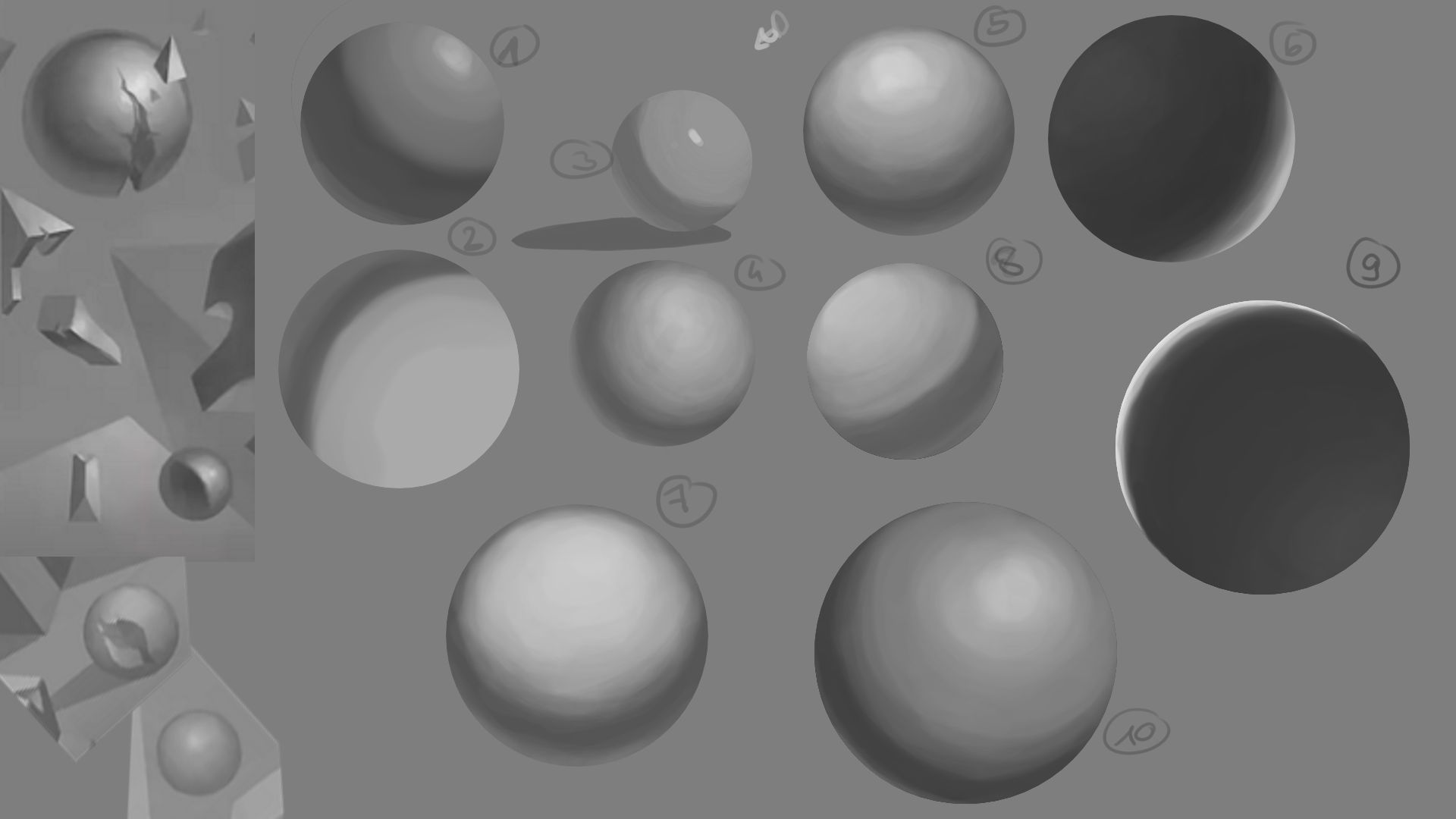
Here is a current attempt on shading som spheres! I really like the quality jump from sphere 1-3 to 4-10. When I started with #4, I decided to take more time with each one of them. Working slower and really taking the time to do things seems to be a reoccurring pattern in my practises. I might have subconsciously increased my tempo by watching youtube artists as all their works are obviously sped up to fit a 10-20min video...
Well whatever, here's today's practise :smile:

I can definitely see the improvement with your later spheres! I love the ones you did with the back lighting. The build up of values is really subtle and looks really nice.

One thing I notice with most of these is the transition between the core shadow and lit area of the sphere is too abrupt. It almost looks like the sphere is two different colors/shades. I think it would help to add more values to make the transition smoother. I think number 5 does this really well. Also, don't be afraid to go stronger and lighter on the bounce light.

This depends on what style you want, but I think going over them with a low opacity soft brush will give them more of a finished look.

Hope this helps!

Oh yeah that makes a lot of sense, Lesley! I might have misunderstood sth regarding bounce light: You sure know about the rule that "the darkes light ist lighter than the lightest dark." --> does this also apply to the bounce light? Because I think the main reason why my bounce lights are so light is because I was kinda afraid to break that rule...
Also thank you so much, Lesley for always taking so much time to give feedback and to provide in such graphic and easy to understand way! :smile: :pray:

Of course, I'm always happy to help!

In general I think that rule is good to follow when doings that are from imagination like this. I think there are rare cases where this isn't true, but I think it is when it comes to bounce light. I eye dropped values from shapes and the bounce light was darker than any value on the lit side. One comes close, but it's still slightly darker.

You bring up a good point with your sphere though. I think for 10 I'd say it's good to go lighter on the bounce light, but for 8 and 3 it's better to make the core shadow darker instead. I should've mentioned that I had to use a darker value for them.

Here's today's practise. I think the spheres with lighter base value still look kinda wrong, but I am pretty happy with the darker ones! (like the first and last of the second row :smile: )
Also tried to lighten the bounce lights, but I am not where I want to be yet... :smile:
Have a great day everyone!

And in addition to that I am currently working on a "personal" piece where I tried to implement what I am currently learning into sth more creative. :smile:
So I thought where would I be able to draw a lot of spheres? Okay yeah, a billiard table. But I wanted the balls to be lit from different angles, so I though: the solar system! Nice slap some bounce light on, bcs that stuff apparently doesnt exist in outer space (because science :smile: ) so I ended up with an orrery!
Here's the current progress. I am not yet sure if all balls are correctly shaded, so I'd be very happy about some quick feedback from your end, everyone! :smile:

This looks really cool and believable!
I'd say go darker on the shadows and blend more in the middle so it doesn't jump too sudden from dark to light.
Can't wait to see this finished.

Thank you for the feedback Lesley! :smile:
Here is the new version:

I don't quite know how to go on with this piece. I guess I have to make up my mind first about what is actually around the Orrery in order to do stuff like bounce lights and also attempting to render the materials.
Maybe I should phrase my question like that: When I have practised the stuff I intended to practise with a practise piece, should I keep going (even though that would mean "wasting" a lot of time with other things like rendering materials), or should I call it a day and go on to the next practise piece?
:smile:
Have a great weekend, everyone! :smiley: