Looking good so far 
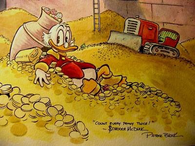
I think your coins just need a bit of detail here and there where you consider it looks good to have detail compositionwise.
Like here XD :

Definitely don't make them detailed all over, at least that's my opinion.
That spot right behind the girl, with some added highlights and definition would be as much detail as you need I think.
I had a similar issue painting a thicket of leaves. I did one small part and copied it a few times, then just touched up the copies so they don't look like exact clones. But coins are pretty much identical, so you can copy/transform more to save yourself some work.