Body Proportions.
My first attempt was pretty horrible, so i looked up some anatomy body references, to understand the lines better. This seemed to help tremendously, but of course, i need to practice this quite a bit more. .
.
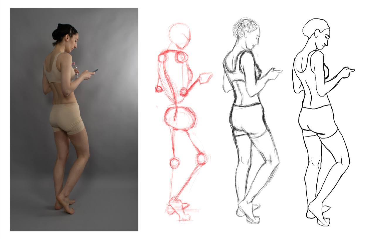
Here are some drawings of full figures from reference, in 3 stages: skeleton, sketch and linework. Interestingly, I found the last one, the almost straight standing figure the hardest to get right. I suppose more practice with proportions is required.

And some gesture drawings, 30 seconds and 1 minute.


Hi Oksi! Welcome to the forums! I really like your practice so far and look forward to seeing more!
Here are some 1/2/5/7/10/15 min drawings from a life drawing event. Quite happy with the last ones, but seeing clearly the insecurity of my lines in faster ones and proportions are where i struggle most.
Hey there! Snakker here, local noob. just spotted your sketchbook and really liking your work, I like the traditional feel
cheers
Hey, thanks so much!
I've been doing quite a lot of figure drawings based on reference and I finally get some confidence to try some easier poses without any reference at all, and i must say, i'm quite happy with the results.
For the middle pose, i did get up and use the mirror to make sure i was getting the feet correctly, as in the orientation of the knees and feet. 
These are very nice, especially with no reference 👀
I used a reference of myself in a pose to sketch a character. I focused mostly on the figure, keeping clothes and shading simple to create a finished drawing. It's in no way perfect, I realised during how much knowledge I'm lacking about clothing and lighting. And I avoided drawing the face altogether by hiding it under the hood xD Looking forward to term 2 to fill those gaps!
Here is the initial figure construction, the sketch of the clothes and the final result, with the line work, shading and lighting.

And another character, same thing, reference pose, simple shading with one light source (my lighting is abismal so far but that's not a prio in this term :D)


Great work, especially the lighting and hair!
17 days later
Before moving on to perspective assignments, I've put some character constructions in the same frame, trying to adjust the perspective of the references to work in the same piece. Quite happy with how it turned out, except for the girl on the far right - not sure what exactly is wrong with her pose but it feels off. It feels good to define a stopping point (lines for the body outline) and not try and work with color and lighting too much, that just takes too much time as I'm largely inexperienced with that.
And for the 1-point perspective, I've drawn a tavern room. I used a room design i found on google, not trying to invent anything, just put it in the perspective i wanted and added some details of my own. This proved harder than i initially thought.
In the end I added some simple colours to make the room feel real.


Very nice studies, I love your character constructions, and I mean I LOVE them, I can't really help you with the far right post though, It looks fine to me, but as I am a total newbie to art in general you can't really trust those words xd.
Though I did notice some things that were off in your perspective study, the first thing that stuck out to me were the windows, one looked like it was further up than the other, so I downloaded the image and popped it in to photoshop and I found some mistakes, not so much one window being higher up than the other, rather the bottom part of the windows were off.
Don't mind the quality, I opened the image in a way too big canvas so It got kind of screwed xd.
The mistakes I found are shown with the red lines, Main issues I've found is some lines aren't parallel to the Horizon Line, and some vertical lines aren't straight, which causes a slight skewed look to objects and such.
Could be my photoshop acting up and it's perfectly straight, but just smt to look our for.