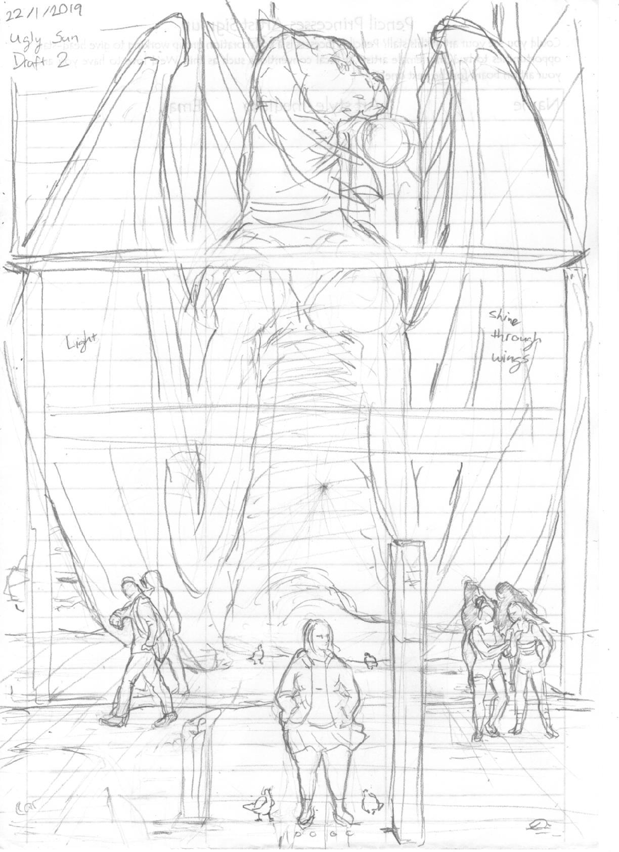
Hey guys! I'm currently working on a personal project that I would like to put into my portfolio and I would really appreciate some feedback on my draft work so far.
Right now I'm drafting up two variant comic covers for the project and would like some fresh eyes to take a look to see if there are any adjustments I could make to the compositions.
Any help would be very appreciated! Thanks! 

Jumping with city skyline in the background

Standing in front of window reflection


