11.12.24
yo looking good, noticing some improvement for sure.
When you draw these, do you start with a sketch? I think it can be really helpful to sketch at least some proportion lines, a brow line and a midline. Also, do note, you don't have to outline everything, sometimes implied line speaks more clearly to our minds, especially in ink. For example, note how prominent ink artists render lips, many will just suggest the shape of the lips with few lines. In general, avoiding "symbolic" or "symbolic-like" outlines helps the image read more 3-dimensional, same with eyes, gotta be careful with almond shapes and always keep in mind the 3d nature of the entire eye, vary that line width and keep at it
cheers
@snakker thanks for the advice
I looked at how some artist imply details and use line weight, its really interesting
12.12.24
I tried to imply some detail, I should have used a reference for it rather than just guessing how to do it
13.12.24
20 days later
2.1.25
Need to make a habit of observing the reference more
3.1.24
6.1.25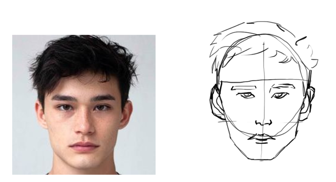
need to work on my observational skills to actually draw what I am seeing
7.1.25
Making a conscious effort to observe more
I think I did better. The face is too low down from the brow ridge. I didnt know a quick way to fix it without erasing ,so I left it
8.1.25
9.1.25
really trying my best to focus on observing the reference properly
10/1/25
not great but feel like I am noticing my mistakes more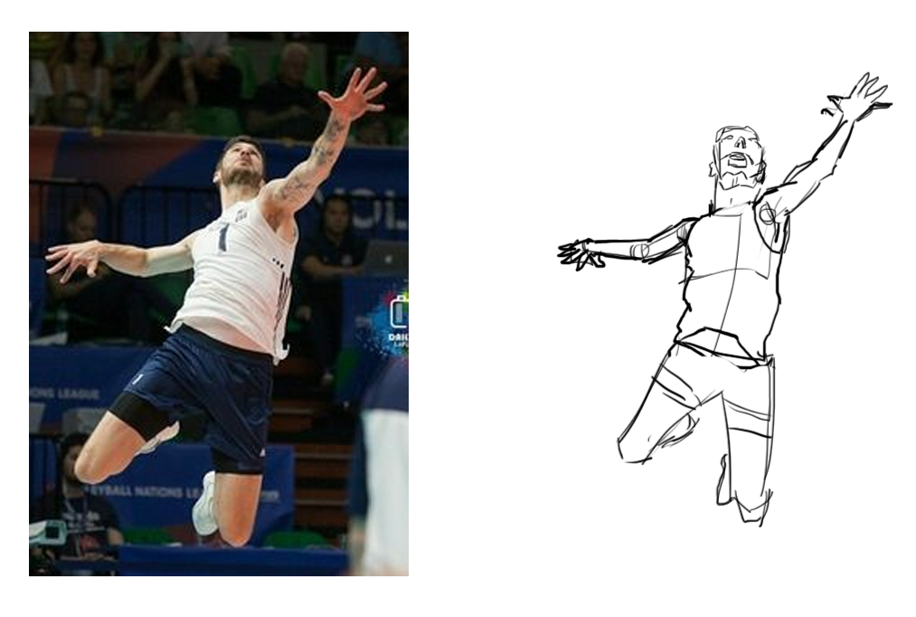
Nice work mate! Getting some major gains here
keep at it
thanks, I guess it really was a good idea to work on my observation skills 
13.1.25
I made sure to look at the reference before drawing. I also tried to measure using my pen not sure how well that worked
Looking good
Given you are on digital, one thing you can do is make two passes. For example, you make one drawing on one layer, with construction lines and you make a new layer in top with final lineart and then hide the construction. Just an idea as seeing these lines does help get an idea of your process and can help with critiquing
This is getting close. Nice job in distance from eye to brow, notice pupil direction - one thing that can quickly make someone look off is when the highlight one one eye is different from the highlight on the other eye, the two brows and forehead are just slighktly off in terms of angles and forehead height, along with the figure’s left cheek and i think in this case, insinuating the crease made by the lower lid can help make a closer match
Cheers
@snakker Its funny how obvious mistakes are when they are pointed out. Thanks for the feedback, I cant unsee how wrong the left cheek is. As for the other mistakes its impressive that you can spot them. Even after you pointed it out I had too look very carefully to notice
14.1.25
tried something that might be harder to measure using my pen. This time I counted how many heads the figure was , I think it was 8. Then used my pen as a tool to notice the alignment and angles in the figure. I hope it actually helped my accuracy
15.1.25