• Gave myself 5 days to do something. This is what I managed to do. I'm trying to get better at illustrations, but I have patience to work on something for 3 days maximum :( Splash_Process.jpg5000x3140 2.21 MB Splash_Process-6.jpg3896x2429 2.83 MB concept list char copy.jpg5388x3000 1.7 MB
    20.6k
  • Did a character concept for a course.https://www.artstation.com/artwork/P6gm3y - more:) list1.jpg3541x1920 2.82 MB
    20.6k
  • Day 4: Star Wars May The 4th =] Queen Padmé Amidala in my art style! First time drawing her and I really enjoyed making this one! Used watercolours, ink pen, acrylic markers and gold paint for accents on my Canson mix media sketchbook. I hope you like it!
    81.6k
  • A creature design from a while back
    by
    6.6k
  • Here is some more recent stuff, I need to make more body studies
  • It's been a while and god, it is so cringe to go through all previous messages xDmy study.
    20.6k
  • Thank you! I finally cleaned that up. Meanwhile started 3 more ..I have a habit of taking too long to finish a piece, then I lose interest in it and just start something else. I found 8 from recently i started and abandoned, that are decent enough to not delete, but not finished. There’s also been a number of drawings I felt I “outgrew” - became better before I finished them, and it would be easier to start from scratch than fix them. Anyone else thinking that?
  • Lady Death Fanart Collectible: Part 6 Polypaint and base Hi, it’s time to share with you another part of the process to create this fanart piece. Polypaint As this is my first collectible fanart I didn’t have previous experience with polypaint so I tried my best and played a bit with it.I wanted to give a ghostly and eerie look to Lady Death, she is beautiful and deadly, but at the end of the day she is a woman that died and was reborn at hell as an avenging spirit, that’s why I gave her skin tone a bluish very cold tone.As you will see I gave myself some creative freedom to deviate from the traditional color scheme that this characater has in comics and illustrations.To add a bit of sensuality by painting some freckles on the face and the chest. The dark nature of this character was the perfect excuse to gave her a kind of goth make up, very dark shadows around the eyes, blue lips and fingernails. I know that the original character includes sexy red lips but I wanted this girl to have a sexy but at the same time creepy look, that’s why we can see some thin veins emanating from her eyes. The biggest chromatic change I did for this character is at the hair. Lady Death has a characteristic white weavy hair but in my fanart I decided to gave her a very saturated blue color.The reason behind this wasn’t only an aesthetic choice. I want that the face area strongly pulls the attention of the viewer so this area needed a stronger contrast. Another reason is that I want her to have a more modern look, as I mentioned before, I’m strongly attracted to women with goth/punk look. I gave myself half an hour or more to analyse the work of experienced sculptors that create collectibles and I discovered that the use of darker values on the skin is often applied to create a greater sense of volume and three-dimensionality. I found that areas with heavy ambient occlusion are the perfect places to paint with darker colors in order to increase the separation between different forms. Even though she has a bluish skin tone, I used a bit of warmer hues in areas that, in real life, tend to go towards red and pink, this is very obvious in the nose, cheeks, and knuckles. Thinking with a logical mind it’s completely absurd to have warmer tones on the body of a zombie like creature but I didn’t want to limit myself by using only blue tones, it looks boring and artificial. In real life these colors are created by blood vessels in areas where the skin is very thin. ** Scythe **for her weapon I applied a cool gray with some warmer variations, this color scheme is influenced by the work of H.R giger. Base I’d like to talk about the design for the base which, to be honest, I forgot to develop along with the character.My main idea with the base is to show that Lady Death inhabits a very sterile and arid land, at the end of the day she is at hell.You can see a that she walks over dirt and rocks, a sign that she’s surrounded by death and loneliness. As part of the landscape we can see some bones and skulls to reinforce the idea of lack of living creatures, yet we can see three hands that try to reach her legs.This hands represent that all creatures are subordinated to her power and seek an evil blessing with a simple touch of the princess of the damned.1- The hand with skin burns represents the souls of those who are newcomers to hell, tortured souls that suffer for the sins comitted on earth.2- The hand with greenish rotten skin and pustules is the reminder of the decay that has infected the souls of those who have been trapped and have forgotten their humanity3- Last but not least, the hand of a demon shows that even dark creatures and entities bow before her presence. The cherry on the top, at least in my vision, are the simese twins that emerge from the ground, this malevolent creatures remind us that in hell there’s only perversion and any trace of innocence is lost. Thanks for reading till this pointI’m really happy to be very close to finish this creative journey, last but not least it’s mandatory to talk about splitting the sculpture in several pieces to be printed, this will be my last entry before showing the final rendered images. See yaMay Zbrush be with you
    1.4k
  • memory 2min gartic phone, used ref 2m gartic, used ref for pose 2min gartic 2min gartic 2min gartic 2min gartic memory memory memory memory study memory memory memorymemory memory memory memory memory memory study memorystudy study stylized left memory, right study study memory memorymemory memory memory memorymemory memory, porportions r offmemory memorystudystudy memorymemorymemory memory memory memory memory memory memory memory, right leg is a bit broken The feeling of only getting 1 - 3 likes on a social media post will never not be discouraging. But nothing is discouraging enough to make me quit drawing. I think the strategy of drawing a lot of stuff and waiting a while to post is good though rather than posting it immediately and then feeling that sadness on the next set of drawing
  • Urban Dragon Girl Wip Urban Dragon Girl_wip1.jpg5000x5000 1.11 MB
  • Long time no see! New artworks produced lately
    6.5k
  • studies studies juri study imagination, how I feel before a speech imagination imagination study something I drew for my presentation also drew this for my presentation, didn't fix the one hand being bigger than the other imagination + study study studies study study, I need to fix the face a bit based on screenshot from anime but in my style study. except for the eye study studies studies study. changed some things tho imagination imagination imagination study studies, except top right samurai based on anime screenshot wolverine studies, changed some of the poses a lil, not very good at all, but first time i drew the character ever. semi study studies study imagination imagination imagination , for first time ever i tried to draw over 3d model for middle pose, I dont like the result tbh, but it makes it much easier than coming up with it from memory.imagination, except right figurestudies imagination + studies, coming up with action poses r hard, these are not dynamic enough, I will redraw better ones in future. imagination , imagination imagination study, except for eye imagination imagination imagination doodles except for the two chrollos imagination storyboard thumbnail, idk if i ever shared this. my storyboards end up being a little detailed since i usually just draw in one layer.
    by
    22.1k
  • Quick fun sketch. CyberFish.jpg2394x3857 674 KB
  • Neon Gambit This is a fan art of my all time favorite character Gambit from the X-Men.I made this a birthday gift (26.04.2024) to myself and honestly I really do like how it turned out in the end =] I hope you like it as well =]
    81.6k
  • Art Blog - April to September 2023 Suffer a little burn out. Look at some memes. Here's some art from in between. critique.jpg1333x5736 1.77 MB
    20.3k
  • And some more! Been painting over them a bit more this time. Some variants I tried for the old guy using mainly the liquify tool. Someohow looking a bit like Owen Wilson (not intended :D)
  • Cafe sketch/color study
  • Hello! My name is Vithor, I am from Brazil, studied Design at a local college worked as an illustrator for more than 10 years. I took a time off around 3 years ago and am trying to get back in my art shape and maybe become professional again. Here are some recent pictures: You can find timelapses for most of them on my instagram: www.instagram.com Vithor Albertim (@vithor_albertim) • Instagram photos and videos 123 Followers, 638 Following, 19 Posts - See Instagram photos and videos from Vithor Albertim (@vithor_albertim) Comments and critiques are always welcome.Cheers!
  • @patrycja.lerch Thank you I created another variant, which might capture the witch look I was going for better
  • Thank you @daceronine! If I remember I save in google cloud, I will have to stick a note to do it more often. Lamp is from life. Poses are from refs but I look at refs for a while and then try to do it myself and look it up if needed. Outfits and rest is from imagination Something went wrong while installing system so we will have to wipe everything again... pc works but something is wrong. We will wait till internet is done and I will save everything on cloud this time Threads came out in eu. It's been 3 days and I had more engagement than after half a year on instagram. It feels really nice I hope it stays this way A portrait of old dude. It's the same character I posted a while ago. Inspired by Bayard Wu work. At first I thought of him as a bear but I named him Fenrir and I think wolf suits him better. Eye gave me a bit of hard time but I think it is fine now. I focused on face and forgot about area below. The way I draw hair clashes with greying hair. I had the same problem while doing Lohse's white hair. Does it looks like it is greying here? I love how desaturated red looks blue there. I keep lying to myself that I will use different color scheme but It all comes down to this blue and yellowish one it is just flipped this time Have a great day!
  • Been bad about posting updates on the forum. I figure I should just throw down stuff. instead of waiting until I finish something.
    14.5k
  • Havent done much this year since I am focusing on learning programming and deving my own Indie Game . But here 's a New Year Piece 2024 , she 's the mascot for my Game Studio - Lucid Realm : Lucid Chan ! LucidChan_v001_sketches.jpg3072x4352 973 KB
  • IMG_0637.jpeg3240x4050 1.6 MB
  • Long Crested Eagle studyI had so much fun making this one and honestly I love that Eagle! It looks so cool! Used for this one high quality watercolours, high quality watercolour sketchbook/ cold press and it was 300 grams paper.I hope you like it!
    81.6k

NOTE: I have already done similar sketches for the skull and rib cage. This is what follows from that, drawing the shoulder bones and arm bones.

A couple of things to note of what my mindset is when I'm doing these drawings:

  • I'm drawing the bones over a model reference.
  • Trying to keep the shapes as simple as possible
  • Paying attention to show the shapes of the bony landmarks (example: epicondyles, deltoid tuberosity)
    • I'm drawing just enough so that I can note how the bones connect, which sides the Ulna or Radius should connect with the Humerus and the Wrist.
      I have noted the drawings numerically to see how I've improved from one drawing to the other. You can see the change in my observations, from simpler shapes to more a detailed drawing. w

      When it comes to anatomy I'm currently following anatomy videos by Proko, and simultaneously using Stephen R Peck's Atlas of Human Anatomy for the Anatomy (why does it have to be such a long name?) and Michael Hampton's Figure Drawing books. I'm studying the muscle structure as well, but I think its best to first be comfortable with drawing the skeleton before starting to layout the muscles.

Then I'll follow up with the pelvis and leg bones. I'll probably leave out hands and feet last, as they are probably the hardest to draw and also my weakest points.

A couple of sketches I did about studying the spine and its relation to the skull, ribcage and pelvis.

Spent the entirety of the last week continuing with anatomy by practicing the pelvis. The first 2 drawings were drawn as explained by Proko, but I felt as though it was little too simple. From the 3rd to 5th are the from Stephen Rogers Peck's book of Anatomy and how he explained (very detail oriented while breaking down the landmarks and points of consideration). All of these starting from the 6th are drawn on top of reference models, with a mix of male and female. It became pretty clear after a while, you really don't need to know all the details but instead knowing where the landmarks and the variations in the genders were good enough. I think I definitely went overboard with trying to nail certain details.

12 days later

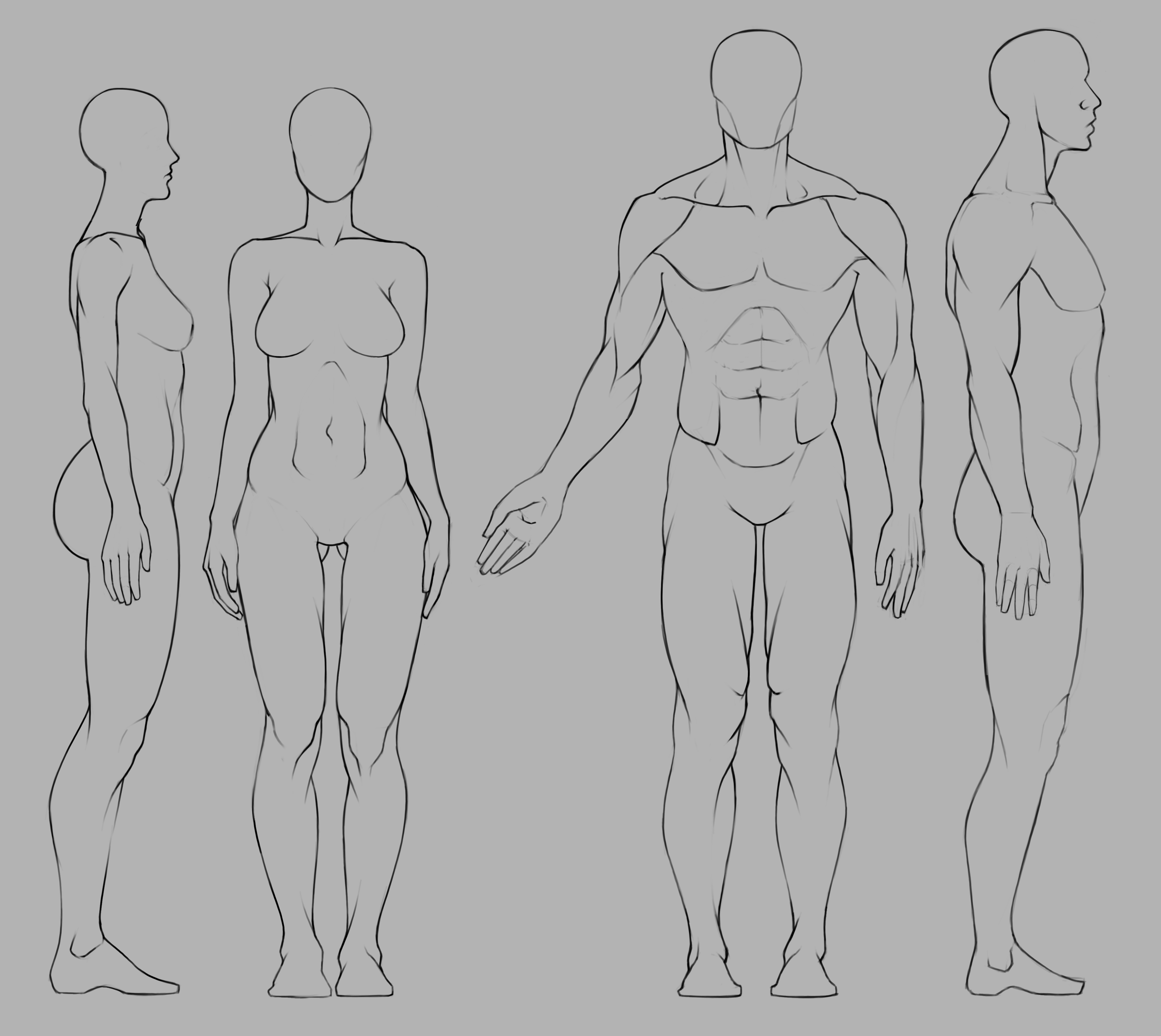
Instead of trying to draw as many dynamic poses as possible, I thought I'd take a crack at drawing the default pose using Marc's anatomy proportions layout. Its basically the same as the Loomis method, except I prefer the Cranial by Robert Beverly Hale.
You can definitely notice my lack practice when it comes to muscle anatomy especially in the abdomen area. Having watched Rey Busto's class on anatomy, I'm familiar with where the origin/insertion points are and what are the general shapes of the muscles. The most difficult area to nail was at the point where the Serratus, Obliques, Lats and Pecs overlap. I should definitely do more drawings that is specific to my weaker muscle points instead of sketching whole poses.
Another of my mistakes (or lack of awareness), was correct scaling and by that I mean when I first sketched the male figure, the body overall was very narrow. This probably due to the fact I've gotten a lot more comfortable drawing female than male anatomy, and subconsciously sticking to the proportions of drawing the female figure (example: the ribcage is two cranial units wide, but in the male its usually 2 and half cranial units, to account for the wider thoracic arch). In this case however went with one and half cranial units wide for the female and two cranial units wide for the male. There's definitely a lot more I learned from this, but I don't want to drag this out for too long.

1 month later

Its been a while since I posted here. I took a month's break travelling back home. Taking a break was something I didn't realize that I needed but it helped me reflect on the work that I was doing and how I need to slightly shift my direction. I was gone for the month of August and here are some of the drawings I did in July (it was quite the slow month, thus the need for a change). I feel as though doing these gesture/figure drawings didn't really help in as many ways as I would have liked it to. I was expecting it to help me understand anatomy and its motions, but instead I think I need to focus on separate muscle groups as I find myself often going back to the anatomy resources or even forgetting things that I haven't learned because I haven't put enough time focusing on different anatomical parts.

Value/Portrait study. I often get distracted from completing a painting when I get lost in trying to recreate the reference as it should be. This was a painting I started last year but gave up halfway through as I found the overhead lighting rather difficult AT THE TIME. I came back to this a month ago and was able to finish it up without much difficulty. I think I could have done more with rendering the hair, add highlights and give it better form. Rendering hair (especially short and messy) is definitely one of my weakest points.

9 days later

Another portrait drawing. At this point my goals here are values and rendering. I think the complexity of facial features make for a great exercise in practicing rendering form. Obviously it is important that you are able to breakdown the forms into simple 3D shapes when in the drawing phase, which for some reason I still prefer doing traditionally. Surprisingly one of the hardest features to render for me is the nose.

I really like how confident your lines appear to be. Big fan of your studies esp. the pelvis ones. Super crispy and inspires me to do more studies.

Thank you! I highly recommend looking up Mike D. Mattesi's Force: Dynamic Human anatomy. It's not cheap but its well worth the price, I'm only a few chapters in, but it has tremendously helped in understanding how to make lines that have purpose. As for the pelvis, you can thank Proko for that. I may have gone overboard with the details for a skeletal landmark that barely has an visibility through the skin.

heyyy I really love all your sketches and also this last post! ^^
I think you got all the shapes, and they work pretty well together, maybe try and make the value changes less dramatic, as this reads a bit metall-y.
keep it up :smiley_cat:

1 month later

Its been a month since I've uploaded any new work, with my final year of college started, I haven't gotten around to do much. I've been doing a lot of studying of Scott Robertson's How to Draw and I feel as though those exercises aren't worth uploading. If think I should, let me know. On the anatomy's side, I've been studying the arm, which is something I'll definitely upload. I really didn't have much of a plan for the following sketches thus why they may not look as polished. There's definitely some proportional errors but I still wanted to show something for the time I haven't been as active as usual.

Nice figure studies either way. Not much to add seeing as you already pointed out what needs work.

27 days later

For while I've been studying Scott Robertson's How to Draw and I thought I'd upload some of the exercises I have done from the chapters I've completed so far. It's nothing fancy but studying perspective has really changed the way how I observe and break down subject matter. These are not all the exercises just some I thought was worth uploading. Does anyone have good ideas to practice perspective aside from drawings boxes and spheres in space? Most reference material I find are too complex.

  1. Mirroring Technique
  2. SImple 2 Point Perspective with subtraction and Duplicating Curve

  3. Mirroring Offset and Mirroring Tilted Planes. "X" marks incorrect drawing.

  4. Mirroring Curves using the different methods

  5. Practicing Tilted Planes and Curves
  6. Combining Mirroring Tilted Planes and Curves
  7. More of mirroring curves and Tilted Planes
  8. 2 Point Perspective, drawing the primitive shapes.
  9. One Point Perspective with a mix of subtraction/addition and primitive shapes
  10. 2 Point Perspective with 90 degree cone of vision and Grid

8 days later

I haven't done any digital work for quite some time now because I've been spending time studying perspective theory. So I thought I'd try doing some master studies. This is my first time at it, so I'd thought I'd try studying someone who's work I really admired but also simple to approach. I grew up watching Batman: The Animated Series. It was so different from anything that was airing at the time and Bruce Timm was probably the first artist whose style was etched in my head. I started with the Joker. I also made a video for the entire process, it's a bit lengthy but I hope you guys take a look. I should definitely try and shorten the time but that shows how less confident I come across when working digitally compared to sketching with a pencil. Here ye go!

I wanted to do these studies (more coming) because for the longest time I've been studying from references and trying to draw them as realistically as possible with very little creative effort. And that can be daunting. I wanted to take a break from doing anatomy and perspective studies and just have fun with it doing a study. After all that's the point of it right?