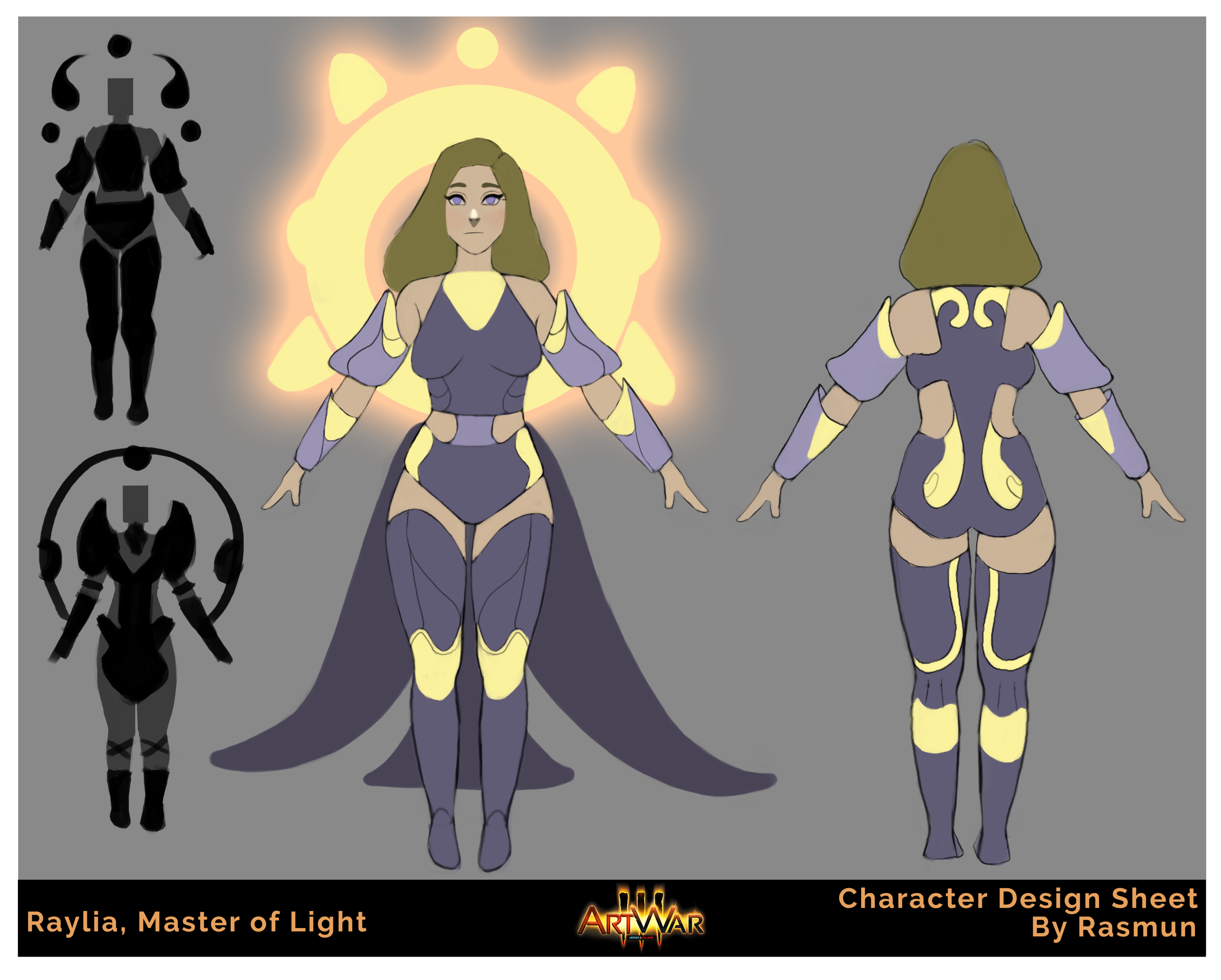
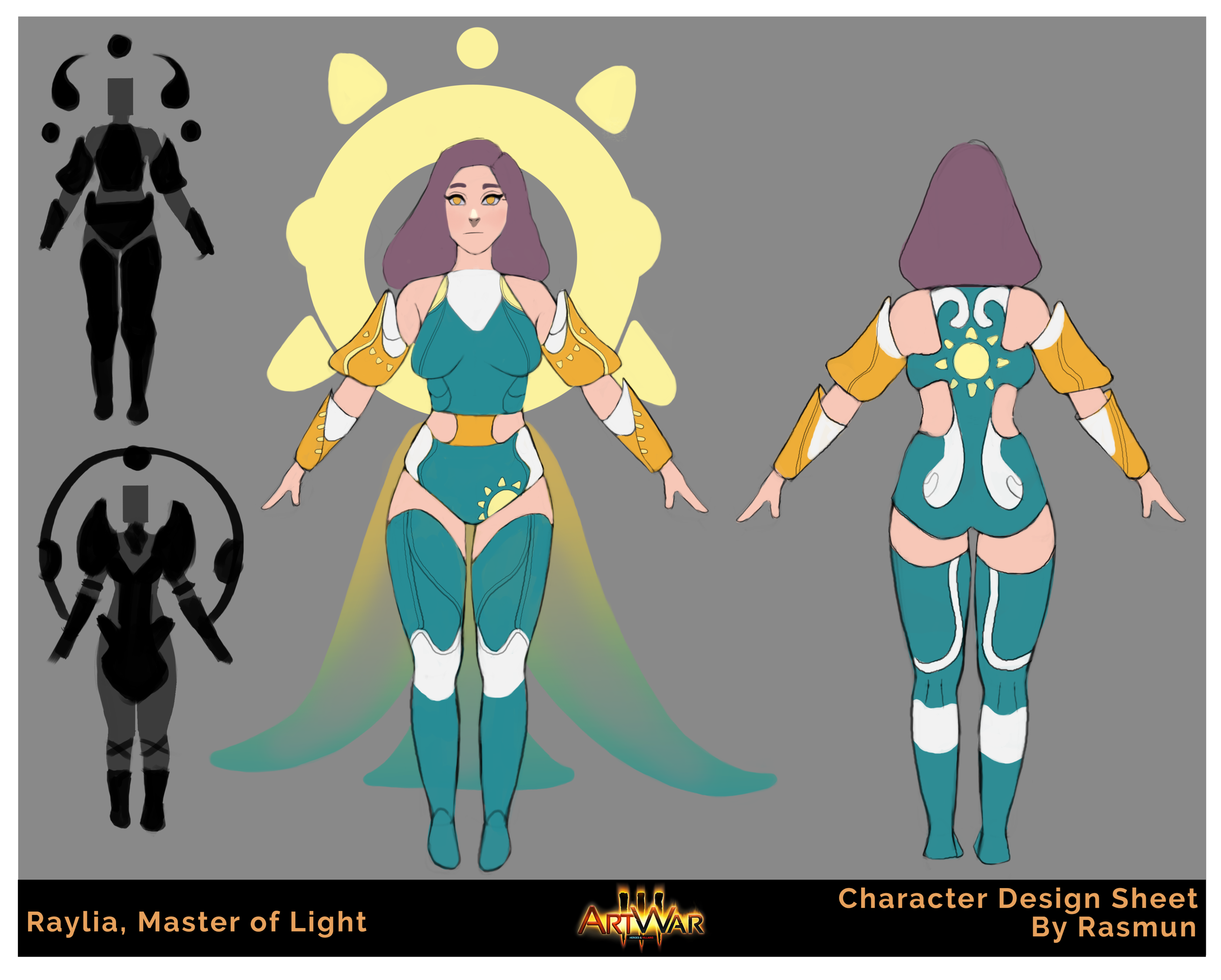
Hopefully I can find a better name as my idea becomes more fleshed out, but I want to create a character that manipulates light, and can even manifest it in a physical form.
Also my Arstation is My Artstation but I will also link my deviantart since I haven't put up much on Artstation.My deviantart, My email is rasmunart@gmail.com, and my name is Blake Rasmussen

Finished versions of the concept sheet and illustration, since the submit button isn't working for me.

I'm a major rookie when it comes to designing characters so i'm slowly doing these silhouettes, which ones stick out to you guys, so I can have a general feel for which one is better. Also I think i'm going to name this character Raylia, since she uses light and rays of light came to mind, kind of cheesy but hey I like it so far

After some feedback I went with #4 from the previous post and tried to do more variations of that, they may not be very close to #4 but it was good to explore new things

So this is my character sheet so far, any feedback is welcome. Entering this contest and seeing all the great designs really lets me know that I still have a lot to learn about character design. I'm not even sure if I should've entered yet since I'm such a rookie.

Welcome aboard ArtWar! And don't feel down about joining in, a big part of what Marc has put together here is about learning, growing and building a community! So keep at it! Stick around and browse the other forums too and check out all the fun stuff!.

Regarding the silhouettes, I think that going with 4 was a solid choice, it and 10 were probably the most fun, and that circle has a lot of symbolic links with the sun which helps. Personally I like 10 more. And I am talking about your very first post btw.

I would recommend trying to develop the big ol halo, really makes for a more interesting silhouette than what you have in the most recent post. The most recent just kind of reads like "just a woman"

Keep at it! I look forward to seeing more.

Now that you mention it, the silhouette in the latest one is more bland, so maybe I should try and bring back the halo shape. And thanks for the encouragement, sometimes it's kind of hurts when you compare yourself to others, and I need to get better at not doing that.

After getting some feedback I tried to elaborate more on the halo, and also someone pointed out that I didn't have a good enough ratio of big, medium, and small shapes. So I tried to fix that a bit

Oh yeah, thats a solid improvement.

Keep at it!

I added a face with a blank expression, wasn't sure if I should've made a different expression for the design sheet so I just went with the I currently have on there. Also I was thinking about making her eyes blue to make them stand out from all the purples in the clothes, what do you guys think?

Starting to finalize the character sheet, it's kind of bland but it's my first time making one of these so I kind of expected that to happen. Also began doing some thumbnails for the illustration. Are there any thumbnails that would fit for a hero character, sorry if that's a bit vague, don't know exactly what I want out of the illustration at this point.

14 days later

Been a while since I updated this, but this is what I have so far, I decided on going with this composition

Composition is a major weakness for me, and also making a background, I hope to learn to improve those a little with this.

So after getting some feedback from a discord I am in, I chose to restart the illustration, and I am liking it quite a bit more than the previous version