Welcome to ArtWar!
I like how far you are pushing the proportions.
Welcome to ArtWar!
I like how far you are pushing the proportions.
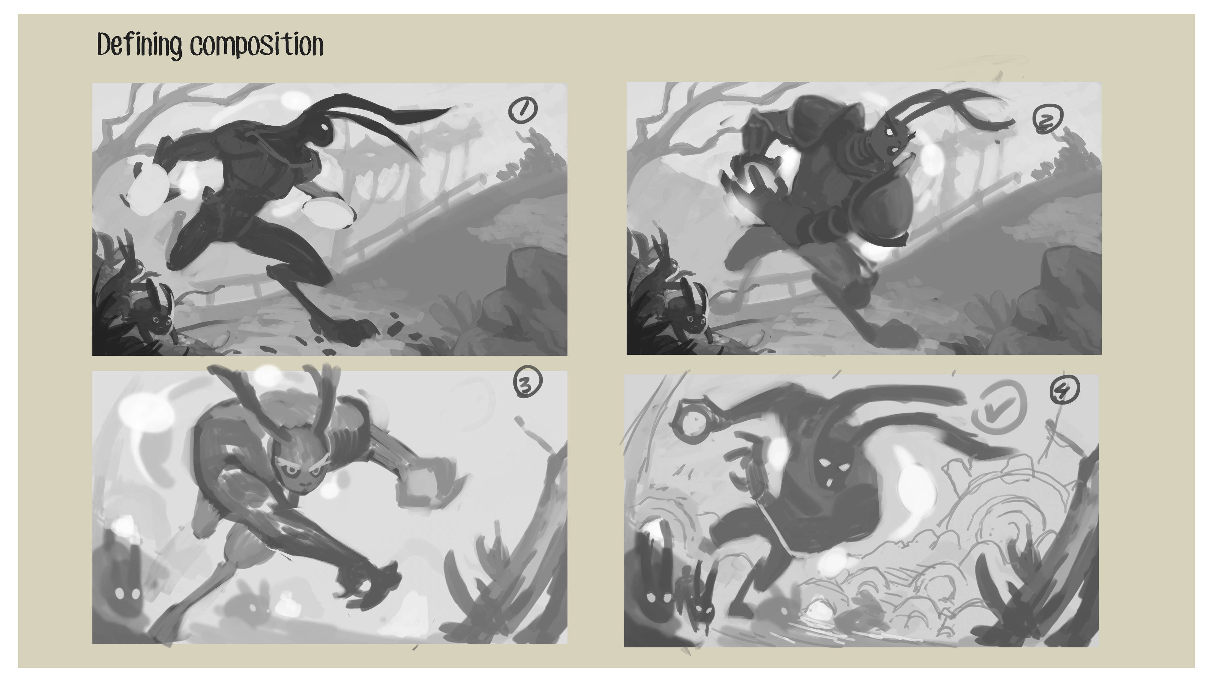
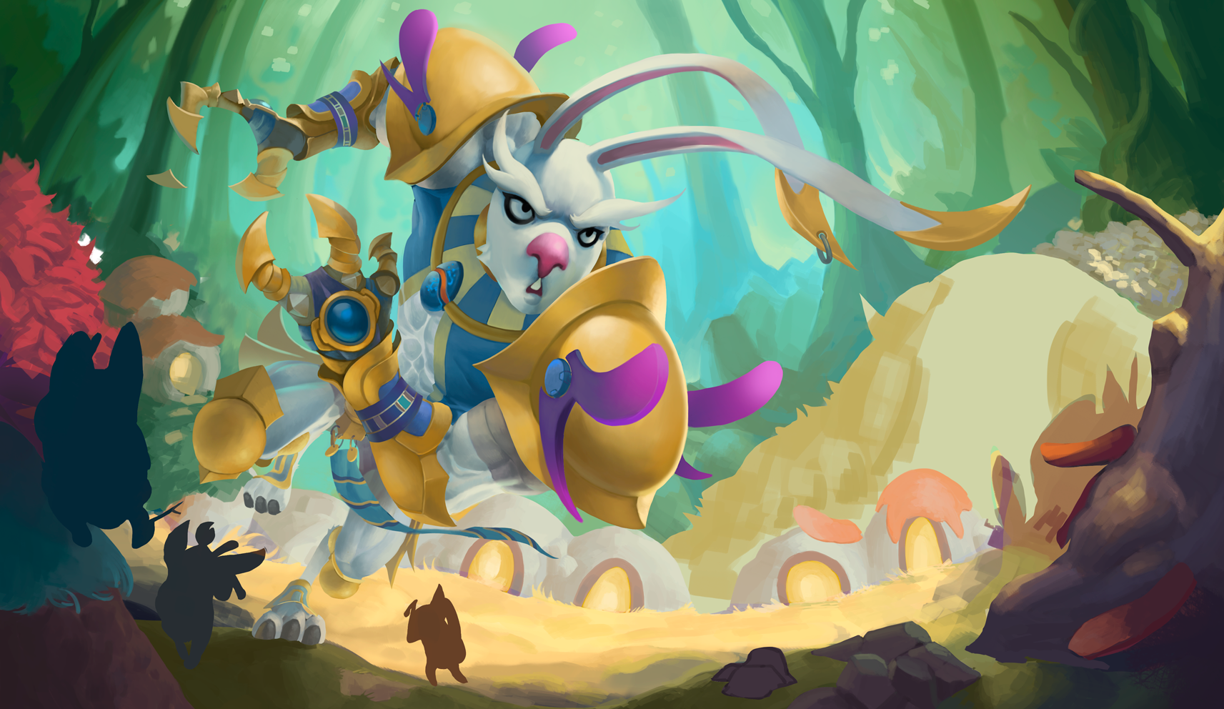
just a lil composition crit, try and place Rah bit so he two thirds of the image, at the moment in 1,2 and 3 you could cut the image in half and basically see none of him in one of the halves.
As for the comps themselves, I love the stance in 2, maybe have a whole crowd of lil rabbits cheering him on 
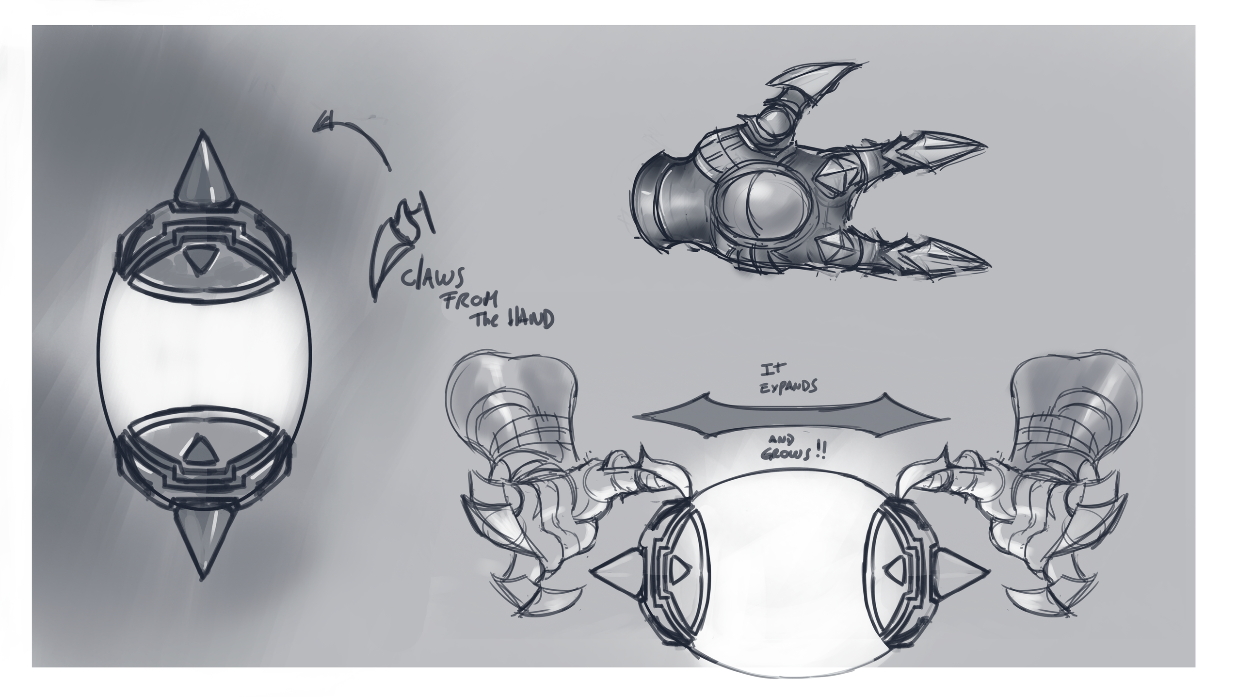
@mr_dessin Yes! the third is more dynamic, but the fourth lets me show certain details of the design, which in the third could not show.
thank you very much and equally
Oh yes I understand your concern...you're probably talking about the 80% appearance of our character...that is sure troublesome when we want to do something too much dynamic...
You're welcome and thank you !
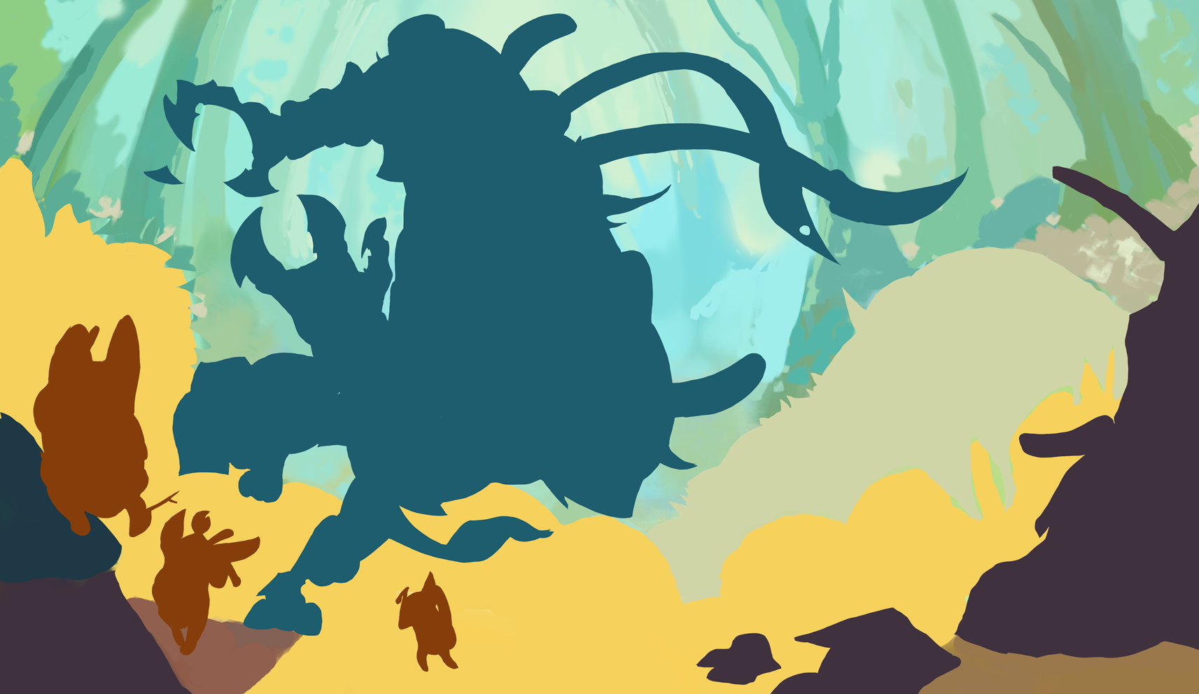
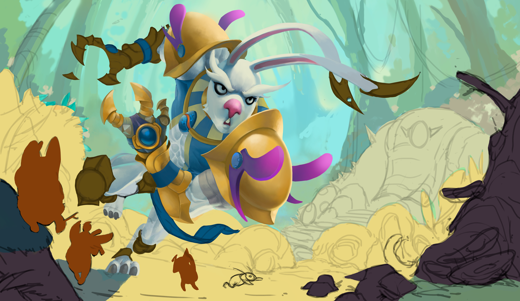
I can see certain problems with the contrast of the rabbit with respect to the background, or maybe the background is very bright.
If you see any detail that could improve, I would be very grateful!
Tomorrow I will continue to fix them. Thank you very much to all!
Maybe put some fog so the background colours won't blend too much with your character.