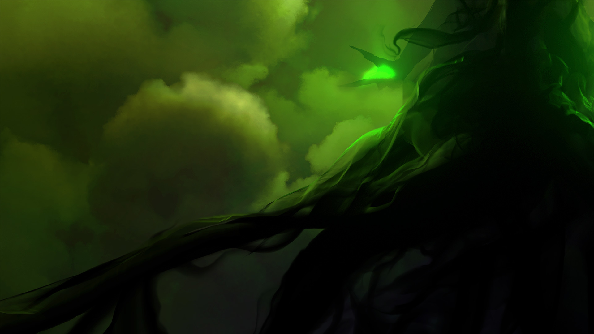
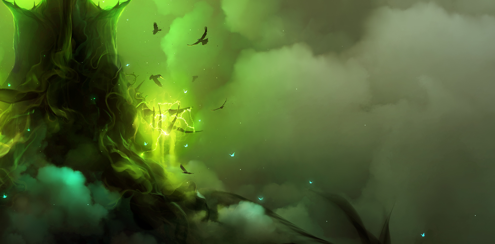
After taking a break. I experimented with some more color shifting. I ended up combining or more like ..saving... the green and blue tones ( best of both worlds )
I also did a portrait crop .. even if I had to try and squeeze in some more blue .. the green tone which is acting like a point of focus for the character will be pinched in way too much.
So i let it dominate the canvas but not in a polarizing sort of way.
Still tons of fixing . .cleaning .. adding more elements.
Some of my friends were concerned about many missing pieces of this concept and the title itself ; for which I might have to change later on.
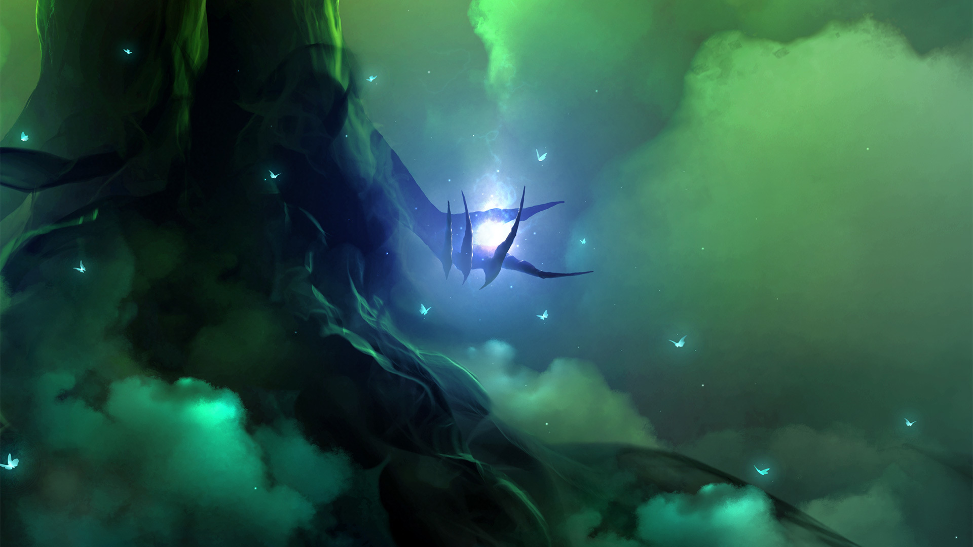
Although mentioned earlier … some of the key elements weren't added. Which is why I decided to bring them in, just to see how it would look with the new lighting.
- the glowing butterflies
- the ravens
Last but not the least - the missing piece of the puzzle to bind the story together.
the soul - being atomized by the spirit itself. ( It's primal power )
These are just rough-outs though, once finished .. everything will be explained.

Even rough, it looks already very nice !
But yes...I guess you want your piece, almost perfect, as usual xD
Thank you so much bro ❤️
Absolutely... This piece really has a lot to say. I know it'll never match up to whatever I have in mind... But how much i can do... I will surely try.
Hey nevs38,
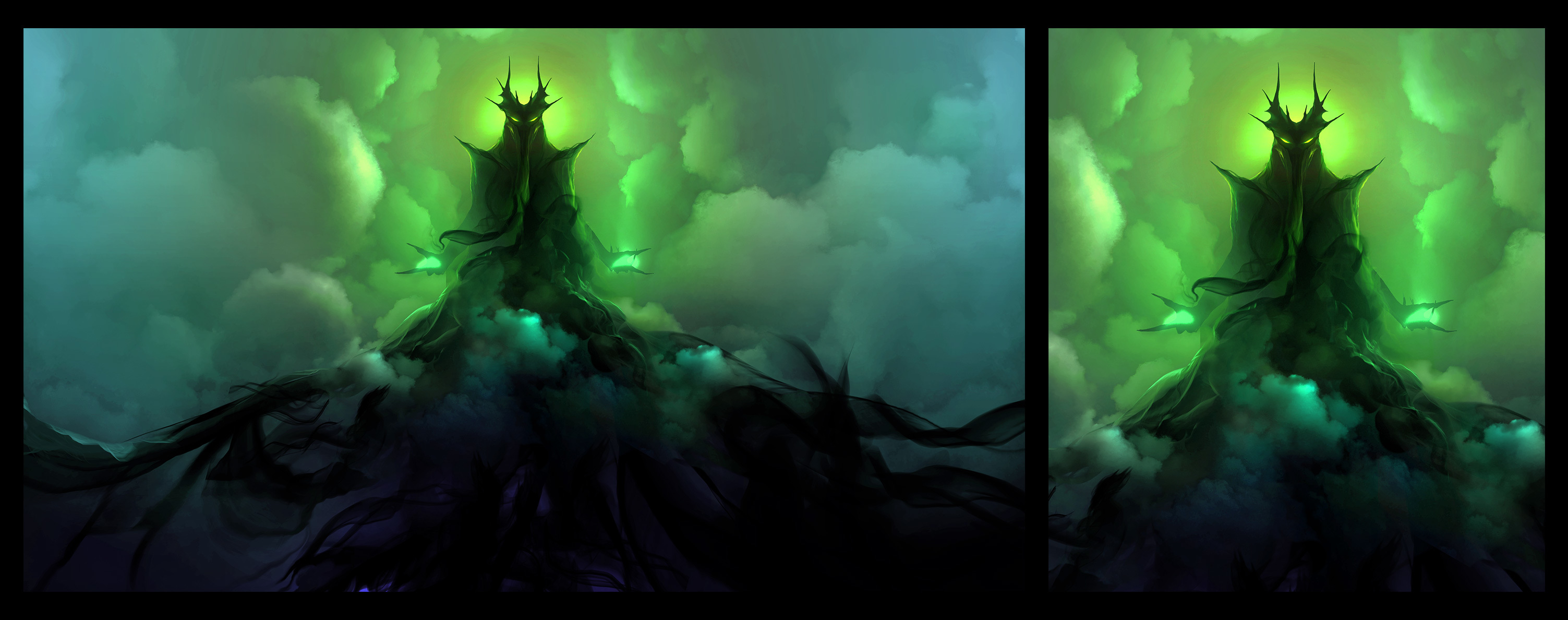
if you ask me I would crop the image like that (like you did before). You will be able to focus more on your character instead on the environment and he´s also easier to read that way. Perhaps, give it a try : ) Also keep the blue perhaps only in the butterflies, if you use it elsewhere the mystical effect is gone.

Matt .. thanks a lot buddy! 
Will work on the high res landscape version .. but will keep this portrait version for the final submission.
Was freaking confused as to how much should be in focus. This certainly helps!
Will play around with the butterfly color as well.

Wasn't happy with the bluish / purple glow .... so i chose a stark yellow green tone. I kept experimenting with many cold colors .. but none of them worked.
Somehow the background didn't go well with them either.
I think .. i finally found a rather unsual combination ... ( keeping fingers crossed i stick to this palette till the very end o_O )
Will need to further refine and mix carefully as i proceed further.
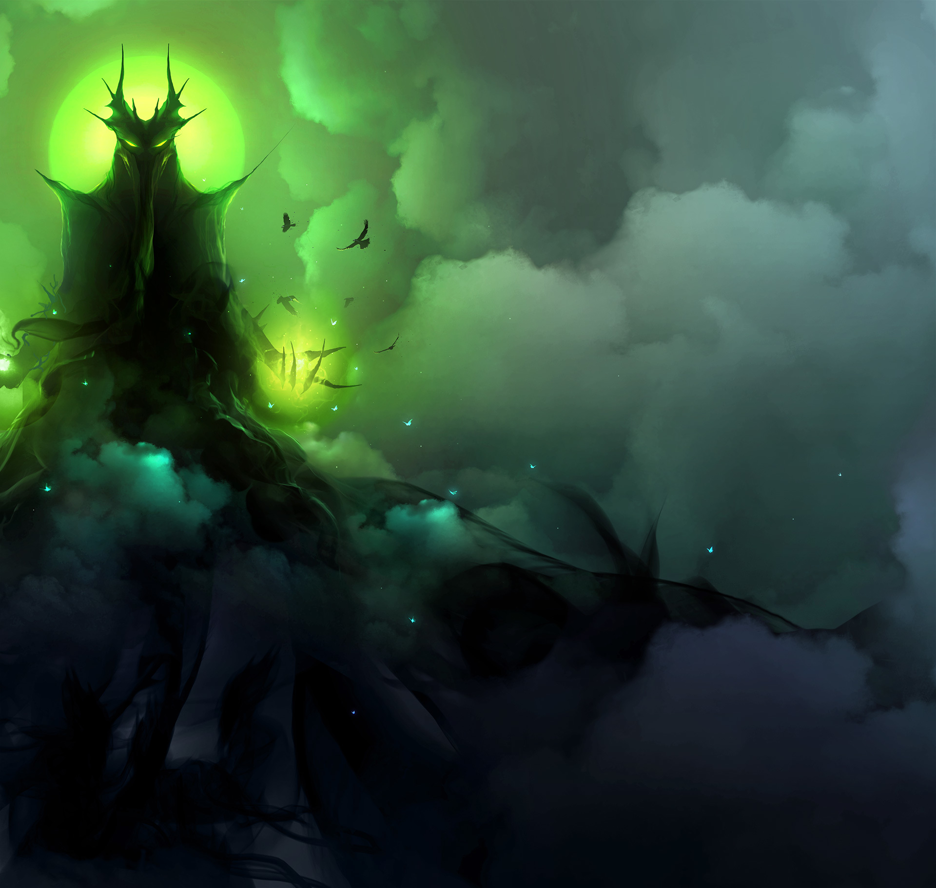
The green does work better. I think the top side is becoming a bit monochrome, maybe add another lightsource for that part for some more hue variation? I'm not sure though, so take it with a grain of salt ^^, it's just a little too different from the more colorful clouds below imo.
Thank you so much bro!
Actually you know what ... i did exactly what you mentioned. There was some color at the sides earlier. Somehow .. that hint of blue was distracting. My eye was just going there. So i was playing around with the hue/saturation slider ; the "grey" tone weirdly enough was calming. All i could then see .. were the colors in the middle of the canvas, further allowing the character to gain more attention.
Also .. .when cropped .. the green still stays strong.
( That'll be the final layout for submission )
The color of the clouds in the middle could change .. maybe toward the end..
Not sure yet.

Wow, pure atmosphere. The clouds look amazing. I love looking at other peoples work on here and how they progress. The different techniques and styles. New to Art War this year and grateful to have found. The figure has a real presence. Got an air of mystery to it. Certainly wouldn't want to face it in a dark alley....
Hey Arron! thanks a lot! \m/
I love weird mysterious dark art. So i hope i nail this. But most importantly .. the meaning behind the force / spirit itself.
I wish you all the luck!
Thanks again dude!


Your details are so hypnotizing : O
Thank you bro. <3
This piece is personal to me. It's mixed with anger, sadness .. most of all .. revenge.
You're always welcome ^^
Maybe I'm wrong with this...but whatever reason it is...when we work tirelessly hours on a piece, it has to be personal...I guess ?
I still think I don't put enough of my guts and blood on my work, and it is so painful to me...(usually because I deeply feel inside me I can do better, each time...it's like a force which push me the over way instead of the right path...).
Maybe you should put a bit more of love into your piece as well ? For sure it's opposite to what this piece has to mean...but I feel you should too : D
(yes a odd advice probably xD)