- Name: Irigaray celeste
- Email: cele_saga@hotmail.com
- Website: https://www.artstation.com/faycel
- @Twitter: celesele
- @Facebook: https://web.facebook.com/ferceliry/

REVIEW
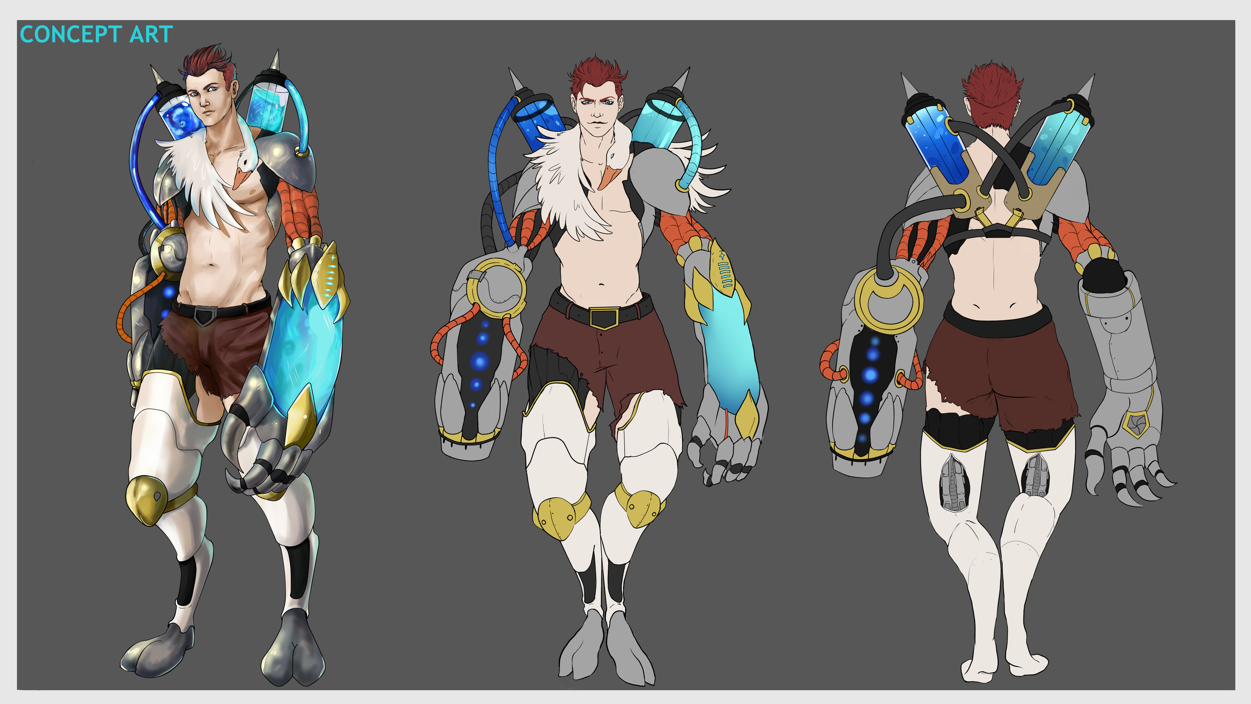
In an apocalyptic future, the earth is in complete decline, there is hunger, little oxygen and too much pollution.
However, there is an individual who wants to save the souls of what awaits them and its duty is to give them a quick and painless death.
But this does not look good, there are many who do not understand his mercy and compassion and will fight against him to save humans from what they call Hades, "the hunter of souls".

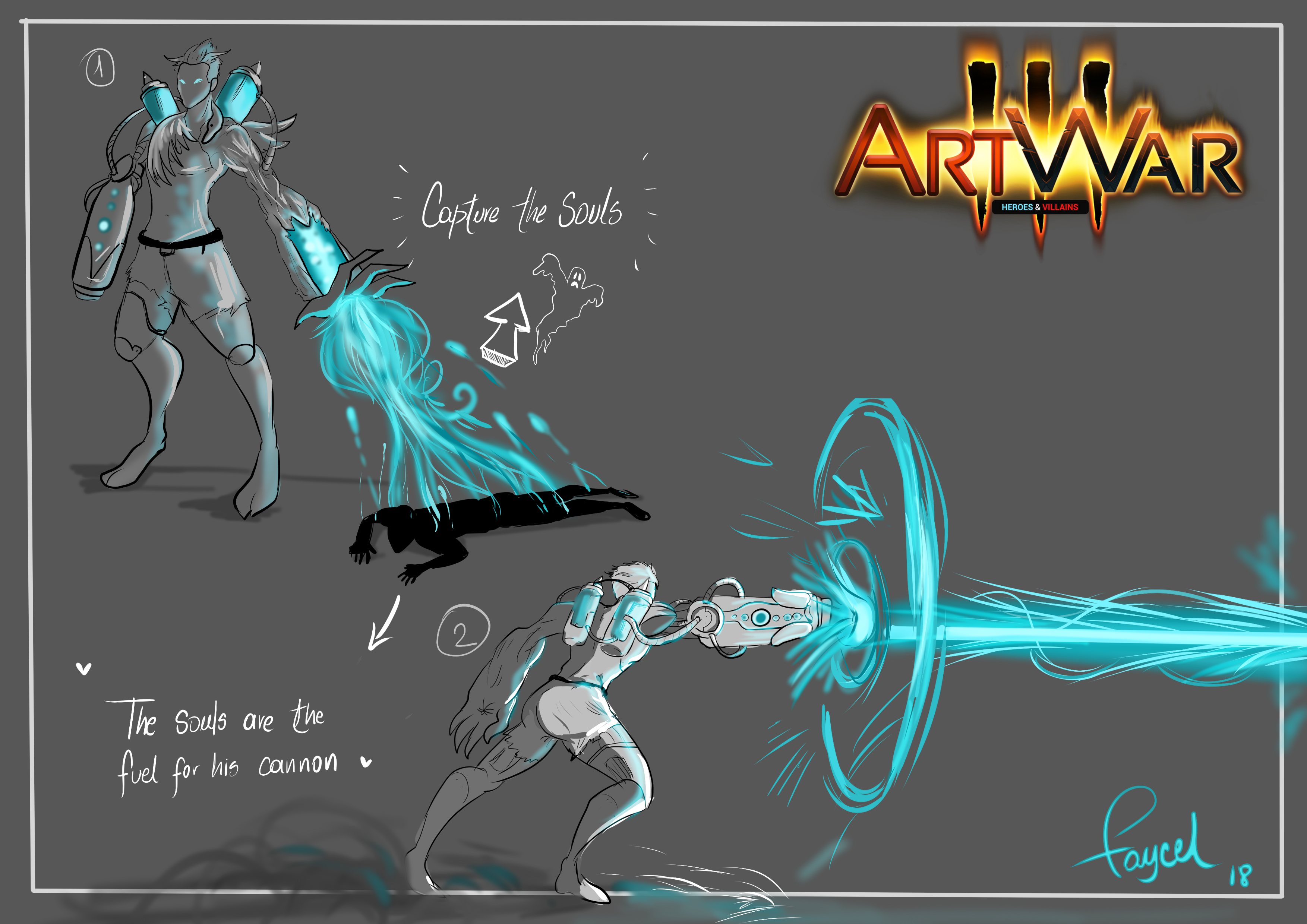
"Hades" for being persecuted armed his defense with a large cannon (which feeds those "saved" souls) and will use it against those who want to break His "human compassion".

keep it up!, Nice Concept!, I want to see more !!

Welcome to ArtWar.

I am really digging the concept of the soul gun, it gives you a lot of opportunities to put some cool effects into the beam, like a face of someone dead nearby that he previously drained.

@PeterH Ohh, that idea is very good!
I had thought to make the soul of the person being absorbed but I am going to do some tests with your idea because it is very good!

I'm a bit hesitant, but I'll try to make one of the designs of this composition, the ones I like a lot, are 5 6 and 7 ... maybe a little bit the 4

What you think? Everything helps me to do better! Thank you!

7 or 5! I like the megaman cover vibe on those ones.
On 1, 4, 6 the use of his two powers at the same time feel a bit forced.
2 & 3 might work better with a vertical composition.
That was my two tokens.

@mr_dessin thank youu!! :blush:
The truth that I liked more the 7 haha.
I will make some changes, very few but that will be the end.
thanks for the comment, I appreciate it very much!
I will soon upload the color of the composition! :smile:

I really liked 2! It really shows off the villanous aspect as it's the most intimidating
Maybe 2 with a mix of 5 having him capture souls whilst shooting someone on the ground or causing that explosion behind him.
I also liked the 1st a lot too but it probably doesn't show as much of the character traits as it should
Really good comps! congrats!
Best of luck and see you at war? :laughing:

Heey @edenriquebq it was a good idea!
sorry I read it late T_T
I decided on the 7! and add some souls circling haha
now I did a color test
and the great dilemma, which one did I choose? Hahaha
See you in the war, comrade in battle :grin:

Its a bit normal, but I like 1 the most, even though the later images look a bit more interesting color wise. Perhaps pushing 2 a bit more might be a good solution, it just feels like he needs to pop a bit more in that one.

And I agree that 7 was the best choice.

First look cool...but I like the second purple/pink atmosphere as well : D (mixed with the last green glowy effects maybe).
And I don't know but purple-ish is more or less villainy in my head xD