Looks really cool. I'm curious about the fire dragon arm. How does it function? Is it a part of give and take with the curse?
Thanks Motocrab, that is the exact concept of his dragon arm, but it gives more than it takes, as it is killing him over time (that's why he is more and more enraged).
Honestly, I would be super upset too. Eager to see the composition.


Which one is your favourite? 

I like A and D the best, personally. With A, the camera looking up at the figure makes him feel more powerful during the lunge. Also the silhouettes are instantly readable in both. For A, the contrast between the background and the staff, then the character, is interesting. The recoil in D, like preparing for a strike, has a larger silhouette and might have potential for more detail. If I had to pick between A and D, I really like D. They all look really cool though. Great compositions.
Thanks a lot for your analyse @Motocrab!
Really loving D too. A could work well, but definitely loving D more!
Thanks @nesokaiyoh !

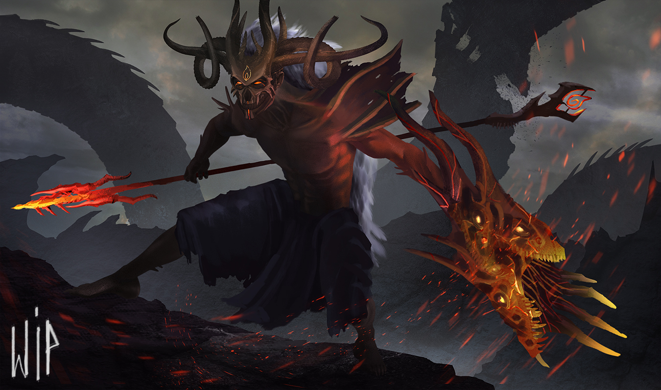

Looks really cool. That dragon arm is wild. The cooler background colors in 1 make the weapons pop but I feel like the more desaturated hues in 2 give more depth and realism to the composition. Both are awesome.
Thanks my wife told me the same thing ahah, I will probably continue the second one then
I personally love the overall tone and feel of the first, like Moto said it helps the red pop more - and in any case it shouldn't be too hard to mix these two, have some of that yellowish tone amidst the clouds.
I hope I'm not spotting some photo bashing though, it's not allowed for the competition xD
Thanks I will do it! And I didnt use photobashing, only textured brushes, but I'll take care with the render :).
