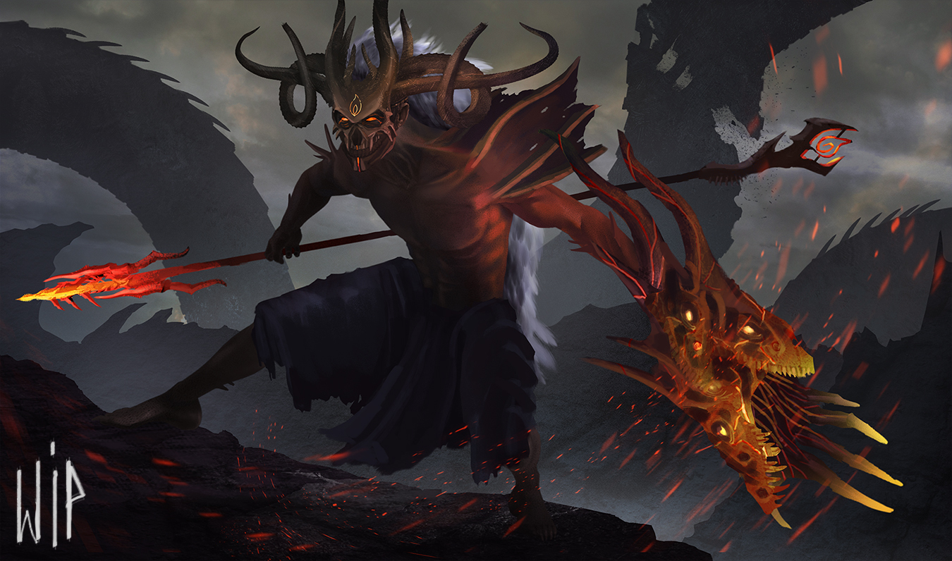
I like A and D the best, personally. With A, the camera looking up at the figure makes him feel more powerful during the lunge. Also the silhouettes are instantly readable in both. For A, the contrast between the background and the staff, then the character, is interesting. The recoil in D, like preparing for a strike, has a larger silhouette and might have potential for more detail. If I had to pick between A and D, I really like D. They all look really cool though. Great compositions.
Thanks a lot for your analyse @Motocrab!
Thanks @nesokaiyoh !
I personally love the overall tone and feel of the first, like Moto said it helps the red pop more - and in any case it shouldn't be too hard to mix these two, have some of that yellowish tone amidst the clouds.
I hope I'm not spotting some photo bashing though, it's not allowed for the competition xD


