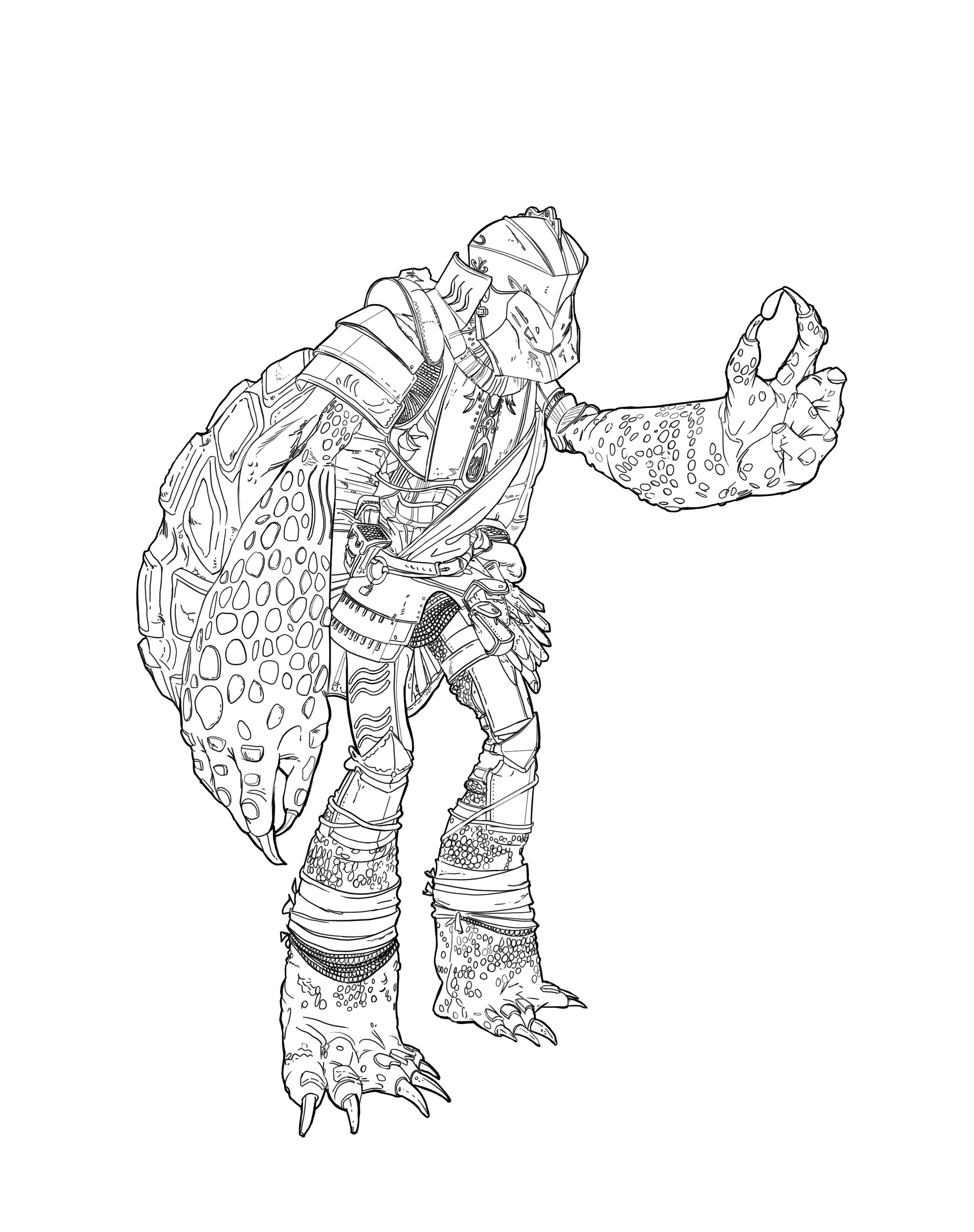
I wanted my character to resemble a drop of water in the general silhouette of the character and doing more iterations on thumbnail 11, I decided my champion to be a turtle. To give it a spin and some fun I added knight into the mix, trying to solve how to blend the initial armor of the turtle shell with some knight armor. At the end I did some iterations of thumnail number 4, too.

As of now, I think I'm going to go with turtle Number 2. It feels best for the constraints I gave myself. As of weapon, I'm not sure yet, it's probably going to be a sword. I feel like a physical fighter is something I'm going for more in this design for my illustration.

Any other ideas, help or feedback in general is very much appreciated.

Now I'll first sleep on my decisions here,
Have a nice day everyone!

I like numbers 2 and 3 the best. Number 3 looks like a turtle that would use sword as it's more agile looking.

Love the weapon designs you have made too. Looking forward to see some colours and what you do next.

this character looks like a heavy weapon user, maybe a very bulky sword or a hammer, even an axe . But if i'd pick a weapon for now it'd be #8 with some extra thickness

Thank you for the feedback guys!. I chose to go with #2 as it intrigued me the most, but thought that the axe idea was great and fitting. I did 3 more ideations on #2 and will proceed to do a final design out of elements from A, B and C before laying down some color :smile:

C for me it seems more solid with the larger “feet”.

Colour Scheme #1 and #3 seem to fit naturally for a marine creature, but I really like #5 too. The warm pinks and reds make it pop out more.

I love the intricate details in the armour.

@tj-works Agree and thought to proceed with it at first, but finally went with #4, because it seems interesting to me.. we'll see how that turns out haha

In the meantime went and proceeded with some illustration thumbnails, picking #5 and starting going down with that one, pretty challenging, but let's go

10 days later

Okay, I think I pulled through the finishing line. There are definetly lots of things I learnt and lots I did wrong in the process

This looks very eccentric, the patterns on the walls are very interesting. I think you can push this further by separating your character a bit from the background. A lot of things look very merged, maybe add some mist behind the character or some red to shades (to go with the background) and to also push forward your character. They look like they're underwater so maybe add some bubbles behind the hero as well and floating upwards. I really like the concept, you can definitely refine it more!

16 days later

@yazziixx Thank you, I completly agree with what you said and tried to implement it to the best of my ability :smile:

Way better you can see the character much more now!