Thanks for the feedback. I'll probably accentuate the saturation around her face and hair to draw attention to her. It's funny how I was drawing some inspiration from butterflies and nature in general. I drew the fluffy neck to her outfit at first and then it suddenly became a familiar instead. Things just evolve and flow like that during the exploration process. I will definitely consider your feedback as I continue. Thank you!
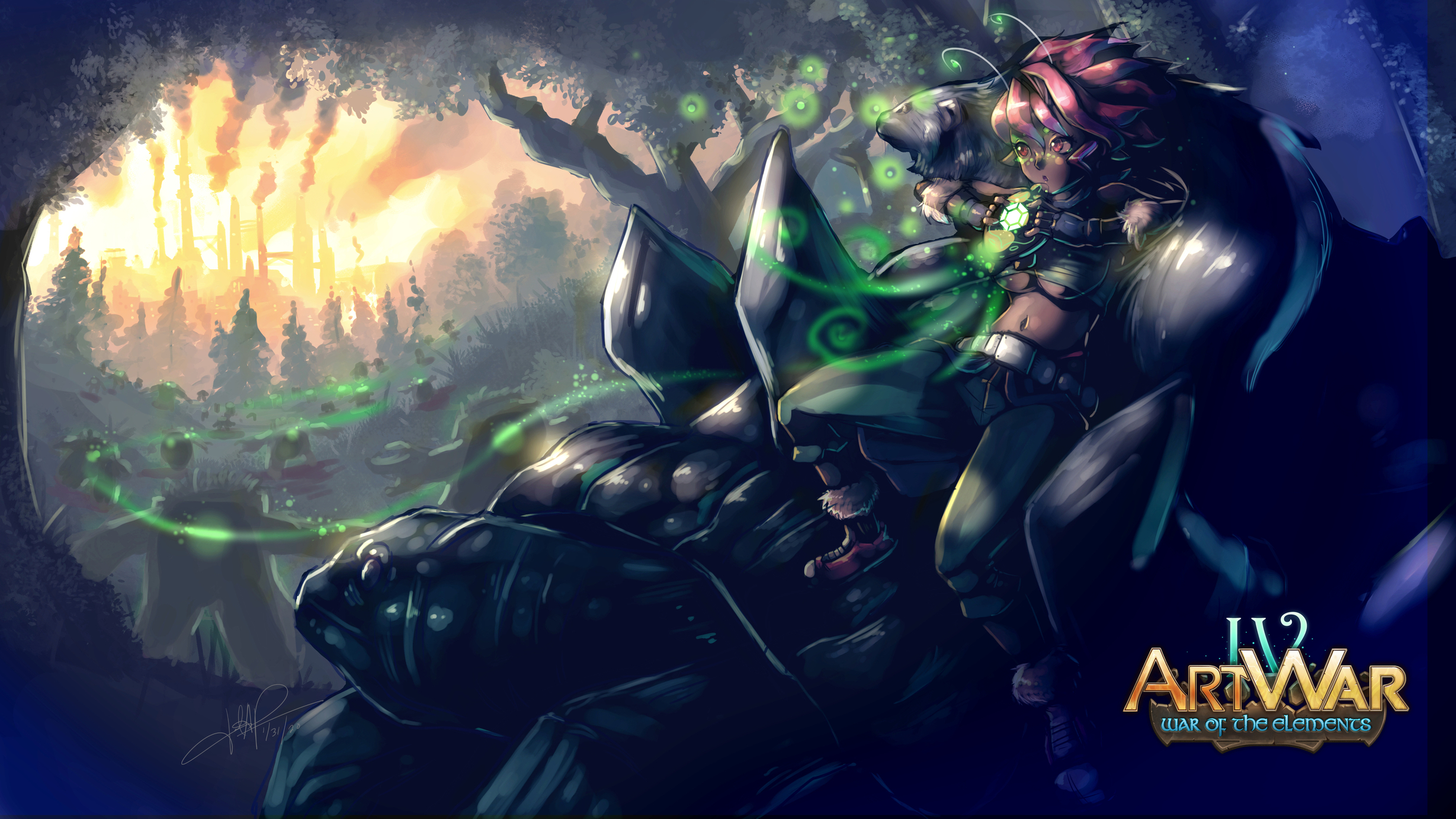
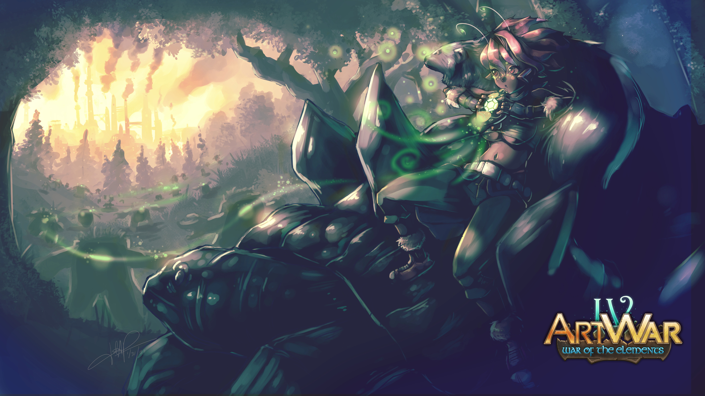
If you're thinking colour wise, the colour palette of Fili would work better with the orange, but the second is far more natural. If you wanted to mix them you could even have it more orange as the perspective recedes, showing that there's clearly more smog and mist over by where those factories are, as naturally there will be more there. It depends on where your characters are going though, so I'd do a bit of research and find some ref.
testing out my focus areas with the use of a gradient map. ever since working in photo retouching I've learned not to use absolute blacks and whites plus in illustration absolute blacks appear to muddy the colors. So I use the gradient map and a levels layer to affect the black and pay attention to the saturation areas too. I'll be adding the other characters into the image once I get the overall look resolved.Plus using this forum lets me have quick access to my previous images while I work on in my software of choice. (I'm using a laptop).