Yeah xD And you have two weeks in any case! My main concern with your piece is that while the warping does distort the view of it a little, the girl also is not on the same plane as the environment. I based my over sketch of your girl on the perspective she is in, so I modified the environment, you're going to have to distort your character a lot more to fit in the perspective you have currently! take it with a grain of salt though, and if you do want to work on the perspective so everything fits it's always better to do it in the early stages as it'll save you a lot of grief and wasted time later down the line when you actually come to fixing it 
Thanks mate! 
That's it for today. Next time I'll try to fix my perspective and start rendering the character.

Instead of my initial thought, that I'll be rendering the character, I started overpainting the background. Here is the result: 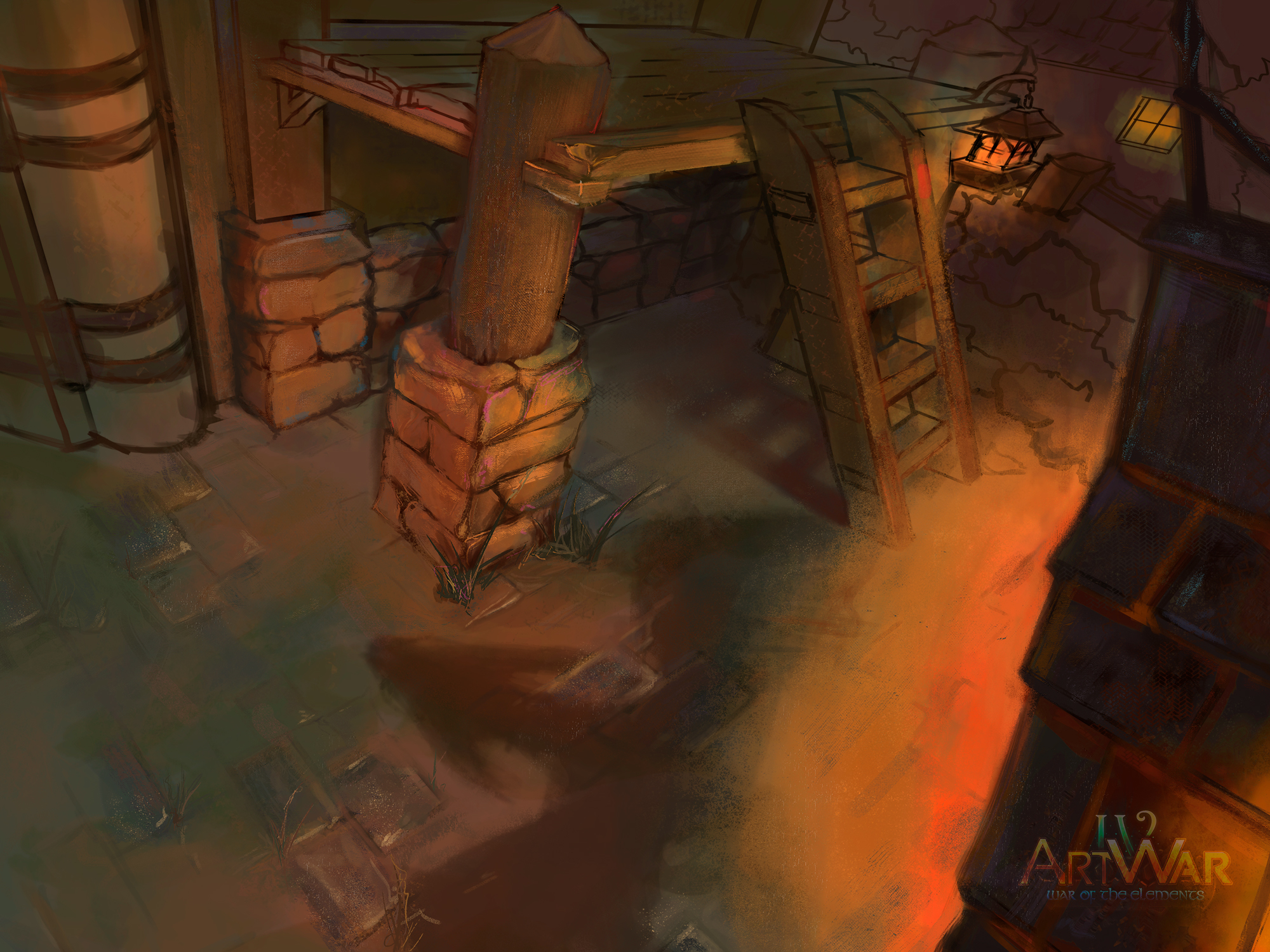
Ahh you have such a beautiful variety of colours here, the greens and slatey blues in those stones are really stunning! I am a little confused with that arrow head shadow on the floor though, that must be a really strong light source - but that light isn't showing on the rest of the piece yet (aside the shadows from it, although the pedestal is missing it) Unless you just haven't painting that on yet and I'm impatient lol
Oh yeah, thats going to be tricky. 
I actually have a very good technique to add realistic lights to darker scenes and therefore drasticly changing the mood. The only things I need for that are some adjustment layers, some light rays made with point blur and lastly some ambient light.
But to use these, I'd first need to finish the overpainting which will happen in the upcoming days c:
I didn't have much time today, so I just put some smaller details in the background. Soon I'll start working on the character itself. 
I pretty much finished the background. Also, I started experimenting with lights. Which one do you guys like more?

That shadow is still confusing me, but the first one works best. If you're having the shadows caused by the fire though they're on the wrong plane and the lighting doesn't really match up (also just noticed the lantern in the top right, again the shadow of that ladder doesn't match with it)
I'm actually not sure what that phantom ladder shadow is being caused by lmao
I cleared up the shadows a little bit.
I'm planning to add some flames, to make it obvious what's happening, but for now, I'm focusing on the character.
Ok, so here is today's progress. I'm using a linked psd, to make changing stuff easier.
Any thoughts? 

Your character's posing is a little awkward because it feels more like a front view morphed into the perspective you're working with - and it's a difficult perspective. I'd use some blocks to define parts of the body in that perspective first before going too far on the rendering with her
Well, I tried and brutally failed.  I hate to say this, but can you please help me out with it? I tried putting her in boxes, that were in the right perspective, but if I fit her into those same boxes, she became way too deformed...
"Failing" I would take lightly haha you've chosen such a tough and difficult perspective! I respect that you've done so much with it honestly. And of course I can, I'll do a draw over for you (a little less rushed than the previous ones ehe) and I'll break it down so it can help you understand how it looks in this perspective, and hopefully help for future pieces too
Thank you so much. Until then I'll draw something else fast, so I can turn my thoughts away from this. It's honestly pretty tiring.
Mainly because the character is based on my girlfriend and we recently broke up, which hurt me quite a bit... 
Ahh well I'm sorry to hear that. Find solice in the fact you will at least learn a lot from this artistic experience, even though your relationship didn't go well. Here is the bit of help I can offer, I'd spend more time on the sections but with there being a deadline and my own painting unfinished I can't spare too much currently. Either way, I hope this helps a little. If you need extra ref, I recommend looking up the perspective and foreshortening tutorials of Krenz, he's a master and simplifies them quite well.
Anyway, the point being you need to start off with big, simple shapes that fit easily into a perspective, boxes work well as they fit it perfectly. Humans are more complex, and I'd suggest you study more on applied humans in perspective rather than just going at it blindly. A good book on that would be "Perspective for the Comic Book artist" by David Chelsea. That's where I learned initially!
About the drawover, I featured two slightly different poses on the right there - it's difficult emulating your pose because it's uncomfortable to stand like that irl, and jutting out the far hip is really difficult to show in a perspective setting. So I modified both a little, made it easier even, as I struggled a little initially. When it comes to people in perspective, I think of three large boxes, one for the head, torso and legs although arguably the torso can be split into two as the ribcage and hips operate separately of course.
Another thing about your pose, I assume you were going for some kind of contrapposto, but both sides of her body were leaning at the same time, which again is actually really unnatural and difficult to do irl, so I gave her a proper contrapposto (i.e. if you're unsure what that is, it's where the figure is leaning on one hip, with a shoulder tilt meaning one shoulder is raised, there's an example below)


With contrapposto by the way, it can only be opposites of the body, the shoulders tilting upward on the left, leaning on the right hip or vice versa
I wouldn't worry too much about getting either the pose or perspective right though, it's already really distorted on that side of the painting, so I had to normalise it a little in order for it not to become a fish eye. You can tell it's distorted by the way the box leans in the upper left, that's where the distortion gets bad as it's out of the proper range that works well for 3 point. When you move out of that field of view, things get really distorted and warped, it can look well in certain aspects but the entire piece needs to be consistent in order for it to not look out of the ordinary. If that makes sense? lol

